Corporate branding has become strangely polished.
Table of Contents
- The Problem Is Not Minimalism
- Brands Are Designing for Approval
- The Sans Serif Trap
- AI Made the Average Look Better
- Generic Brands Often Sound Generic Too
- Typography Is Where Personality Comes Back
- One Strong Detail Is Better Than Ten Trends
- How to Avoid Corporate Branding That Looks Alike
- From Our Desk
- Fonts to Explore from Figuree Studio
- Bolde – Powerful Sans Serif
- Ignazio – Modern Sans Serif
- Neobique – Modern Display Serif
- Kastroz – Luxury Vintage Serif Font
- Graphiel – Modern Bold Script
- Final Thoughts
Everything looks cleaner now. The logos are simpler. The colors are calmer. The websites are smoother. The decks look more expensive. Even small startups can launch with a visual system that feels ready for investors.
But there is a quiet problem under all that polish.
Many brands are starting to look alike.
A clean sans serif logo. A soft neutral palette. A rounded button. A vague gradient. A friendly illustration. A headline about trust, clarity, or innovation. It all feels professional, but also familiar in the wrong way.
This is not always bad design. In many cases, it is careful design. The real issue is that too many brands are making the same careful choices.
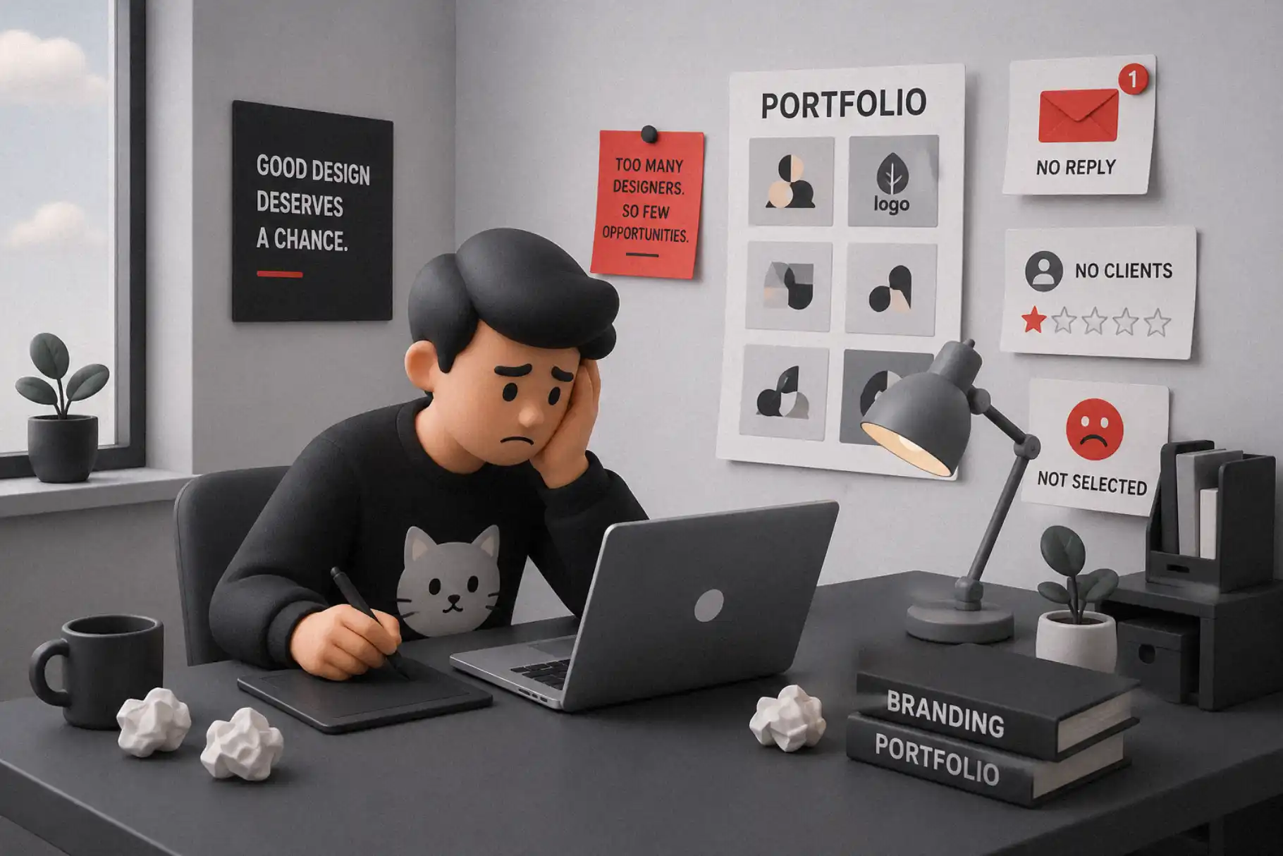
That is where the biggest corporate branding mistake begins. Brands are designing to avoid criticism, not to be remembered.
The Problem Is Not Minimalism
Minimalism is not the enemy.
A simple identity can be strong. A clean logo can be timeless. A quiet layout can feel premium. Some of the best brand systems in the world use restraint beautifully.
The problem starts when minimalism becomes a default answer instead of a clear decision.
Many corporate brands remove details because details feel risky. They flatten the logo. They neutralize the type. They soften the colors. They remove anything that might feel too specific, too cultural, too strange, or too emotional.
At first, the brand looks sharper.
Then it starts looking like every other brand that made the same decision.
A brand does not become memorable just because it looks clean. It becomes memorable when people can recognize its voice, even before they see the logo.
Read More: Avoid These 7 Common Branding Mistakes That Hurt Your Growth
Brands Are Designing for Approval
A lot of corporate branding happens inside meetings.
That matters.
When many people need to approve one identity, the safest option often wins. Bold ideas create questions. Distinctive typefaces create debate. Unusual color choices make someone nervous. Anything with personality can be described as “too much.”
So the team moves toward the middle.
Not too loud.
Not too playful.
Not too sharp.
Not too niche.
Not too emotional.
The result is a brand that nobody hates.
But nobody remembers it either.
This is one of the most common corporate branding mistakes. The identity is built to survive internal approval, not to create a strong external impression.
A safe brand can pass a meeting.
A memorable brand has to live in people’s minds.
Those are not the same thing.
The Sans Serif Trap
Sans serif fonts are everywhere in corporate branding, and there is a good reason for that.
They are clean. They are flexible. They work well on screens. They feel modern. They are easy to use across websites, apps, pitch decks, dashboards, and social media.
The issue is not sans serif itself.
The issue is sameness.
When every brand uses a similar neutral sans serif with similar spacing, similar layout, and similar tone of voice, the type stops carrying personality. It becomes invisible in a bad way. Not quiet. Not elegant. Just forgettable.
D&AD has also discussed this wider design problem in its article on how type can move beyond blanding, especially around the way sans serifs often get blamed for a deeper lack of brand character.
That point is important.
A sans serif can still be distinctive. It can feel human, technical, warm, sharp, editorial, or confident. But it needs intention.
Typography should not only make a brand readable. It should make the brand feel like itself.
AI Made the Average Look Better
AI did not create generic branding.
But it made generic branding faster.
Now it is easier to generate logo ideas, moodboards, color palettes, mockups, and layout directions in minutes. This can be useful for designers. It can help with exploration, speed, and presentation.
But AI often works from existing patterns.
If the brief is generic, the result will probably feel generic too. If the direction is “modern, clean, premium, professional,” the output may look polished, but it will also look familiar.
That is the risk.
AI can make the average look better. It cannot automatically make the brand more meaningful.
The difference still comes from taste. From direction. From knowing what to keep, what to remove, and what visual detail deserves to become part of the brand’s memory.
Read More: Best Fonts for Logo Design: Make Your Brand Unforgettable
Generic Brands Often Sound Generic Too
Visual sameness is not only about logos and fonts.
It also appears in brand language.
Many corporate brands now speak in the same calm, abstract way. They promise better solutions, smarter systems, seamless experiences, and future-ready growth. The words sound professional, but they often say very little.
When the voice is generic and the design is generic, the brand becomes even harder to remember.
This is why typography matters.
Type gives tone to language. The same sentence can feel corporate, playful, luxury, rebellious, editorial, or technical depending on the font. Before people process the full message, they already feel something from the type.
That feeling is part of the brand.
So when a company chooses a type system with no personality, it weakens the voice before the copy even starts.
Typography Is Where Personality Comes Back
A brand does not need to become loud to become distinct.
It needs a few recognizable choices.
Typography is one of the easiest places to bring personality back into corporate branding without making the whole system messy.
A brand can still use a clean sans serif for body text. That is practical. It keeps long content readable and digital interfaces clear.
But the brand can pair it with something more expressive for headlines, campaigns, packaging, social visuals, or key brand moments.
That contrast creates memory.
A refined serif can make a corporate brand feel more editorial. A bold display font can make a campaign feel more alive. A techno-inspired typeface can make a future-facing brand feel sharper. A handwritten or brush style can bring warmth when the system feels too cold.
The goal is not decoration.
The goal is voice.
One Strong Detail Is Better Than Ten Trends
A lot of brands try to stand out by adding more things.
More colors. More icons. More motion. More gradients. More layout tricks. More visual noise.
That rarely solves the problem.
A stronger approach is to choose one detail that becomes ownable.
It could be a headline typeface.
It could be a custom wordmark.
It could be a unique number style.
It could be a strong editorial serif.
It could be a sharp display font used only in campaign moments.
One memorable detail can do more than a full trend package.
Because trends are easy to copy.
A specific typographic voice is harder to replace.
How to Avoid Corporate Branding That Looks Alike
The first step is to stop asking only, “Does this look professional?”
That question is too small.
A better question is, “Will people remember this?”
Good corporate branding should feel clear, but not empty. It should feel consistent, but not lifeless. It should feel modern, but not like it came from the same template as every competitor.
Start with the brand personality.
Is the brand precise or warm?
Calm or energetic?
Editorial or technical?
Premium or playful?
Established or disruptive?
Then let the typography support that answer.
Do not choose a font only because it looks clean. Choose it because it carries the right kind of energy.
Do not use a display font everywhere. Use it where the brand needs impact.
Do not make every element neutral. Leave room for a visual signature.
That is how a corporate brand becomes easier to recognize without becoming chaotic
Read More: SaaS Branding Simplified: Fonts That Make Your Tech Startup Look Future-Ready
From Our Desk
Marty Neumeier, author of The Brand Gap, wrote one of the clearest lines about branding: “Your brand isn’t what you say it is. It’s what they say it is.”
That quote feels even more relevant now.
A company can say it is bold, premium, human, innovative, or different. But if the identity looks like every other company in the category, people may not feel that difference.
Branding is not just the message a company sends out.
It is the memory people carry after seeing it.
That memory is shaped by many things: product experience, voice, color, imagery, rhythm, and typography. But type often becomes the quiet anchor. It appears everywhere. In the logo. On the website. In the deck. On social posts. In packaging. In ads. In emails.
When typography is generic, the brand loses one of its strongest chances to be remembered.
Figuree Studio is an independent type foundry creating fonts for designers, brands, creators, and digital businesses. The studio’s voice is clear, human, premium, editorial, and practical, with a focus on useful font products, licensing, and visual branding.
That is why expressive font choice matters.
Not every corporate brand needs a dramatic typeface. But every brand needs a typographic point of view.
Fonts to Explore from Figuree Studio
For clean corporate branding, Bolde, Ignazio, and Midnight Workers can support modern identity systems that still need confidence and clarity.
Bolde – Powerful Sans Serif

Ignazio – Modern Sans Serif

For brands that want a more premium or editorial feeling, Neobique, Huitside, and Kastroz bring a stronger serif direction. These styles can help a visual identity move away from generic corporate minimalism.
For tech, AI, SaaS, gaming, or future-facing visuals, Exoflash, Synthetix, Meta Futura, and Overmars can give campaigns a sharper and more futuristic voice.
Neobique – Modern Display Serif

Kastroz – Luxury Vintage Serif Font

For expressive campaign moments, Graphiel, Retro Young, and Astroph can add personality when a brand needs more movement, warmth, or visual energy.
The best font is not always the loudest one.
The best font is the one that helps the brand become easier to recognize.
Graphiel – Modern Bold Script

Final Thoughts
Corporate branding does not look alike because designers forgot how to design.
It looks alike because many brands are trying to feel safe, scalable, digital, and easy to approve.
Those goals are understandable. But they are not enough.
A brand still needs memory. It needs a recognizable voice. It needs visual choices that feel connected to its story, not just to current design habits.
Typography can bring that personality back.
Clean design can make a brand look professional. Strong typography can make it feel specific.
Explore Figuree Studio’s font catalog and find typefaces that help your next brand identity feel less generic, more memorable, and more alive.