Branding is more than just a logo or color palette. For freelancers and brand owners, it’s the soul of your business. But even the most creative minds fall into traps that silently hurt their growth. In this article, we’ll break down 7 of the most common branding mistakes—and how to avoid them with clarity and confidence.
Table of Contents
- 1. Inconsistent Visual Identity
- Fix it:
- 2. Neglecting Brand Voice
- Fix it:
- 3. No Clear Brand Positioning
- Fix it:
- 4. Overcomplicating the Message
- Fix it:
- 5. Ignoring the Power of Typography
- Fix it:
- 6. Forgetting Emotional Connection
- Fix it:
- 7. Failing to Evolve with Your Audience
- Fix it:
- From Our Studio: What We’ve Learned About Branding Risks
- Final Takeaway: Don’t Let These Branding Risks Hold You Back
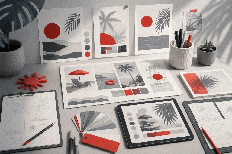
1. Inconsistent Visual Identity
If your logo looks one way on your website and another on your packaging, you’re sending mixed signals. Consistency builds recognition.
Fix it:
- Use a brand kit with defined colors, fonts, and logo versions.
- Use font pairings like Break Fridays for bold headers and Ontro Buck for expressive touch.
Also Read: Fonts That Make Your Digital Planners Look Stunning


2. Neglecting Brand Voice
Tone of voice is your brand’s personality. A mismatch between visuals and words confuses your audience.
Fix it:
- Define your tone: playful, professional, bold?
- Be consistent across socials, newsletters, and your site.
Also Read: How Freelancers Can Balance Love, Work, and Wellness Without Burning Out

3. No Clear Brand Positioning
If you don’t stand for something, you’ll get lost in a sea of competitors.
Fix it:
- Identify what makes you different.
- Communicate your niche clearly in your tagline or intro.
Example: “Fonts made for rebels, rule-breakers, and dreamers.”
Font Suggestion: Roadpunks – for street-smart identity.

4. Overcomplicating the Message
A cluttered message confuses rather than converts.
Fix it:
- Stick to a single core message per asset.
- Use clear headlines, short paragraphs, and impactful CTA.
Also Read: The Perfect Morning Ritual to Unlock Creative Focus
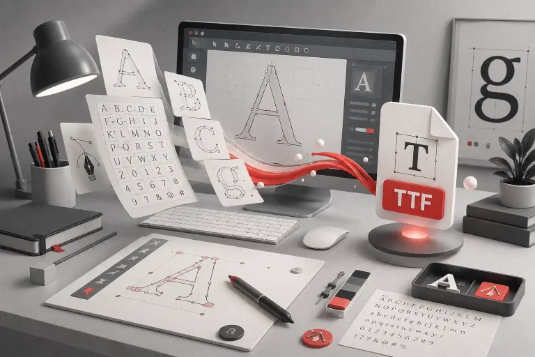
5. Ignoring the Power of Typography
Typography affects how people feel about your brand—often more than they realize.
Fix it:
- Use expressive fonts that match your brand’s personality.
- Explore unique options like The Gunslinger or Death Markers for statement pieces.
External Link: Typography Tips from WebDesignerDepot


6. Forgetting Emotional Connection
Brands that don’t connect emotionally are forgettable.
Fix it:
- Tell stories. Share what your studio stands for.
- Use visuals and fonts that stir feeling.
Font Suggestion: Darkest Saturday – melancholic yet bold.
Also Read: How to Design Fonts That Make People Feel

7. Failing to Evolve with Your Audience
What worked last year might not work today.
Fix it:
- Revisit your brand quarterly.
- Ask: Is this still working? Does this reflect who we are now?
Also Read: Unlock The Quiet Power of Consistency to Dominate Your Freelance Career
From Our Studio: What We’ve Learned About Branding Risks
At Figuree Studio, we’ve seen firsthand how small details make or break a brand. One of our designers once pushed for an entirely new font for a client who refused to ditch their generic typeface. Weeks later, that custom font became the spark that redefined the brand’s identity—and sales.
Our journey has taught us:
“Your brand is what other people say about you when you’re not in the room.” — Jeff Bezos
We obsess over storytelling, sketching on Procreate, crafting alternate glyphs, and building fonts that feel right. Why? Because your typeface might just be your loudest ambassador.
Final Takeaway: Don’t Let These Branding Risks Hold You Back
Branding is never a one-and-done project. It evolves with your audience, your values, and your vision.
So refine it. Rethink it. And when you’re ready—reinvent it.
Explore our font collections designed for impact:
👉 Explore Fonts
👉 Grab a Freebie
👉 Get Corporate License