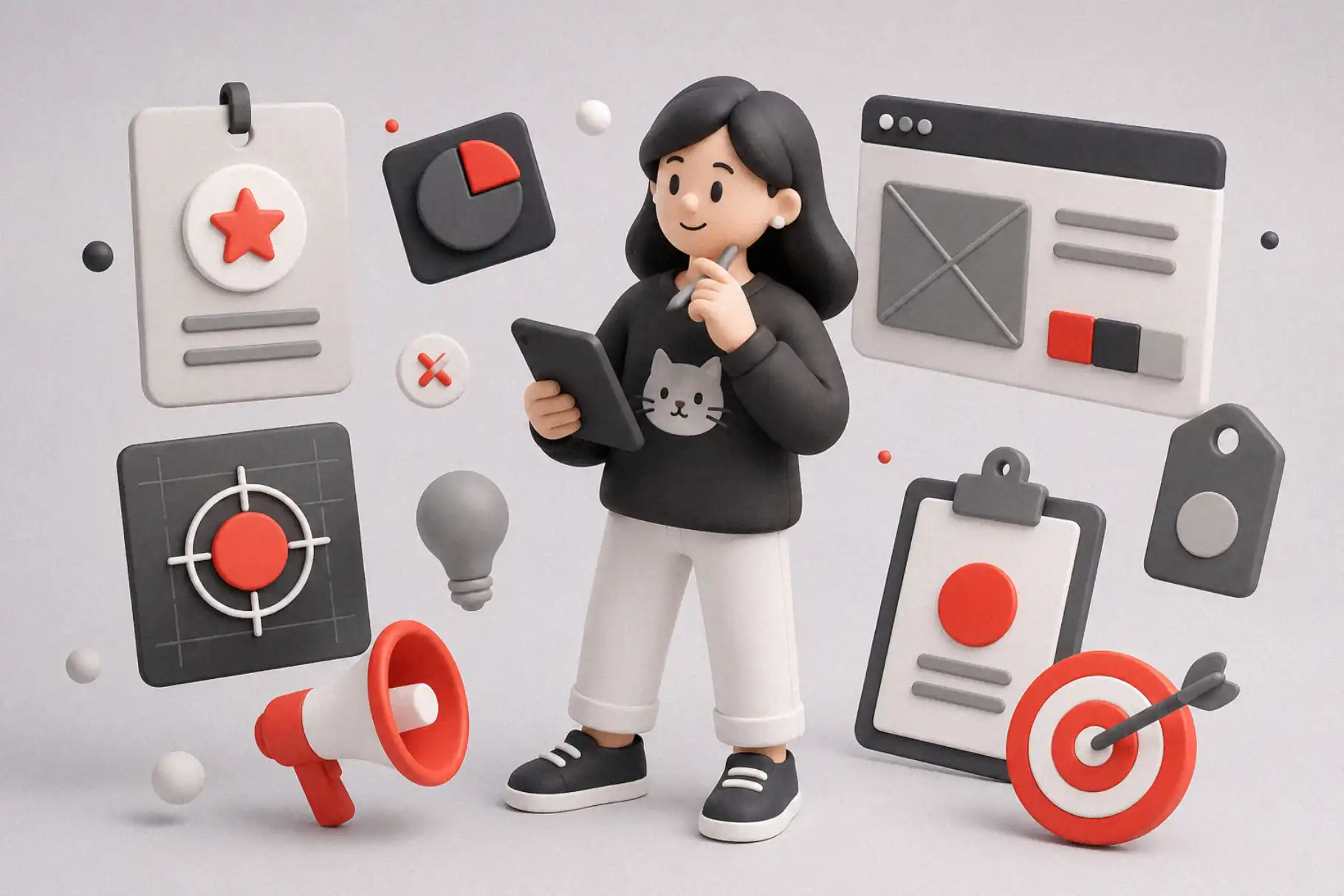
AI Branding Mistakes often happen quietly. A brand can look polished, modern, and expensive at first glance, but still feel strangely forgettable once people scroll away.
Table of Contents
- AI Makes Branding Faster, Not Automatically Better
- Mistake 1: Starting With a Prompt Instead of a Point of View
- Mistake 2: Letting AI Choose the Taste
- Mistake 3: Making Everything Too Polished
- Mistake 4: Using Generic Typography
- Mistake 5: Confusing Consistency With Sameness
- Mistake 6: Forgetting the Audience Has Taste Too
- From Our Desk
- How to Use AI Branding Without Losing Human Taste
- Fonts to Explore from Figuree Studio
- Grock Marker – Stylish Brush Marker Font
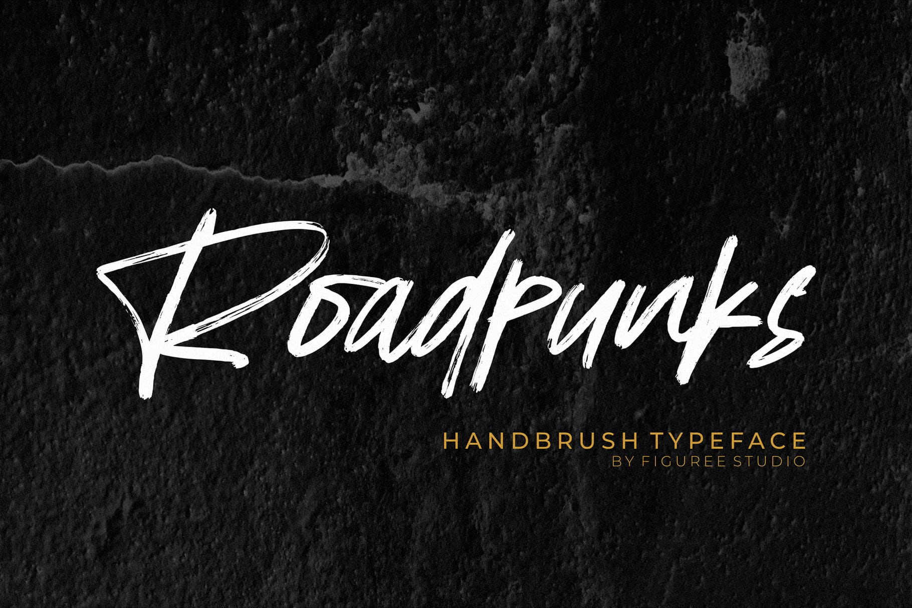
- Roadpunks – Handbrush Typeface
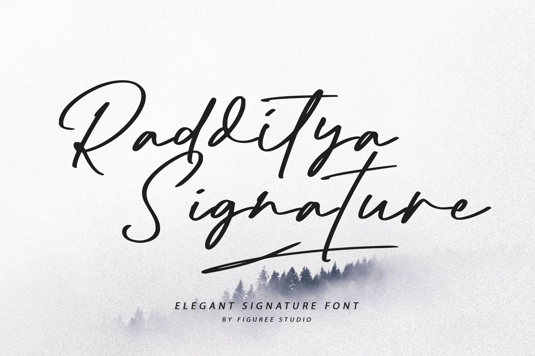
- Radditya – Elegant Signature Font
- Robot Brain – Display Techno Font
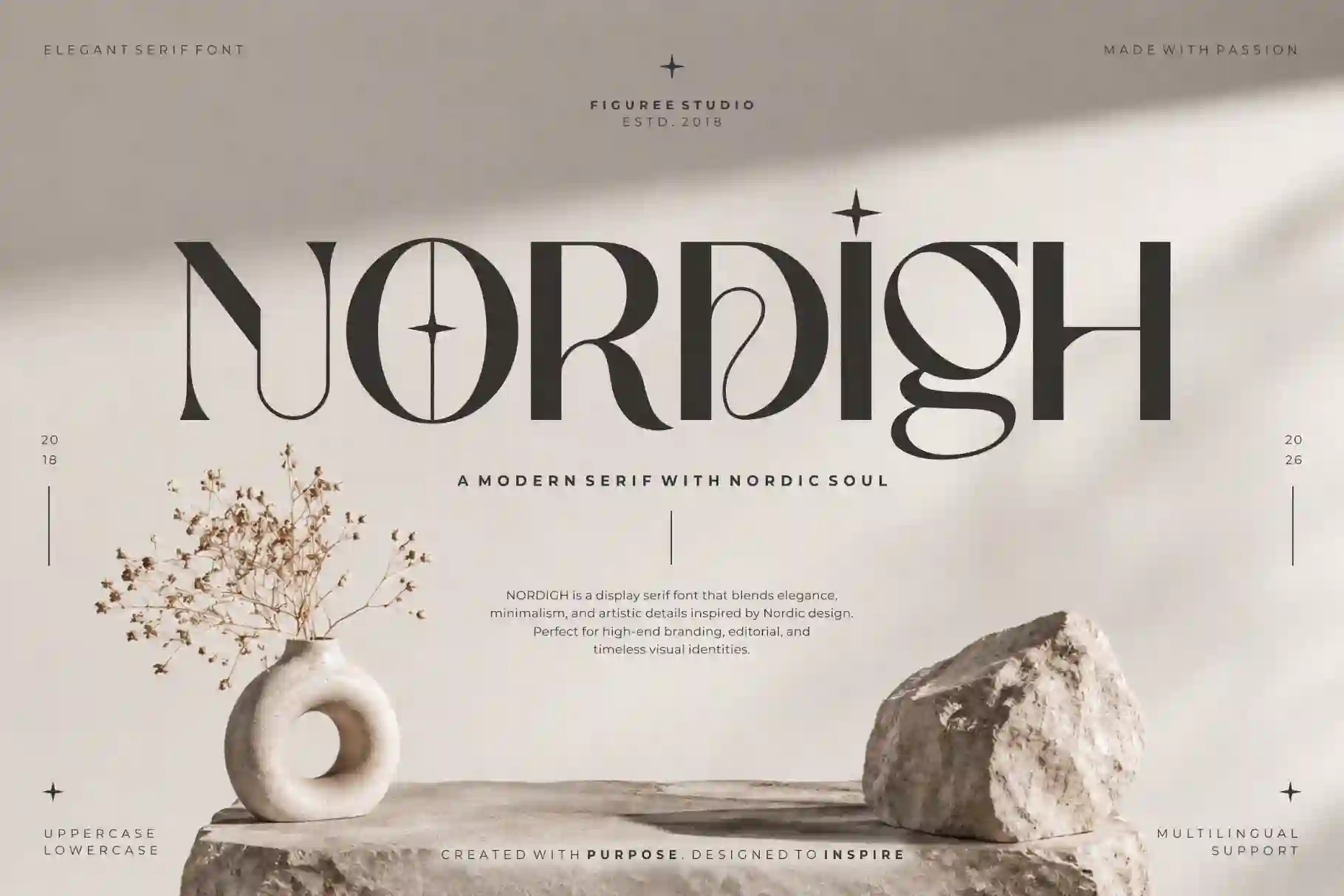
- Nordigh – Serif Display Font
- Final Thoughts
AI has changed the way brands are built. A logo idea can appear in seconds. A moodboard can be generated before the coffee gets cold. A color palette, brand pattern, social post concept, and landing page direction can all come out of one short prompt.
That speed is useful.
It helps designers explore faster. It helps founders visualize ideas earlier. It helps small teams look more polished without waiting for a long branding process.
But speed also creates a new problem.
When the first result already looks clean enough, many people stop too early. They accept the polished version before asking whether the brand has a point of view.
That is where AI-assisted branding can become dangerous.
Not because it looks bad.
Not because it looks amateur.
Not because the tool fails.
But because the result can look good enough to pass.
And “good enough” is often where brand memory goes to die.
AI Makes Branding Faster, Not Automatically Better
AI is good at producing options.
It can create a clean logo direction. It can suggest a layout. It can generate a polished visual mood. It can help with copy, naming, presentation, and campaign ideas.
But speed is not the same as taste.
A brand is not only a set of visual assets. It is a feeling people remember. It is the tone behind the message. It is the small detail that makes someone say, “I know this brand.”
That part still needs human direction.
Even in the design industry, the conversation around AI is moving in this direction. Figma CEO Dylan Field recently argued that AI-generated design is often based on averages from existing data, while humans still bring the ability to make original, boundary-pushing work.
That is the point.
AI can help you move faster.
But it cannot decide what your brand should mean.
Read More: Write Better AI Image Prompts That Actually Build Your Brand
Mistake 1: Starting With a Prompt Instead of a Point of View
The first AI branding mistake is starting with the tool before knowing the brand.
This happens a lot.
Someone opens an AI tool and writes: “Create a modern, premium, minimalist brand identity for a tech company.”
The result may look clean. It may even look impressive at first glance. But the problem is already inside the prompt.
Modern.
Premium.
Minimalist.
Tech.
These words are too broad.
Thousands of brands want to look modern. Thousands want to feel premium. Thousands want to look clean and digital. If the prompt sounds like everyone else’s brief, the result will probably look like everyone else’s brand.
A stronger brand starts with a sharper question.
What should people feel?
What should they remember?
What should this brand never look like?
What kind of customer should feel seen by this identity?
What visual choices would competitors be too afraid to make?
AI can help after that.
But the point of view has to come first.
Mistake 2: Letting AI Choose the Taste
AI can generate a beautiful moodboard.
But a beautiful moodboard is not a brand strategy.
This is where many AI branding projects become weak. The designer or founder sees something visually pleasing and assumes it is right. The colors match. The shapes feel clean. The layout looks trendy. Everything feels ready to post.
But taste is not only about what looks nice.
Taste is about judgment.
It is knowing which option feels too expected. It is knowing when a logo looks polished but has no soul. It is knowing when a font feels premium for the wrong audience. It is knowing when a design is attractive but not true to the brand.
A recent discussion about personal taste and algorithmic culture described how algorithms can push people toward safe, inoffensive, and easily consumable choices.
Branding has the same risk.
When the machine gives you something pleasing, it is tempting to accept it. But the human job is to ask, “Is this actually us?”
Read More: Best Fonts for Logo Design: Make Your Brand Unforgettable
Mistake 3: Making Everything Too Polished
AI often makes things look smooth.
That can be helpful. But too much smoothness can erase personality.
Real brands need friction. Not messy friction, but human friction. A small surprise. A strange curve. An unexpected type choice. A color that feels specific. A rhythm that does not look like a template.
When everything is perfect, the brand can become emotionally flat.
This is especially true for corporate brands, SaaS brands, digital products, and personal brands that use AI to build their identity quickly. They often end up with the same visual language: soft gradients, glassy shapes, rounded sans serif, floating icons, and vague futuristic energy.
It looks professional.
But it does not always feel personal.
A memorable brand does not need to be loud. It needs one thing that feels hard to replace.
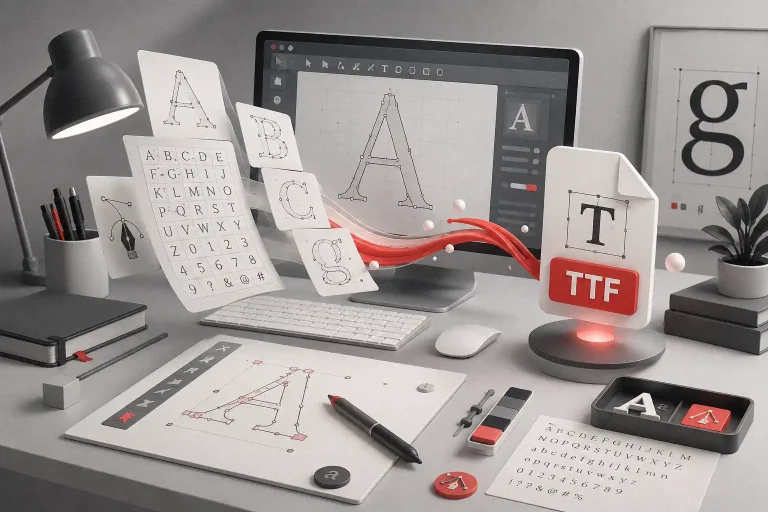
Mistake 4: Using Generic Typography
Typography is where many AI-assisted brand identities lose their voice.
The logo may look fine. The colors may feel balanced. The layout may feel modern. But the font choice often feels like an afterthought.
This is a major mistake.
Type is not just a container for words. Type gives words a body. It changes how a sentence feels before someone fully reads it.
A clean sans serif can make a brand feel modern. A serif can make it feel editorial or refined. A display font can create impact. A script or handwritten style can bring warmth. A futuristic typeface can make a tech brand feel sharper.
But when every AI branding project defaults to the same neutral type style, the brand loses one of its best chances to be remembered.
D&AD has written about this wider issue in its article on how type can move beyond blanding, especially around the way neutral typography can become part of a larger sameness problem in branding.
The issue is not that clean fonts are bad.
The issue is that clean fonts need personality, contrast, and intent.
Mistake 5: Confusing Consistency With Sameness
Consistency matters in branding.
A brand should feel connected across its website, social posts, packaging, pitch deck, email, and ads. People should be able to recognize the brand without seeing the logo every time.
But consistency does not mean every asset should look identical.
This is another common AI branding mistake. Once a brand finds a nice visual direction, it repeats it everywhere. Same layout. Same color balance. Same headline treatment. Same composition. Same AI-generated mood.
At first, it feels cohesive.
Over time, it becomes boring.
A good brand system has rhythm. It has rules, but it also has range. It knows when to be quiet and when to be expressive. It knows which elements should stay stable and which elements can flex.
Think of typography like a voice.
A person does not speak with the same volume in every situation. They can whisper, explain, joke, announce, and persuade while still sounding like themselves.
A brand should be able to do that too.
Mistake 6: Forgetting the Audience Has Taste Too
AI can help generate what looks good.
But branding is not only about looking good to the creator. It needs to connect with people.
Different audiences read visual signals differently. A font that feels premium to one audience may feel cold to another. A futuristic logo may excite one market and confuse another. A minimalist identity may feel elegant in one category and empty in another.
This is why human taste matters.
Not only the designer’s taste. Also the audience’s taste.
The best brand identities understand context. They know the culture, category, price point, emotional need, and visual expectations of the people they want to reach.
AI can support that process. But it should not replace the human act of noticing.
The small things matter.
What does the audience already see every day?
What are they tired of?
What visual style feels overused in the category?
What kind of typography would make them stop scrolling?
A brand becomes memorable when it respects the audience’s eye.
Read More: SaaS Branding Simplified: Fonts That Make Your Tech Startup Look Future-Ready
From Our Desk
Marty Neumeier wrote in The Brand Gap, “A brand is not a logo.”
That line still hits hard because it reminds us that branding is not only about the visible mark. Neumeier also describes a brand as a person’s gut feeling about a product, service, or company.
This is where AI branding needs human taste.
A tool can make a logo.
A tool can make a color palette.
A tool can make a beautiful mockup.
But a gut feeling is built through choices.
The typeface you choose.
The image you reject.
The detail you keep.
The trend you avoid.
The weird little visual decision that makes the brand feel alive.
Figuree Studio is an independent type foundry creating fonts for designers, brands, creators, and digital businesses. The studio’s voice is clear, human, premium, editorial, practical, and focused on real design use, not generic marketplace copy.
That matters in the AI era.
Because when everyone can generate visuals, the real difference is no longer access.
The real difference is taste.
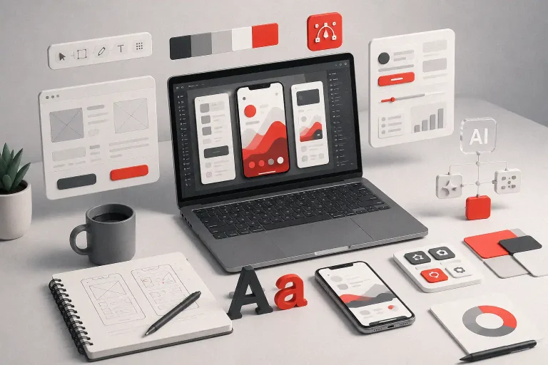
How to Use AI Branding Without Losing Human Taste
AI can still be a powerful part of the branding process.
Use it for exploration. Use it to test visual moods. Use it to create rough directions. Use it to speed up early thinking. Use it when you need to compare possibilities quickly.
But do not let it become the creative director.
Before generating visuals, write a clearer brand direction. Define the personality. Define what should feel different. Define the emotional memory you want to create.
Then use AI as a collaborator.
After that, edit with taste.
Remove the generic parts. Push the typography. Adjust the rhythm. Replace safe choices with more specific ones. Make sure the system can work in real life, not only in a pretty mockup.
A strong AI-assisted brand should still feel human.
Not because it avoids technology.
But because every important choice has intention behind it.
Fonts to Explore from Figuree Studio
AI-assisted branding often needs one thing: a stronger human signal.
For brands that feel too polished or too machine-made, Astogria Bejha, Grock Marker, and Roadpunks can bring a more organic, hand-made energy into campaign visuals, posters, packaging, and social content.
Grock Marker – Stylish Brush Marker Font

Roadpunks – Handbrush Typeface
For brands that need warmth without looking childish, Hello Mozza, Augustha, and Radditya Signature can add a softer handwritten touch. These styles work well for lifestyle brands, personal brands, creative studios, and human-centered digital products.
Radditya – Elegant Signature Font
For AI brands that still need a future-facing look, avoid making everything cold. Pair a sharper tech direction like Robot Brain or Neon Strix with a warmer supporting font or more human imagery, so the identity feels advanced but not soulless.
Robot Brain – Display Techno Font

For expressive brand moments, Nordigh, Astroph, and The Gunslinger can help create a more memorable visual voice across headlines, campaigns, and brand storytelling.
The goal is not to make AI branding look handmade by force.
Nordigh – Serif Display Font
The goal is to add enough human taste so the brand does not feel like it came straight from the same prompt as everyone else.
Final Thoughts
AI branding is not the problem.
Lazy direction is the problem.
A brand can use AI and still feel human. It can use automation and still have taste. It can move faster without becoming forgettable.
But that only happens when people stay involved in the important decisions.
AI can generate the options.
Human taste chooses the meaning.
That is the difference between a brand that looks polished for a moment and a brand that stays in someone’s memory.
Explore Figuree Studio’s font catalog to find typefaces that help your next AI-assisted brand identity feel sharper, warmer, and more human.