Why Movie Poster Fonts Decide Whether Viewers Click—or Scroll Past
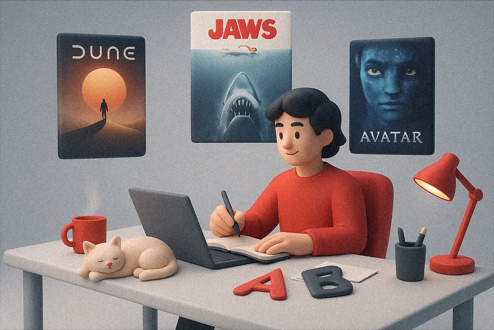
If you’ve ever stared at a blank artboard trying to design a film one-sheet that actually feels cinematic, you’re not alone. For designers, freelancers, and brand owners in film, entertainment, and streaming, typography becomes the quickest way to project scale, genre, and mood—before your audience reads a single word. The right Movie Poster Fonts set the emotional key: opulent for period drama, razor-clean for sci-fi, gritty for urban thrillers, and raw for horror. Choose well, and your poster sells the story instantly.
Table of Contents
- Why Movie Poster Fonts Decide Whether Viewers Click—or Scroll Past
- How to Choose Movie Poster Fonts Like a Pro (In Minutes)
- 12 Movie Poster Fonts That Feel Like Cinema
- 1) Olyphs — Luxury Art Deco for Prestige Drama
- 2) Locrian — Modern Display Serif with Gravitas
- 3) Kastroz — Vintage Serif with Command
- 4) Grow Boys — Playful Display for Animated & Feel-Good Stories
- 5) Ignazio — Modern Sans for Clean, Credible Credits
- 6) Bolde — Powerful Sans for Big-Studio Energy
- 7) Midnight Workers — Contemporary Sans for Neo-Noir
- 8) Technos — Futuristic Display for Sci-Fi Titles
- 9) Futrons — Sleek Futurism for Space Adventure
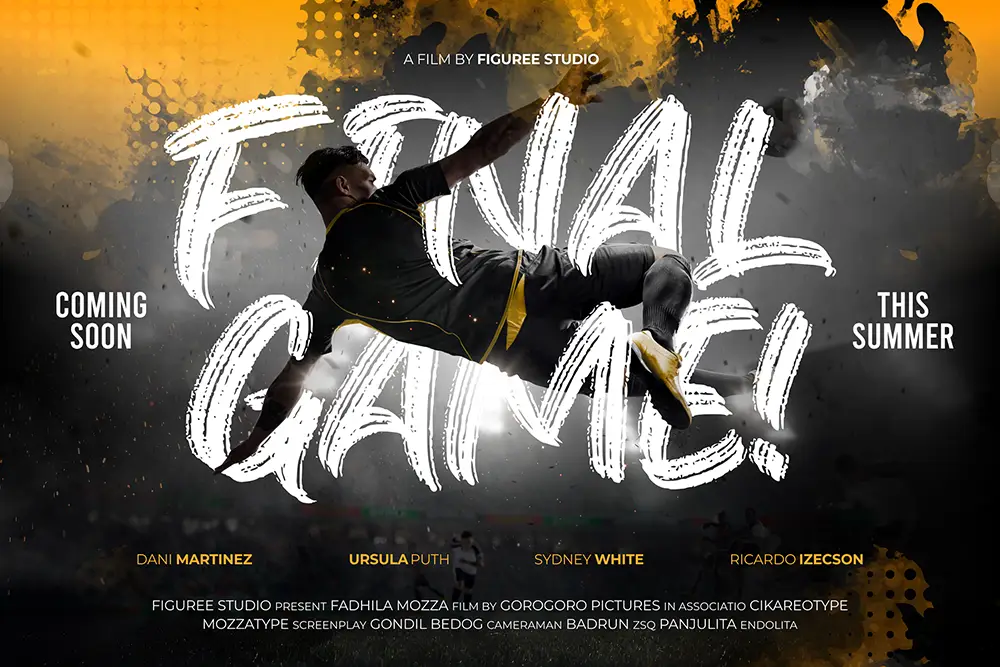
- 10) Jocker Block — Strong Brush for Adrenaline
- 11) Melted Brain — Dripping Horror That Moves
- 12) Dragonit — Medieval Strength for Epic Fantasy
- Fast-Track Title Systems with Movie Poster Fonts
- Practical Tips to Make Movie Poster Fonts Pop on Every Platform
- From Our Desk: What We’ve Learned About Movie Poster Fonts
- Quick Pairings (Copy/Paste for Your Next Brief)
- Licensing That Matches Real-World Production
- Final Checklist: Make Your Movie Poster Fonts Work Harder
- Quick Links to Featured Fonts
As creative budgets shrink and timelines tighten, Movie Poster Fonts also reduce iteration time. When a typeface “speaks” your genre, the rest of the layout falls into place—credits, taglines, billing blocks, studio and festival laurels. That’s why we curated a practical, cinematic-ready set you can deploy today.
Also Read:
• Best Horror Movie Fonts for Halloween 2025
• Best Fonts for Logo Design: Make Your Brand Unforgettable
• Font Categories Explained: 2025 Guide
How to Choose Movie Poster Fonts Like a Pro (In Minutes)
Great cinematic type choices follow three rules:
- Match genre (luxury serif for prestige drama, geometric sans for sci-fi, brush or graffiti for action/street).
- Design for distance (does the title read at 3–5 meters on a wall—or as a tiny streaming thumbnail?).
- Plan hierarchy (title first, then star names, tagline, credits). For a quick refresher on movie poster principles and legibility, this guide from 99designs is a solid reference on hierarchy, contrast, and genre cues (see their movie poster tips and examples).
When in doubt, build a fast type system: Title (Display) + Subtitle (Sans Serif) + Credits (Condensed Sans/Serif). Now let’s get to the fonts.
12 Movie Poster Fonts That Feel Like Cinema
Below are 12 production-ready picks from Figuree Studio’s catalog—balanced across serif, sans, and high-impact display styles. We’ve noted the best genre fits so you can slot them into real projects immediately.
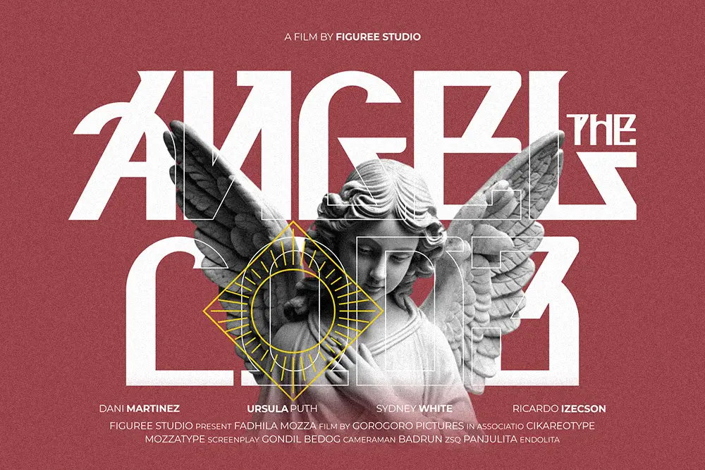
1) Olyphs — Luxury Art Deco for Prestige Drama
For film titles that need old-Hollywood glamour, Olyphs delivers tall elegance, Art Deco rhythm, and a refined title presence. Think awards-season biopics, period romance, and high-society intrigue. Pair with a clean sans for credits to keep the title breathing.
.fs-hover-wrap{ position:relative; width:100%; max-width:900px; margin:20px auto; overflow:hidden; border:2px solid #e9e9e9; background:#fff; cursor:pointer; }.fs-hover-wrap img{ width:100%; height:auto; display:block; object-fit:cover; transition:opacity 0.4s ease; }/* Gambar kedua disembunyikan */ .fs-hover-wrap .hover-img{ position:absolute; inset:0; opacity:0; }/* Saat hover ganti gambar */ .fs-hover-wrap:hover .hover-img{ opacity:1; } .fs-hover-wrap:hover .main-img{ opacity:0; }
2) Locrian — Modern Display Serif with Gravitas
Locrian gives you sharp serifs, luxury contrast, and modern prestige. It shines on theatrical posters and limited-series key art. Use small caps for star names to echo the title’s authority.
.fs-hover-wrap{ position:relative; width:100%; max-width:900px; margin:20px auto; overflow:hidden; border:2px solid #e9e9e9; background:#fff; cursor:pointer; }.fs-hover-wrap img{ width:100%; height:auto; display:block; object-fit:cover; transition:opacity 0.4s ease; }/* Gambar kedua disembunyikan */ .fs-hover-wrap .hover-img{ position:absolute; inset:0; opacity:0; }/* Saat hover ganti gambar */ .fs-hover-wrap:hover .hover-img{ opacity:1; } .fs-hover-wrap:hover .main-img{ opacity:0; }

3) Kastroz — Vintage Serif with Command
If your story has classic gravitas—mafia sagas, western epics—Kastroz projects authority in all caps. It also grades beautifully into monochrome or duotone comps.

4) Grow Boys — Playful Display for Animated & Feel-Good Stories
Here’s where playfulness meets cinema. Grow Boys adds quirky movement and hand-drawn charm—great for animation, coming-of-age films, or comedy posters. It brings the “fun-title energy” studios love in youth-centric releases.

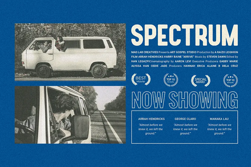
5) Ignazio — Modern Sans for Clean, Credible Credits
You need a reliable workhorse for taglines and credit blocks. Ignazio offers clean rhythm and modern clarity that scales from theatrical posters to streaming thumbnails.
.fs-hover-wrap{ position:relative; width:100%; max-width:900px; margin:20px auto; overflow:hidden; border:2px solid #e9e9e9; background:#fff; cursor:pointer; }.fs-hover-wrap img{ width:100%; height:auto; display:block; object-fit:cover; transition:opacity 0.4s ease; }/* Gambar kedua disembunyikan */ .fs-hover-wrap .hover-img{ position:absolute; inset:0; opacity:0; }/* Saat hover ganti gambar */ .fs-hover-wrap:hover .hover-img{ opacity:1; } .fs-hover-wrap:hover .main-img{ opacity:0; }
6) Bolde — Powerful Sans for Big-Studio Energy
Bolde feels muscular without losing refinement. Use it for action, true-crime, or blockbuster thrillers. Tight tracking + bold weight = instant marquee punch.

7) Midnight Workers — Contemporary Sans for Neo-Noir
Midnight Workers has late-night grit with a polished backbone—great for detective stories, street dramas, and tech thrillers. It reads crisply at small sizes in credit rolls.

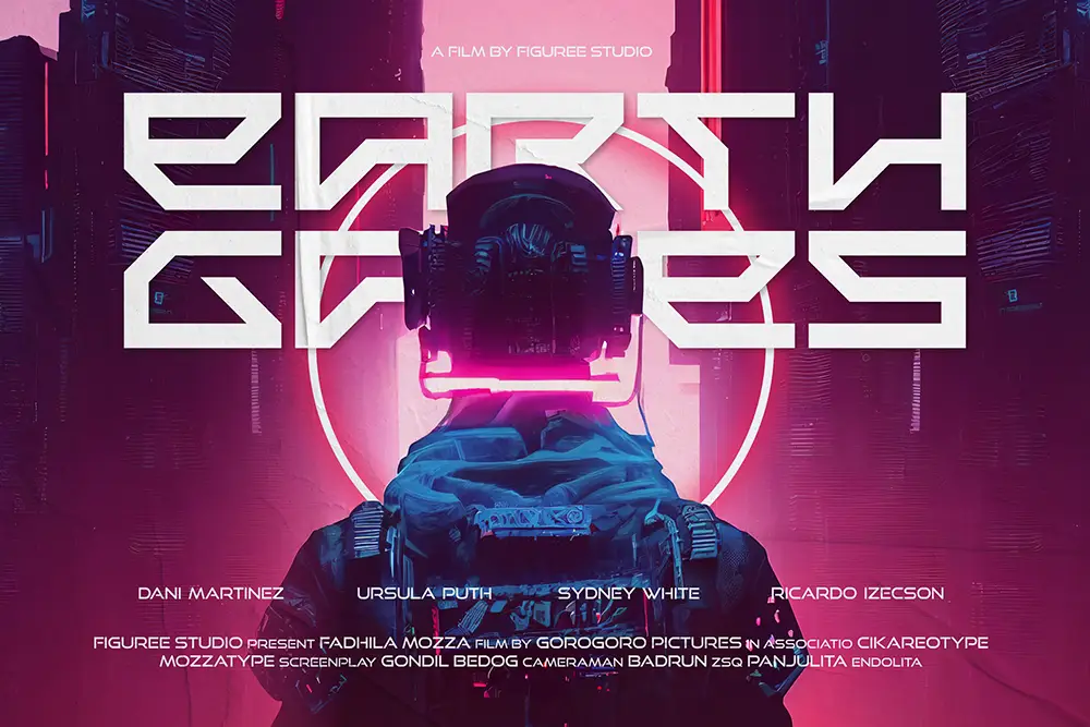
8) Technos — Futuristic Display for Sci-Fi Titles
Technos brings galactic alternates and cyberpunk flair. For sci-fi key art and futuristic franchises, its angular DNA screams “world-building.” Combine with a neutral sans for secondary lines.
.fs-hover-wrap{ position:relative; width:100%; max-width:900px; margin:20px auto; overflow:hidden; border:2px solid #e9e9e9; background:#fff; cursor:pointer; }.fs-hover-wrap img{ width:100%; height:auto; display:block; object-fit:cover; transition:opacity 0.4s ease; }/* Gambar kedua disembunyikan */ .fs-hover-wrap .hover-img{ position:absolute; inset:0; opacity:0; }/* Saat hover ganti gambar */ .fs-hover-wrap:hover .hover-img{ opacity:1; } .fs-hover-wrap:hover .main-img{ opacity:0; }
9) Futrons — Sleek Futurism for Space Adventure
Futrons trades in minimal futurism and clean geometry. It’s ideal for spacecraft dramas, techno-mysteries, and speculative futurescapes.

10) Jocker Block — Strong Brush for Adrenaline
Jocker Block adds kinetic energy to action posters, revenge thrillers, and survival stories. Its textured strokes give titles tactile urgency—especially over smoky or grainy backdrops.
.fs-hover-wrap{ position:relative; width:100%; max-width:900px; margin:20px auto; overflow:hidden; border:2px solid #e9e9e9; background:#fff; cursor:pointer; }.fs-hover-wrap img{ width:100%; height:auto; display:block; object-fit:cover; transition:opacity 0.4s ease; }/* Gambar kedua disembunyikan */ .fs-hover-wrap .hover-img{ position:absolute; inset:0; opacity:0; }/* Saat hover ganti gambar */ .fs-hover-wrap:hover .hover-img{ opacity:1; } .fs-hover-wrap:hover .main-img{ opacity:0; }
11) Melted Brain — Dripping Horror That Moves
For slashers, supernatural, and Halloween releases, Melted Brain oozes mood. Use the layered styles (Regular/Outline/Shadow) to build title depth without overdesigning.
.fs-hover-wrap{ position:relative; width:100%; max-width:900px; margin:20px auto; overflow:hidden; border:2px solid #e9e9e9; background:#fff; cursor:pointer; }.fs-hover-wrap img{ width:100%; height:auto; display:block; object-fit:cover; transition:opacity 0.4s ease; }/* Gambar kedua disembunyikan */ .fs-hover-wrap .hover-img{ position:absolute; inset:0; opacity:0; }/* Saat hover ganti gambar */ .fs-hover-wrap:hover .hover-img{ opacity:1; } .fs-hover-wrap:hover .main-img{ opacity:0; }

12) Dragonit — Medieval Strength for Epic Fantasy
For legendary tales, Dragonit brings medieval power and carved-stone presence. Perfect for fantasy franchises, historical epics, and sword-and-sorcery adventures.
.fs-hover-wrap{ position:relative; width:100%; max-width:900px; margin:20px auto; overflow:hidden; border:2px solid #e9e9e9; background:#fff; cursor:pointer; }.fs-hover-wrap img{ width:100%; height:auto; display:block; object-fit:cover; transition:opacity 0.4s ease; }/* Gambar kedua disembunyikan */ .fs-hover-wrap .hover-img{ position:absolute; inset:0; opacity:0; }/* Saat hover ganti gambar */ .fs-hover-wrap:hover .hover-img{ opacity:1; } .fs-hover-wrap:hover .main-img{ opacity:0; }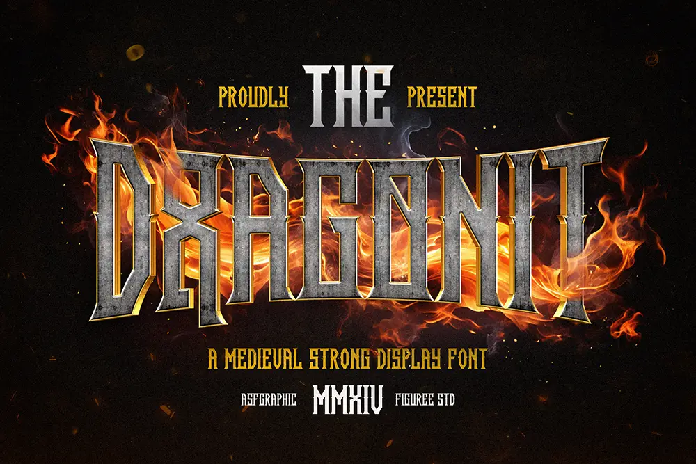
Fast-Track Title Systems with Movie Poster Fonts
A quick way to ship comps: pick a Title from the bold group (Olyphs, Locrian, Kastroz, Technos, Futrons, Melted Brain, Jocker Block, Dragon Brothers), then support it with a Sans for taglines/credits (Ignazio, Bolde, Midnight Workers). For prestige dramas, mix Huitside with Ignazio; for sci-fi, pair Technos or Futrons with Bolde.
Also Read:
• Fonts and Imagery in Design: Your Ultimate Visual Storytelling Guide
• The Ultimate Guide to the Best Fonts for Packaging Design in 2025
Practical Tips to Make Movie Poster Fonts Pop on Every Platform
- Design for the smallest size first. Your title must be readable at thumbnail scale. Test at 160–200 px width before polishing the theatrical version.
- Use contrast like a cinematographer. Hard light vs. deep shadow behind the title amplifies dimensionality; rim-lit edges help white type float without outlines.
- Limit styles. One display + one sans is usually enough. Over-layering kills that “single strong voice” a title needs.
- Earn your texture. If you add grunge, make sure the poster world justifies it (urban, horror, war). When in doubt, keep the letterforms clean and age the background.
- Credit blocks need rhythm. Condense slightly, tighten tracking, and align to a clean grid. A sans like Ignazio or Midnight Workers keeps the block legible.
For deeper reference on movie poster hierarchy, contrast, and readability across sizes, see this Adobe resource on title legibility and display type in poster layouts (a credible companion while you build your style frames).
From Our Desk: What We’ve Learned About Movie Poster Fonts
“Style is a simple way of saying complicated things.” — Jean Cocteau
When you’re racing toward a festival deadline, nothing saves more time than genre-true typography. Our strategic angle: begin with three adjectives for your film’s emotional tone (e.g., opulent, dangerous, inevitable), then map them to letter traits—contrast, width, terminal shape, modulation. The moment the letters embody your adjectives, blocking the rest becomes editorial, not guesswork. That’s exactly why Movie Poster Fonts are leverage: they compress discovery into a single, decisive choice.
“Your brand is what other people say about you when you’re not in the room.” — Jeff Bezos
Film titles are brands. They must be sayable, memorable, and shareable at a glance. Pick the type that makes people repeat it.
Quick Pairings (Copy/Paste for Your Next Brief)
- Prestige Drama: Title Olyphs or Locrian; Tagline/Credits Ignazio
- Sci-Fi Thriller: Title Technos or Futrons; Secondary Bolde
- Action/Revenge: Title Jocker Block; Secondary Midnight Workers
- Urban/Docu-Music: Title Dragon Brothers; Secondary Ignazio
- Period Crime: Title Kastroz; Secondary Bolde
- Art-House Romance: Title Huitside; Secondary Ignazio
Also Read:
• Design Better Apps: Fonts That Transform Web & Mobile UX
Licensing That Matches Real-World Production
When your poster moves from pitch to theatrical, licensing must keep up—especially for streaming, trailers, OOH, and merchandise. See our License page for clear tiers (including a special discount on Extended Licenses) and Corporate coverage for studio-scale campaigns. For quick experiments and social tests, grab our Freebies, then upgrade as your project locks.
Want ongoing inspiration and launch updates? Subscribe to our newsletter from the Figuree Studio homepage—we send real, designer-tested workflows and fresh font drops.
Final Checklist: Make Your Movie Poster Fonts Work Harder
- Is your Movie Poster Fonts choice aligned to genre, distance, and hierarchy?
- Does the title survive grayscale, glare, and JPEG compression?
- Are credits legible and rhythmically spaced?
- Did you proof exports for both theatrical size and streaming thumbnails?
Don’t let small typography decisions dilute a big story. Choose confidently, license clearly, and ship with momentum.
Call to Action:
Design your next cinematic title with our curated picks. Browse the full catalog, secure the Extended or Corporate license from our License page, and test concepts with Freebies first. Your story deserves typography that opens like a curtain, not a disclaimer.
Quick Links to Featured Fonts
Olyphs • Locrian • Kastroz • Huitside • Ignazio • Bolde • Midnight Workers • Technos • Futrons • Jocker Block • Melted Brain • Dragon Brothers