
Your Font Choices Shape the Entire User Experience
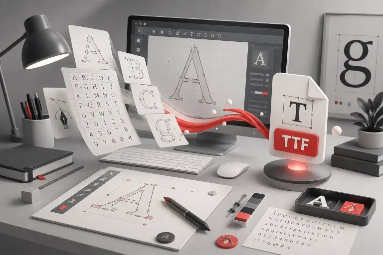
You’ve spent hours perfecting your app’s layout, crafted each screen with care, and tested every interaction. But here’s a secret many designers overlook: your font choices are silently shaping the entire experience. From onboarding to checkout, from tiny tooltips to main headers — typography plays the silent role of a UX guardian.
Table of Contents
- Your Font Choices Shape the Entire User Experience
- Why Fonts Matter in UX/UI Design
- 1. Fonts Control Readability Across Devices
- 2. Fonts Influence Emotional Response
- 3. Fonts Guide Navigation
- 5 Fonts That Will Elevate Your App & Web Design
- 1. Midnight Workers – Modern Sans Serif
- 2. Synthetix – Futuristic Techno Font
- 3. Graphiel – Modern Bold Script
- 4. Technos – Futuristic UI Font
- 5. Bolde – Professional Sans Serif Family
- From Our Desk: The UX Mindset Behind Every Font We Pick
- How to Choose the Right Font for Your App or Website
- Final Takeaway: Fonts Are UX Superpowers
And in mobile-first design, where screen space is limited and attention spans even shorter, the right font can spell the difference between conversion and confusion.
“Typography is the craft of endowing human language with a durable visual form.” — Robert Bringhurst
Also Read: Fonts That Make Your Digital Planners Look Stunning
Why Fonts Matter in UX/UI Design
1. Fonts Control Readability Across Devices
Legibility isn’t optional — it’s the cornerstone of any good interface. Choosing a font with clean spacing and strong hierarchy ensures users don’t get lost, no matter their screen size.
2. Fonts Influence Emotional Response
Fonts have a subconscious power. A sleek sans serif can say “professional and modern,” while a playful display font can feel fun and friendly.
3. Fonts Guide Navigation
Clear headings, consistent spacing, and thoughtful type scaling make interfaces more scannable — which leads to faster decisions and better usability.
Also Read: Avoid These 7 Common Branding Mistakes That Hurt Your Growth
Learn more about typefaces for UI from Google Fonts UX Case Study

5 Fonts That Will Elevate Your App & Web Design
1. Midnight Workers – Modern Sans Serif
A clean, modern sans serif that shines in onboarding flows, login forms, and user dashboards. Simple yet dynamic.

2. Synthetix – Futuristic Techno Font
Perfect for fintech, AI apps, or dashboard-heavy tools. Its precise geometry signals tech-forward clarity.

3. Graphiel – Modern Bold Script
When you need to inject energy and style into titles or hero banners, Graphiel delivers bold, charismatic curves.

4. Technos – Futuristic UI Font
With a clean aesthetic and cyber edge, Technos is ideal for navigation labels, alerts, and system feedback.

5. Bolde – Professional Sans Serif Family
If your product serves a wide user base, Bolde’s balance of clarity and warmth makes it a flexible choice across headlines and body text.

Also Read: Best Fonts for Logo Design: Make Your Brand Unforgettable
From Our Desk: The UX Mindset Behind Every Font We Pick
Fonts aren’t picked by vibe — they’re picked by strategy. At Figuree Studio, we choose fonts the same way UX designers choose button placements: based on impact.
We ask: Will this font help the user take action faster? Will it improve readability in low-light mode? Will it elevate perceived value?
“Your brand is what other people say about you when you’re not in the room.” — Jeff Bezos
Fonts like Bolde and Midnight Workers were created to solve real UI problems — from mobile clutter to accessibility on retina screens. Synthetix? It came from our obsession with sharp, futuristic UI tools. Fonts are not just design assets; they’re experience enhancers.
Also Read: How to Make Money from Fonts in Your Sleep (Passive Income Guide)
How to Choose the Right Font for Your App or Website
- Match tone to audience: Fintech? Go minimalist. EdTech? Add a little playfulness.
- Check responsiveness: Does it scale well from desktop to mobile?
- Look for versatility: Does it work in both headers and body text?
- Test accessibility: Check contrast and legibility at small sizes.
Also Read: Every Font License Type Explained: How to Choose the Right One for Your Projects
Final Takeaway: Fonts Are UX Superpowers
Typography isn’t just style — it’s substance. It’s what makes a user stay longer, read smoother, and feel more connected. So if you’re building a digital product that people love to use, don’t settle for default fonts.
Elevate your UX, one typeface at a time.
🎯 Explore our full font catalog
📥 Get your Extended or Corporate License
🎁 Download freebies & font bundles now