Visual storytelling isn’t just a buzzword—it’s the foundation of powerful branding and emotional connection. For designers, the combination of fonts and imagery can create a narrative that speaks louder than words. If you’re a designer, freelancer, or brand owner aiming to evoke emotion, guide behavior, or elevate engagement, this is your ultimate guide to mastering visual storytelling through font and imagery.
Table of Contents
- Why Visual Storytelling Matters in Design
- The Power of Fonts in Visual Storytelling
- 1. Fonts Speak Brand Personality
- 2. Font Hierarchy Guides the Eye
- 3. Matching Fonts to Mood
- Imagery: Creating Atmosphere and Emotion
- 1. Use Style Consistency
- 2. Composition & Balance
- 3. Add Movement & Energy
- Combining Fonts & Imagery: 3 Winning Formulas
- Formula 1: Playful Storytelling for Children’s Brands
- Formula 2: Urban & Youth Culture Branding
- Formula 3: Retro Mood with a Modern Twist
- From Our Desk: What We’ve Learned About Visual Storytelling
- Tools to Elevate Your Visual Storytelling
- Final Tips for Designers
- Don’t Let Boring Visuals Water Down Your Message
Why Visual Storytelling Matters in Design
People don’t just buy products—they buy stories. And the fastest way to tell a story visually is through a seamless blend of typography and imagery. Fonts set the tone; imagery adds context. When both align, you create an experience that’s not just seen, but felt.
“Design is the silent ambassador of your brand.” — Paul Rand
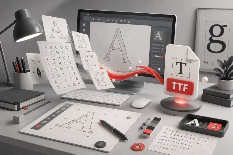
The Power of Fonts in Visual Storytelling
Fonts are more than letters. They’re emotional cues. They can shout, whisper, or sing depending on the message.
1. Fonts Speak Brand Personality
- Serif fonts (like Olyphs) project elegance and authority.
- Sans serif fonts (like Midnight Workers) show simplicity and clarity.
- Script and brush fonts (like Shutter Breathing) feel personal and expressive.
2. Font Hierarchy Guides the Eye
Use size, weight, and spacing to build narrative flow—your viewer should know what to read first and what to feel next.
3. Matching Fonts to Mood
Choose fonts that echo your story’s emotion:
- Joyful & playful? Try Magic Dreams or Kids Zone.
- Retro and nostalgic? Go for Retro Young.
- Bold and urban? Use Nightfall or The Rughton.
Also Read: Fonts That Make Your Digital Planners Look Stunning
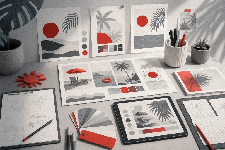
Imagery: Creating Atmosphere and Emotion
An image can tell a story in seconds—no translation needed. But for it to work, it must align with your message and typography.
1. Use Style Consistency
Match your font style with your image style. For example:
- Watercolor illustration + script font = warm, emotional
- Bold graffiti + heavy brush font = streetwise, rebellious
2. Composition & Balance
Never let imagery overpower your message. Create contrast and breathing room between text and visuals.
3. Add Movement & Energy
Use imagery that leads the eye across your composition. Diagonal lines, open space, and subject gaze all affect how your design is experienced.
Also Read: The Perfect Morning Ritual to Unlock Creative Focus
Combining Fonts & Imagery: 3 Winning Formulas
Formula 1: Playful Storytelling for Children’s Brands
Font: Kids Zone, Magic Dreams
Imagery: Cartoon-style, bold colors, simple shapes
Use Case: Children’s books, edutainment websites, toy packaging
Also Read: Craft Your Way to Profit: From DIY Passion to Payday


Formula 2: Urban & Youth Culture Branding
Font: Nightfall, Shutter Breathing
Imagery: Street photography, hand-drawn textures, layered collage
Use Case: Music posters, apparel labels, digital merch drops
Also Read: Tired of the Same Fonts? Freelancers, Here’s How to Break Free


Formula 3: Retro Mood with a Modern Twist
Font: Retro Young
Imagery: Grainy photos, warm gradients, vintage patterns
Use Case: Event branding, food labels, nostalgic social content
Also Read: The Hidden Formula Behind Corporate Brands’ Obsession with Handwritten Fonts

From Our Desk: What We’ve Learned About Visual Storytelling
At Figuree Studio, our font creation process often begins with visual storytelling in mind. We sketch by hand, refine in Procreate, and test font pairings across different mockups to ensure the vibe is just right. For instance, Magic Dreams was born from a series of comic-style storyboard sketches meant to capture the joy of discovery.
“Your brand is what other people say about you when you’re not in the room.” — Jeff Bezos
A designer on our team once said, “Fonts aren’t just tools—they’re voice actors for your message.” That belief influences how we choose shapes, curves, and spacing.
Also Read: How Freelancers Can Balance Love, Work, and Wellness Without Burning Out

Tools to Elevate Your Visual Storytelling
Here are tools we often use to combine fonts and imagery:
- Canva: Fast mockups and layout experiments
- Coolors: To find palette harmony between font color and imagery tone
- Unsplash: Free high-quality photography
- Google Fonts: For exploring typography pairings
Final Tips for Designers
- Don’t overdesign. Keep the message clear.
- Align all visual elements to your core emotion.
- Test your composition in black and white to evaluate balance.
- Use imagery that serves the story, not steals attention.
Don’t Let Boring Visuals Water Down Your Message
Now that you know how fonts and imagery can work together to tell unforgettable stories, it’s time to apply it. Whether you’re designing for a brand launch, an Instagram campaign, or your next client project—make every visual decision count.
👉 Browse our full font catalog
🎁 Grab some freebies
💼 Need an extended or corporate license?