Generic branding usually does not look bad at first glance.
Table of Contents
- The Polished Trap
- When “Clean” Becomes Invisible
- The First Impression Problem
- Why Typography Carries So Much Brand Memory
- The Rise of Anti-Generic Brand Design
- The Template Problem
- How to Make a Visual Identity Less Forgettable
- 1. Give Your Headlines a Stronger Voice
- 2. Build Contrast Between Display and Body Text
- 3. Choose One Signature Visual Move
- 4. Avoid Designing Only for Approval
- From Our Desk
- Fonts to Explore from Figuree Studio
- Monstarch – Bold Display Font
- Kastroz – Luxury Vintage Serif Font
- Synthetix – Futuristic Techno Font
- Urban Thunder – Aggressive Display Font
- Olyphs – Luxury Art Deco Font
- Memorable Brands Usually Have a Point of View
That is the tricky part.
It looks clean. Balanced. Modern. Safe. The logo sits nicely on the website. The colors feel calm. The typography does not offend anyone. The layout follows all the expected rules.
But after a few seconds, something disappears.
You close the tab. You scroll past the post. You walk away from the packaging. Then you try to remember the brand later, and nothing clear comes back.
Not the logo.
Not the type.
Not the mood.
Not the feeling.
Just a vague memory of something “professional.”
That is the quiet problem with generic branding. It does not always fail loudly. Sometimes, it fails politely.
The Polished Trap
There is a reason many brands end up looking similar.
Most founders, designers, and small business owners are not trying to make boring work. They are trying to make the right work.
They want the brand to look trustworthy. They want it to look premium. They want it to feel clean enough for a website, flexible enough for social media, and simple enough for packaging.
So the design starts moving toward safety.
A simple sans serif.
A neutral color palette.
A soft icon.
A lot of white space.
A smooth mockup.
A tone that says “modern” but not much else.
None of these choices are wrong on their own.
The problem starts when every choice is made to avoid risk. After a while, the brand loses its edge. It becomes easier to approve, but harder to remember.
And in branding, being easy to approve is not the same as being easy to recognize.
Read More: Best Fonts for Logo Design: Make Your Brand Unforgettable
When “Clean” Becomes Invisible
Clean design is useful. Nobody wants a brand identity that feels chaotic, confusing, or hard to read.
But clean design has a limit.
When a visual identity becomes too neutral, it stops carrying a point of view. It starts looking like something that could belong to anyone.
A skincare brand.
A coffee brand.
A SaaS product.
A design studio.
A lifestyle newsletter.
A wellness app.
Different businesses, same visual mood.
That is where generic branding becomes dangerous. It creates visual identities that look acceptable, but interchangeable. The design may pass the first glance, yet fail the second one.
People notice visual cues quickly. Nielsen Norman Group explains that first impressions shape how users judge relevance, credibility, and even usability, which means brand visuals are not just decoration. They help people decide whether a brand feels worth remembering.
The brand may feel calm, but it does not feel specific. It may look premium, but it does not feel owned. It may be beautiful, but it does not leave a fingerprint.
And a brand without a fingerprint has to work harder every time it wants to be remembered.
The First Impression Problem
People make quick visual judgments.
Before they read your full story, they notice shape, contrast, color, spacing, and typography. They feel the brand before they analyze it.
This is why first impressions matter so much in visual identity.
A strong first impression does not mean everything has to be loud. It means the brand gives the audience something clear to hold onto.
Maybe it is a sharp logo.
Maybe it is an unusual headline style.
Maybe it is a bold display font.
Maybe it is a strange but beautiful color combination.
Maybe it is a layout rhythm that feels different from the usual template.
The key is not noise.
The key is distinction.
If your visual identity looks like ten other brands in the same scroll, your audience has no reason to remember it. They may like it for a second, but they will not recognize it later.
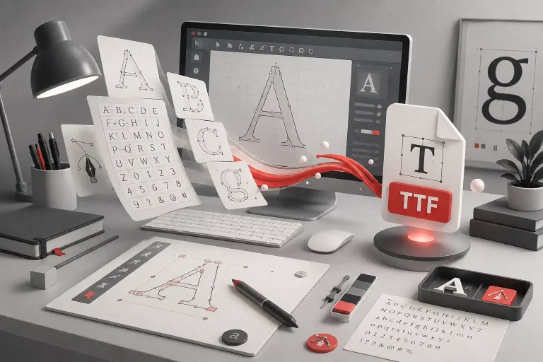
Why Typography Carries So Much Brand Memory
Typography is often treated like a final styling choice.
Pick the logo. Choose the colors. Build the layout. Then find a font that “fits.”
But type is not just decoration.
Type is voice.
A brand can say the same words in different typefaces and feel completely different. A clean geometric sans serif may feel rational and tech-forward. A vintage serif may feel editorial and established. A bold script may feel energetic and handmade. A graffiti display font may feel rebellious and street-level. A futuristic font may feel sharp, digital, and experimental.
That is why typography can quickly move a brand away from generic branding.
It gives the identity a tone before the copy even begins.
For brands that need stronger first impressions, display fonts are especially powerful. They can shape logos, campaign headlines, packaging names, social media graphics, posters, merch, and hero sections.
Figuree Studio creates fonts for designers, brands, creators, and digital businesses with a clear, practical, and premium tone. That makes expressive typography a natural tool for brands that want to feel more specific and less template-driven.
Read More: The Best Premium Fonts with a Fresh, Stylish Twist
The Rise of Anti-Generic Brand Design
A lot of modern branding is now moving in the opposite direction.
Not away from professionalism.
Away from sameness.
Brands are starting to bring back more character. More texture. More expressive type. More unusual visual systems. More identity work that feels human, not overly polished.
This does not mean every brand needs to look rebellious.
Anti-generic brand design can be quiet. It can be elegant. It can be minimal. But it still needs a distinct mood.
A luxury fashion label can use sharp serif typography and dramatic spacing.
A coffee brand can use warm lettering and imperfect illustration.
A gaming brand can use futuristic display type and bold contrast.
A streetwear brand can use graffiti-inspired lettering and raw composition.
A children’s brand can use playful, chunky, expressive fonts.
The point is not to be different for the sake of being different.
The point is to make the visual identity feel connected to the brand’s actual personality.
The Template Problem
Templates are helpful.
They make design faster. They help non-designers create decent visuals. They give small brands a starting point when budgets are tight.
But templates are not a brand strategy.
A template can give you layout. It cannot give you a point of view.
This is where many brands get stuck. They build an identity from familiar references, safe fonts, popular colors, and common design patterns. The result looks good, but it feels borrowed.
The brand becomes a moodboard of what already works for others.
That is why generic branding often feels strangely empty. It may have the surface of good design, but not the soul of a specific brand.
Strong branding needs choices that feel intentional.
Why this typeface?
Why this contrast?
Why this color behavior?
Why this logo shape?
Why this layout rhythm?
Why this visual attitude?
When the answer is only “because it looks modern,” the identity may not be strong enough yet.
How to Make a Visual Identity Less Forgettable
You do not need to redesign everything overnight.
Start with the parts of the brand people see first.
1. Give Your Headlines a Stronger Voice
Headlines are often the biggest type on the page. They carry mood quickly.
If your headlines use a very neutral font, ask whether they could use more personality. A display font can make a campaign, landing page, or packaging front feel more recognizable.
Use it with care. Let it lead the important moments.
2. Build Contrast Between Display and Body Text
Expressive typography works best when it has support.
Pair a bold display font with a clean, readable text font. This gives you personality and clarity at the same time.
The display font creates memory.
The body font keeps the message easy to read.
This balance helps the brand feel distinctive without becoming messy.
3. Choose One Signature Visual Move
Not every part of the identity needs to be expressive.
Pick one signature move and make it consistent.
It could be a custom headline style.
A strong typographic lockup.
A unique packaging label system.
A specific illustration style.
A repeated layout structure.
A dramatic use of spacing.
A brand becomes memorable when people see the same distinctive cue again and again.
4. Avoid Designing Only for Approval
Safe design is easy to approve in a meeting.
But the audience is not sitting in that meeting.
They are scrolling fast. Comparing options. Making quick decisions. Forgetting most of what they see.
A good visual identity needs enough clarity to be trusted and enough character to be remembered.
That is the balance.
Read More: Avoid Legal Trouble: Understand Font Licensing Now
From Our Desk
At Figuree Studio, we believe fonts are not just visual assets. They are brand signals.
“A brand does not become memorable because it looks perfect. It becomes memorable when people can feel its point of view.”
The right typeface can make a brand feel sharper, warmer, louder, more premium, more playful, or more rebellious. It can give a simple layout a stronger voice.
That does not mean every brand needs the most dramatic font in the room.
It means the font should carry intention.
If the brand wants to feel bold, the type should not whisper.
If the brand wants to feel premium, the type should not look random.
If the brand wants to feel playful, the type should not feel too corporate.
If the brand wants to feel futuristic, the type should not feel stuck in a generic startup template.
Your typography should help the audience understand the brand faster.
Fonts to Explore from Figuree Studio
For brands that want to move beyond generic branding, a unique display font can create a stronger first impression.
Figuree Studio’s catalogue includes expressive font categories such as futuristic, graffiti, vintage, brush, comic, serif, racing, techno, and bold display styles. These styles can help designers build identities with more attitude and clearer personality.
Here are a few directions worth exploring:
Monstarch works well for bold display branding that needs a strong, confident presence.
Monstarch – Bold Display Font

Kastroz fits luxury vintage identity work, especially for packaging, editorial branding, and premium visual systems.
Kastroz – Luxury Vintage Serif Font

Synthetix can support futuristic, tech-inspired, and digital-first brand visuals.
Synthetix – Futuristic Techno Font

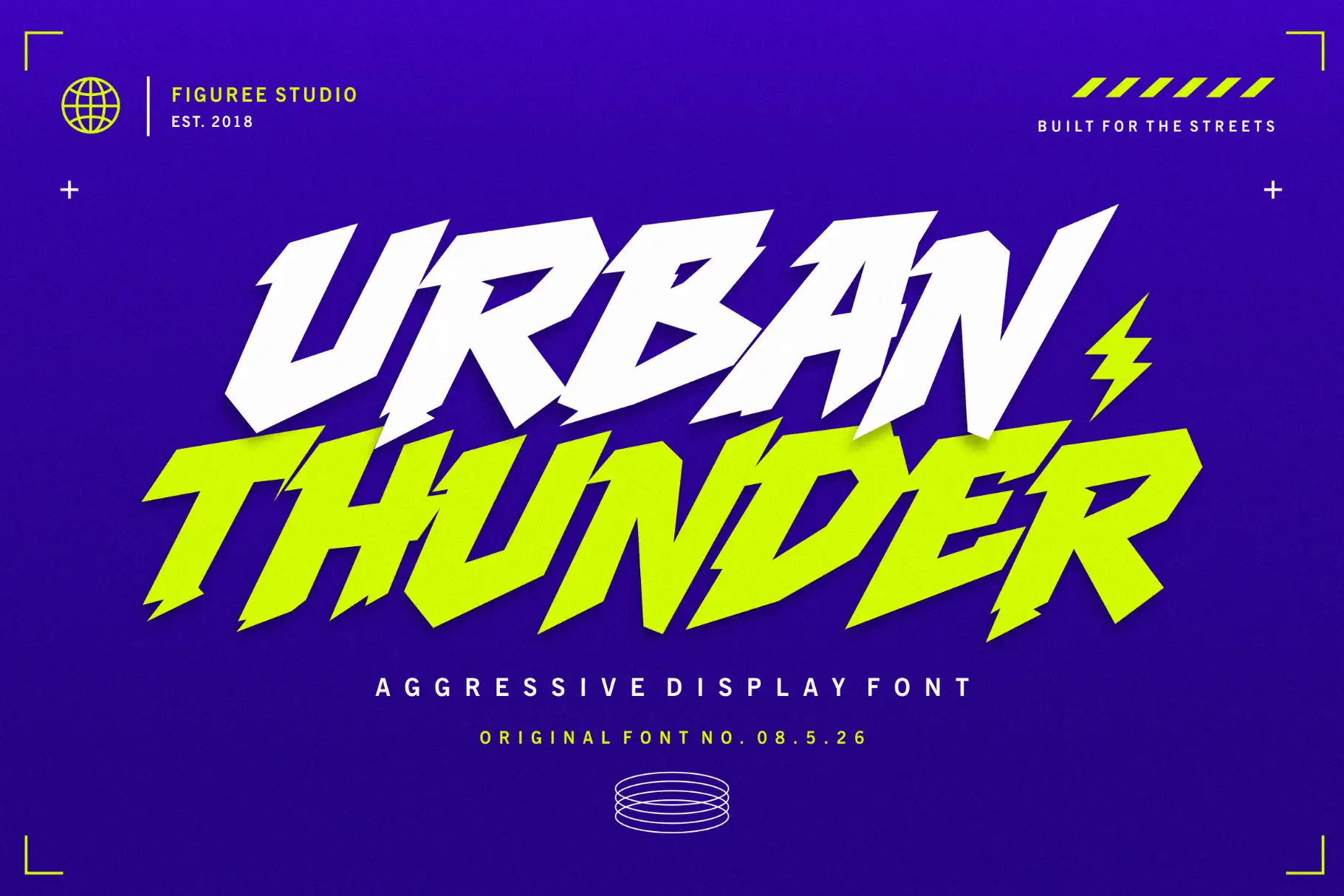
Greatboyz or Urban Thunder can bring a graffiti-inspired edge to streetwear, posters, music visuals, and culture-led branding.
Urban Thunder – Aggressive Display Font
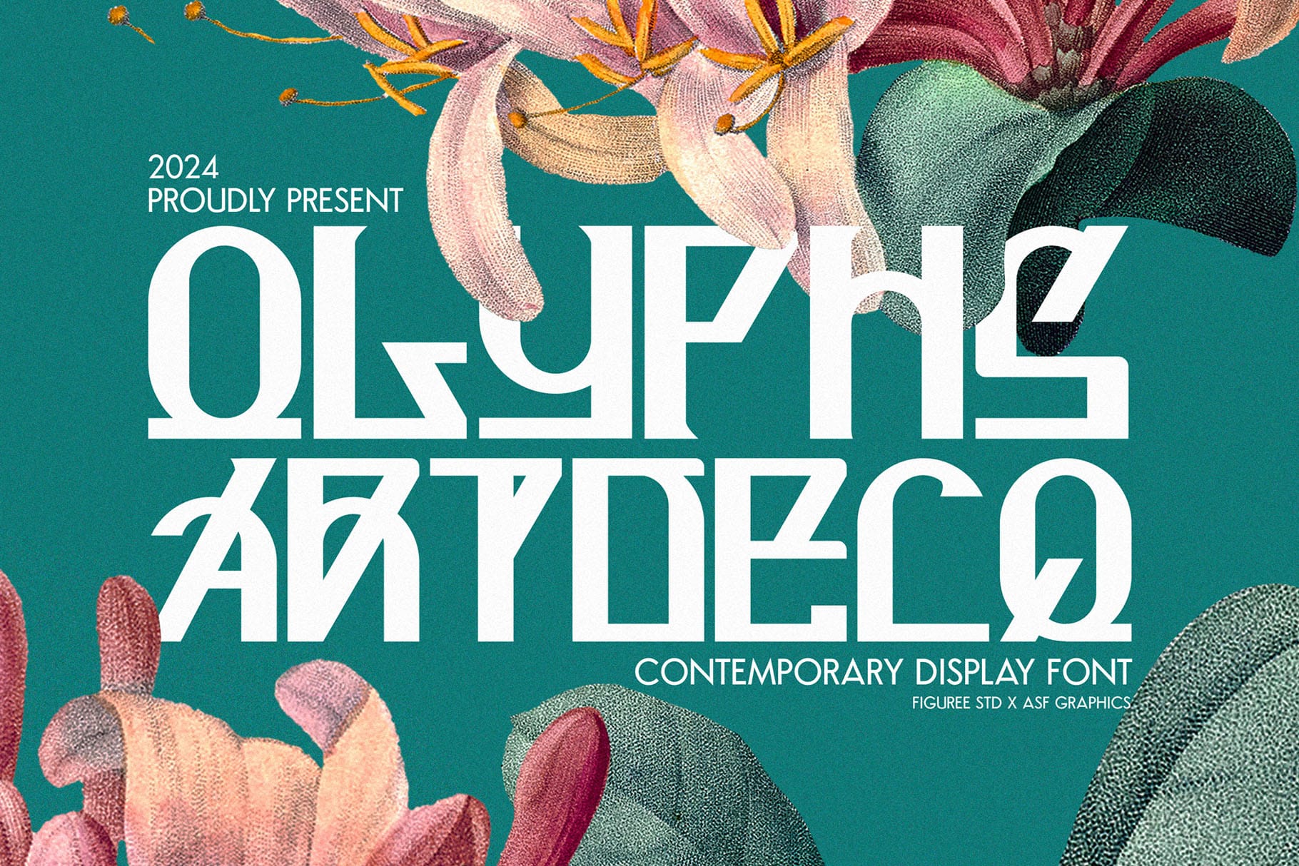
Olyphs fits elegant art deco-inspired branding when a project needs a more refined display mood.
Olyphs – Luxury Art Deco Font
Use these fonts where your audience forms an opinion quickly: logo concepts, hero headlines, packaging fronts, social media covers, product campaigns, posters, and merchandise.
Memorable Brands Usually Have a Point of View
The brands people remember are not always the loudest.
But they usually have something specific.
A rhythm.
A shape.
A voice.
A feeling.
A detail that belongs to them.
Generic branding removes too much of that specificity. It makes the brand easier to fit into a category, but harder to separate from the category.
A memorable visual identity does the opposite.
It gives people a reason to recognize the brand even before they read the name.
That reason can begin with typography.
So if your brand looks clean but forgettable, do not only ask, “Is this design beautiful?”
Ask a better question:
“Would someone remember this tomorrow?”
If the answer feels uncertain, your visual identity may need more character. Start with the type. Explore stronger display fonts. Build a visual voice that feels owned, not borrowed.
To create a stronger first impression, browse Figuree Studio’s font catalog and explore display fonts designed for brands that want to be remembered.