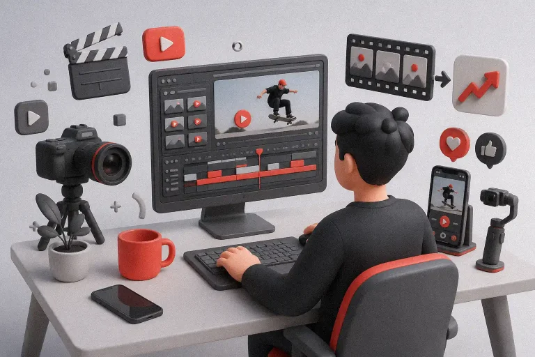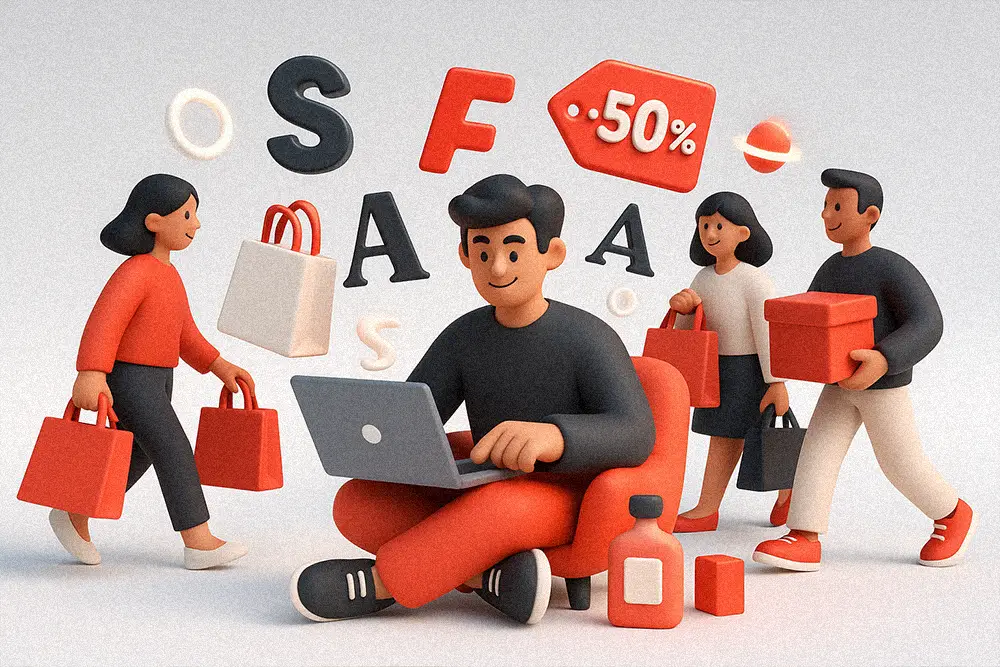
If there’s one week you can’t afford to whisper, it’s Black Friday. Your audience scrolls at light speed, competitors flood the feed, and attention is brutally expensive. That’s why Black Friday Fonts are not just aesthetic choices—they’re levers that move clicks, carts, and cash. In this guide, we’ll show you how to choose Black Friday Fonts that punch through the noise, frame irresistible offers, and retain brand trust—without sacrificing legibility or licensing sanity.
Table of Contents
- Why Black Friday Fonts decide whether your offer gets ignored — or gets clicked
- The strategy: match message, medium, and momentum
- 15 Bold Black Friday Fonts (Headline-Ready) from Figuree Studio
- How to deploy Black Friday Fonts across formats (without chaos)
- From Our Desk: What We’ve Learned About Black Friday Fonts
- Practical checklist to pressure-test your Black Friday Fonts
- Font pairing recipes (plug-and-play)
- Licensing, freebies, and scale-up
- Conclusion
Why Black Friday Fonts decide whether your offer gets ignored — or gets clicked
Headlines do the heavy lifting. Bold, high-contrast Black Friday Fonts anchor your biggest benefits (“70% OFF,” “Ends Tonight”), while body copy keeps it readable. The rule of thumb: clarity first, flair second. Even legends agree—David Ogilvy famously reminded us that “five times as many people read the headline as the body copy.” When the stakes are Black Friday, the headline (and the font behind it) decides if anyone reads line two.
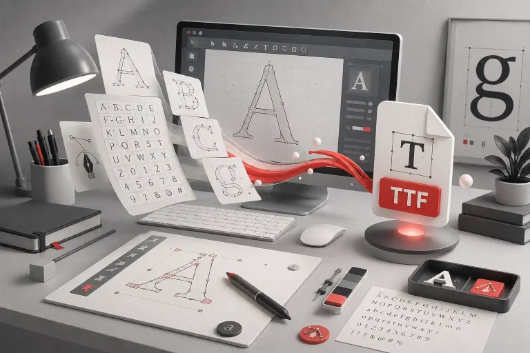
To refine your craft, study practical, vendor-neutral fundamentals like the Google Fonts Knowledge hub (clear, credible guidance on pairing, hierarchy, and readability). It’ll sharpen your instincts so your Black Friday Fonts look intentional—not accidental.
Also Read:
Fonts That Sell: Make Your Etsy Shop Stand Out
Finally Understand Font Licenses: How to Choose the Right One Without Legal Risks
Proven Font Combos to Make Your Packaging Design Pop
The strategy: match message, medium, and momentum
Black Friday Fonts work when they align with (1) message (price drop, scarcity, bundle), (2) medium (stories, feed, banners, email hero), and (3) momentum (speed to publish). For fast-moving campaigns:
- Go bold for the hero. Use robust display or heavy sans for the main promise.
- Keep supporting text clean. A modern sans (or restrained serif) for bullets, details, and CTAs.
- Design for tiny screens. Most Black Friday views are mobile. Test your Black Friday Fonts at 12–14 px equivalents and ensure numerals are crystal clear.
- License before you launch. Use the right commercial license so ads don’t get paused mid-flight. Check our License page (we’re running a special discount on the Extended License).
Also Read:
Best Fonts for Logo Design: Make Your Brand Unforgettable
2025’s Best T-Shirt Fonts to Boost Your POD Sales
15 Bold Black Friday Fonts (Headline-Ready) from Figuree Studio
These picks are built to stop the scroll, print crisply, and scale across placements. Use them as your headline workhorses, pair with a clean subhead/body, and maintain consistent spacing.
Power Strides – Powerful Display Font
All-caps, muscular geometry. Perfect for “FLASH SALE,” “72-HOUR DEAL,” and hero banners that need punch at small sizes.

Headlight – Stylish Bold Font
Hand-lettered bold script with natural flair. A great choice for headlines that need impact with a touch of style—perfect for promos that want to stand out without looking too rigid.

Jocker Block – Strong Brush Font
Natural, strong, and hand-drawn brush style. As a Black Friday Fonts pick, Jocker Block gives bold impact for urgent headlines while keeping an authentic, energetic vibe—great for ads, banners, and fast-sale promos.

Bolde – Powerful Sans Serif
A classic conversion sans—confident strokes, great for price callouts and email heroes.

Ignazio – Modern Sans Serif
Refined but assertive. Use for CTA buttons and secondary headlines when your palette needs hierarchy.

The Rughton – Strong Bold Script
A bold hand-lettered script with natural strength and flow. As a Black Friday headline, Rughton brings urgency and personality—ideal for “LIMITED DEALS” or “FLASH SALE” graphics that need raw impact and style.

Quinoss – Modern Sport Font
Athletic authority. Great for performance, tech, or gear brands—clean numerals for pricing grids in Black Friday Fonts stacks.

Break Fridays – Clean Bold Script
Energetic script with striking clean lines. Perfect for Black Friday Fonts when you want urgency without losing style. Great for banners, posters, and social media hero offers.

Robot Brain – Display Techno Font
Futuristic angles that still read fast. A smart choice for SaaS, gaming, and electronics bundles.

Roadpunks – Handbrush Typeface
A rebellious handbrush font packed with attitude. As a Black Friday Fonts choice, Roadpunks adds raw energy to banners, posters, and urgent promos—perfect when you want to mix urgency with a streetwise vibe.

Kids Zone – Layered Playful Font
Layered playful style that pops in color promos. Adds fun energy to family-oriented Black Friday ads, kids products, or holiday bundles.

Grow Boys – Not So Ordinary Display Font
Playful yet distinctive, perfect for youth-focused Black Friday ads that need originality.

Back Wild – Fun Graffiti Font
Urban graffiti with bonus swashes—injects rebellious energy into Black Friday headlines, posters, and edgy promos.

The Barethos – Delicious Display Font
Food-inspired, bold, and tasty. A quirky Fonts option for F&B promos or campaigns with a “freshly baked” vibe.

Graphiel – Modern Bold Script
Sleek and stylish bold script. Adds sophistication to Black Friday headlines, great for beauty, fashion, or premium brand sales.

Pro move: Keep one display face for your Black Friday Fonts headlines and a neutral sans for body (e.g., Bolde). Consistency builds trust; trust lifts conversions.
Also Read:
SaaS Branding Simplified: Fonts That Make Your Tech Startup Look Future-Ready
The Ultimate Guide to the Best Fonts for Packaging Design in 2025
How to deploy Black Friday Fonts across formats (without chaos)
Landing pages. Use a single display headline font + one sans for copy. Your Black Friday Fonts headline should carry benefit + deadline (“Extra 20% Ends Tonight”). Keep line length under ~9 words.
Paid social. Test two Black Friday Fonts variants: (A) condensed heavy for long offers, (B) wide power for short punchlines. Always export with hinting or outline for crisp results.
Email. Hero image can feature your Black Friday Fonts headline; body stays system-safe (web-safe stack) for deliverability. Keep numbers huge—prices should be unmissable.
Short video/Reels. Motion magnifies weight. Animate letter tracking or scale on the first verb. Your Black Friday Fonts should be optimized for motion blur—avoid ultra-thin alternates.
For a concise, friendly refresher on spacing, contrast, and display usage, this primer from 99designs on font psychology helps you align Black Friday Fonts with emotion and audience expectations. Pair knowledge with your brand’s voice for consistent conversions.
From Our Desk: What We’ve Learned About Black Friday Fonts
When your message is price-driven and time-boxed, restraint is power. We’ve seen campaigns double CTR by reducing style variety: one display headline, one body sans, one accent color. The Black Friday Fonts that win don’t try to be everything—they make one promise unforgettable.
A few truths we return to:
- Legibility beats novelty. If a letterform slows the eye, it’s too expensive for Black Friday.
- Numbers matter. Choose Fonts with clear numerals and currency symbols.
- Hierarchy is a promise. The way you stack headline → subhead → CTA teaches the brain what to do next.
Favorite reminders:
- “Your brand is what other people say about you when you’re not in the room.” — Jeff Bezos
- “The headline is the most important element… it determines whether the reader reads the copy.” — David Ogilvy
Practical checklist to pressure-test your Black Friday Fonts
- At 320 px wide, does your headline still hit? If not, tighten tracking or choose a sturdier option.
- Numerals test: 0, 3, 5, 8, 9—can you distinguish them instantly? Price clarity sells.
- CTA clarity: Your button text should be sans-serif, medium-bold. Your Black Friday headline can be loud; the CTA must be crystal.
- Contrast: Aim WCAG-friendly contrast for hero text on banners. Black Friday often uses dark themes; ensure your Black Friday Fonts pop.
- License: Before launch, confirm usage. Ads are commercial use. See License (discounted Extended License available). For organizations, ask about Corporate License.
Also Read:
Every Font License Type Explained: How to Choose the Right One for Your Projects
Avoid Legal Trouble: Understand Font Licensing Now
Font pairing recipes (plug-and-play)
- Max Urgency: Power Strides (H1) + Bolde (body). Use short verbs; cap line length for fast recognition in Black Friday ads.
- Premium Minimal: Ignazio (H1) + Bolde (body). Keep it monochrome with one accent color for a sleek, trustworthy vibe.
- Bold Energy: Jocker Block (H1) or Roadpunks (H1) + Ignazio (body). Perfect for gritty urgency and dynamic Black Friday Fonts banners.
- Sport/Active: Quinoss (H1) or Break Fridays (H1) + Ignazio (body). Strong numerals for pricing grids, works great in apparel or gear promos.
- Playful/Youth: Kids Zone (H1) or Grow Boys (H1) + Bolde (body). Adds fun energy for kids’ products, family sales, or holiday bundles.
When in doubt, A/B test two Black Friday Fonts headlines that keep everything else identical. If CTR lifts but add-to-cart stalls, your copy or offer—not the font—is the bottleneck.
Licensing, freebies, and scale-up
- Ready to ship hard-working Black Friday Fonts across platforms? Review Figuree Studio Licensing. We’re offering a special discount on the Extended License so teams can run ads without friction.
- Want to try styles first? Explore our Free Fonts section to test layout, grid, and motion before committing.
- Build a repeatable system: headline presets, CTA sizes, and export profiles. Then subscribe on the homepage to get early drops & exclusive codes.
Conclusion
Black Friday pressure forces clarity. Choose Black Friday Fonts that carry your biggest promise, keep bodies readable, and let hierarchy guide action. Use one bold display for the hook, a clean sans for trust, and license correctly so nothing breaks when your ads finally scale.
Design with clarity. Grow with confidence.
Browse our catalog, subscribe for insider drops, and grab freebies to prototype fast:
- Explore more on the font catalog
- Join the newsletter on the homepage
- Test styles from freebies
- Lock usage with a discounted Extended License