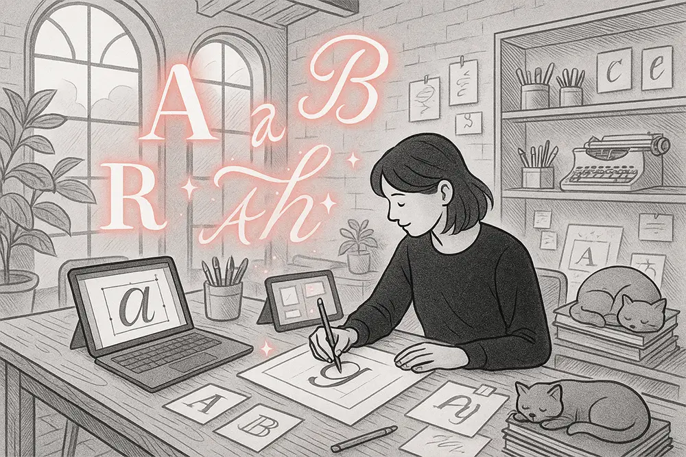
Why Designing Your Own Font is Easier Than You Think
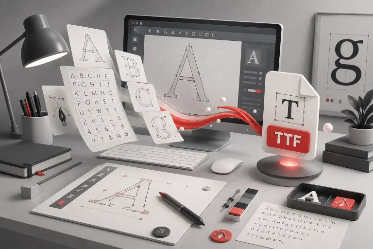
You don’t need a degree in typography or years of experience to design your first font. In fact, many successful font creators started with nothing but curiosity, a laptop, and a free afternoon. If you’ve ever thought, “That font could look better,” or you’re tired of using the same default typefaces everyone else does, this guide is for you. We’ll walk through the tools, techniques, and creative process to make a typeface that’s truly yours.
Table of Contents
- Why Designing Your Own Font is Easier Than You Think
- Step 1 – Understand the Basics of Font Design
- Step 2 – Pick a Style That Fits Your Audience
- Step 3 – Choose the Right Tools
- Step 4 – Create Your First Draft
- Step 5 – Test and Refine Your Font
- From Our Desk: How to Think Like a Font Designer
- Step 6 – Publish and Promote Your Font
- Conclusion: Your First Font Could Be Your Next Big Win
Step 1 – Understand the Basics of Font Design
Before opening any software, learn the building blocks of typography. These include baseline, x-height, ascenders, descenders, and kerning. Even a playful, graffiti-style font follows these principles—it’s what keeps your letters looking balanced and readable.
A good starting point is exploring free resources like Google Fonts to analyze structure and spacing in professional typefaces. See how letters interact, and take notes on what makes them work.
Also Read: Fonts That Make Your Digital Planners Look Stunning
Step 2 – Pick a Style That Fits Your Audience
Your first font doesn’t need to be perfect, but it should be purpose-driven. Are you targeting designers who love graffiti energy? Or maybe tech brands that crave futuristic vibes? Choose a style that feels authentic to you.
Here are 6 fonts from our own catalog that can inspire your journey:
Back Wild – Fun graffiti font with bonus swashes, perfect for urban & street-style projects.

Ontro Buck – Bold decorative marker font for eye-catching headlines.

Oversa – Sleek futuristic type with uppercase/lowercase variations.

Meta Futura – Sharp, progressive display font for modern branding.

Roadpunks – Rebellious handbrush font with a gritty touch.

Hero Bump – Bold comic display font full of punch and personality.

Also Read: Tired of the Same Fonts? Freelancers, Here’s How to Break Free
Step 3 – Choose the Right Tools
You don’t need to invest in expensive software at the start. Many designers begin with free or budget-friendly tools like:
- Calligraphr – Great for turning handwriting into a font.
- Birdfont – Beginner-friendly with export options.
- FontForge – Free open-source font editor.
- Affinity Designer – Vector-based, affordable, and intuitive.
- Glyphs Mini – Mac-only, great for serious beginners.
Once you grow, professional tools like FontLab or Glyphs App can help you refine advanced features like OpenType alternates and kerning pairs.
Also Read: Avoid Legal Trouble: Understand Font Licensing Now
Step 4 – Create Your First Draft
The best way to start is by sketching your characters—digitally or on paper. Focus on A–Z in uppercase and lowercase, plus numbers 0–9. Once these are solid, you can add punctuation and special characters.
Don’t aim for perfection right away. Your first draft is a playground—experiment with weight, width, and style. For example, Back Wild started as loose graffiti sketches, while Meta Futura was refined from sharp geometric shapes.
Also Read: The Perfect Morning Ritual to Unlock Creative Focus
Step 5 – Test and Refine Your Font
After exporting your font file (OTF or TTF), test it in real-world mockups—posters, social media graphics, and product packaging. Look for spacing issues, awkward letter pairs, or inconsistent curves.
Testing in various sizes is key. What looks perfect at 200px might feel cramped at 14px. This is where font testing tools like FontBase or ProofLab can help.
Also Read: Fonts That Sell: Make Your Etsy Shop Stand Out
From Our Desk: How to Think Like a Font Designer
Designing a font isn’t just about letters—it’s about solving visual problems. Every stroke tells a story. One strategic mindset shift we’ve seen in successful designers is this: design for emotion, not just style.
As author Robert Bringhurst said in The Elements of Typographic Style:
“Typography is the craft of endowing human language with a durable visual form.”
When we created Oversa, the goal wasn’t just to make a futuristic font—it was to capture the feeling of stepping into tomorrow. When we made Back Wild, it wasn’t about graffiti—it was about bottling the raw energy of street culture into every curve.
Also Read: How to Design Fonts That Make People Feel: Emotional Storytelling Secrets
Step 6 – Publish and Promote Your Font
Once your font is polished, you can start selling or sharing it. Platforms like Creative Market, Envato Elements, and MyFonts make it easier than ever to reach global buyers. But don’t forget your own website—selling directly gives you more control and higher profit margins.
Bundle your font with mockups, add a clear license page, and promote on Pinterest, Behance, and Instagram. Use your early sales to gather feedback and fund your next typeface.
Also Read: Stop Trading Time for Money: Sell These Digital Products Instead

Conclusion: Your First Font Could Be Your Next Big Win
You don’t need years of training to create something incredible. By learning the basics, choosing your style, using beginner-friendly tools, and refining through testing, you can launch your first font sooner than you think.
Don’t let inexperience hold you back—your first typeface might just be the start of a profitable creative journey.
Start now: Browse our font catalog, grab a bundle deal, or secure an Extended or Corporate License for your next big project.