Summer graphic design styles can help brands create visuals that feel warmer, fresher, and easier to connect with. Summer is not only about beaches, sunshine, and bright colors. It is also a strong marketing season where brands can refresh their look, build seasonal campaigns, and create visual content that feels more emotional.
Table of Contents
- Why Summer Design Matters for Marketing
- Key Elements of Summer Graphic Design Styles
- Color
- Typography
- Layout
- Imagery
- Texture
- 100 Radiant Summer Quotes to Lift Your Spirit
- Best Summer Graphic Design Styles to Try
- 1. Tropical Editorial Style
- 2. Playful Pop Summer Style
- 3. Clean Coastal Minimalism
- 4. Retro Vacation Style
- 5. Handwritten Summer Style
- 6. Bold Festival Style
- 7. Sun-Washed Lifestyle Style
- Font Choices for Summer Marketing Designs
- Moris Palm – Handwritten Summer Font
- Summer Sunshine – Fresh Display Font
- Lemon Chomp – Playful Display Font
- Smiley Candy – Cute Emoji Font
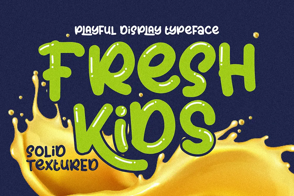
- Fresh Kids – Playful Display Font
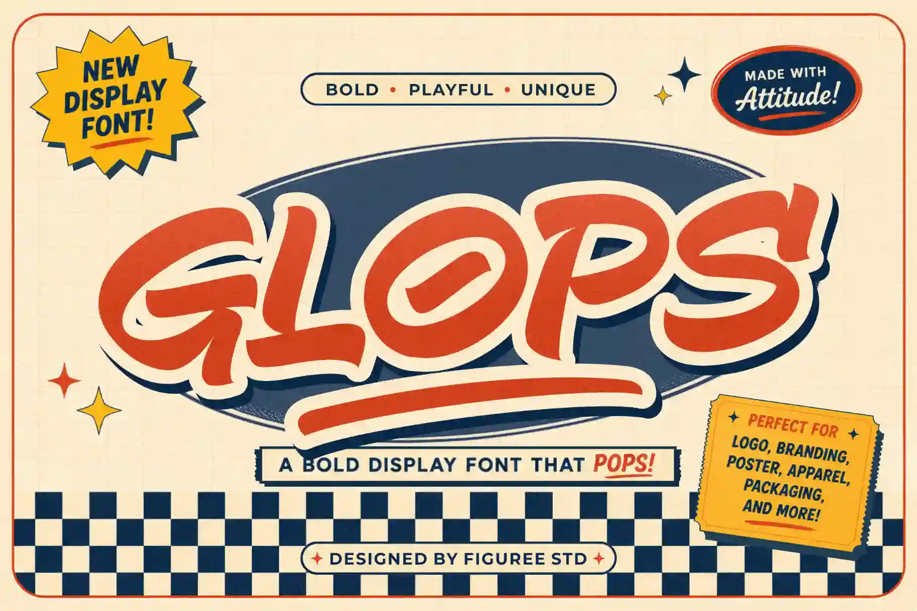
- Glops – Retro Brush Font
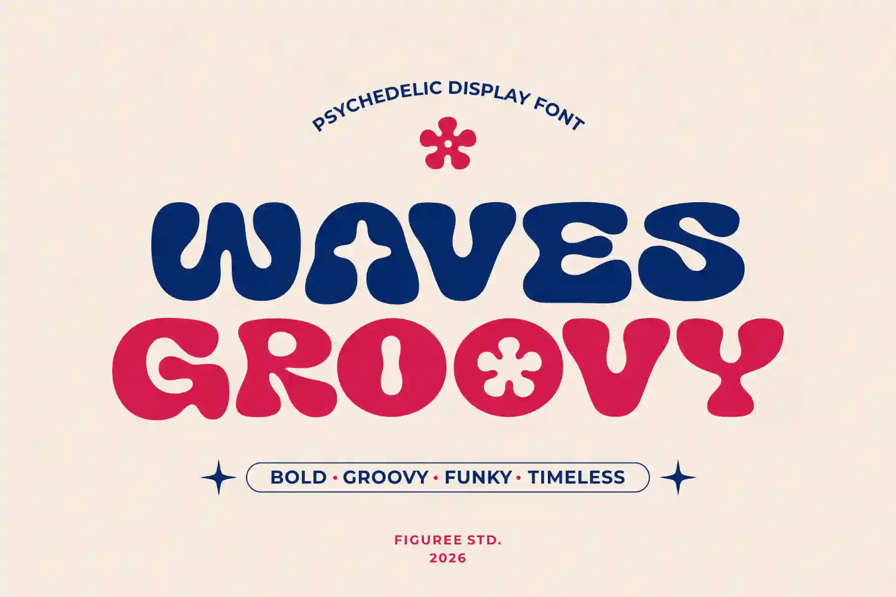
- Groovy Waves – Psychedelic Retro Font
- How to Use Summer Design Across Marketing Channels
- From Our Desk
- Catchy & Creative: 150 Summer Camp Name Ideas You’ll Love
- Final Thoughts
People respond to summer visuals because the season already carries a mood.
It feels relaxed. Bright. Social. Energetic. Open.
That is why a good summer campaign should not feel random. The colors, fonts, layout, images, and textures need to work together. When they do, your brand can look more timely and more memorable.
Before you start designing, it can also help to check seasonal interest with tools like Google Trends, which lets you explore search interest by time, location, and popularity. This can give you a better idea of when summer-related topics start gaining attention in your audience’s region.
For more seasonal creative context, you can also read Figuree Studio’s article, Why Summer Is the Best Season to Create Art.
Why Summer Design Matters for Marketing
Seasonal design works because it gives your campaign context.
A summer campaign can make a brand feel more alive. It can support product launches, social media content, event posters, packaging, merch, travel promos, food branding, and lifestyle visuals.
But better marketing results do not come from adding palm trees everywhere.
They come from visual clarity.
Your design should help people understand the message faster. It should make the product feel relevant. It should create a mood that matches the offer.
For example, a summer drink brand may need juicy colors and playful typography. A resort brand may need calm coastal colors and elegant spacing. A creator selling summer printables may need bold, readable fonts for Pinterest and Etsy product previews.
The style should follow the goal.
Key Elements of Summer Graphic Design Styles
Strong summer visuals usually come from five core elements: color, typography, layout, imagery, and texture.
Color
Color creates the first emotional signal.
Summer palettes often use coral, yellow, orange, sky blue, turquoise, sand beige, seafoam green, and tropical green. But not every summer brand needs loud color.
A premium campaign can use cream, muted gold, deep navy, terracotta, and soft olive. A playful campaign can use hot pink, lemon yellow, bright blue, and fresh green.
The best color palette depends on your audience and brand personality.
For readability, always test contrast before publishing digital designs. Adobe Color has a contrast checker that tests foreground and background color contrast against WCAG guidelines, which helps make text easier to read.
Typography
Typography shapes the voice of your campaign.
A bold display font can feel energetic. A handwritten font can feel relaxed and human. A serif font can feel editorial and premium. A retro script can feel nostalgic. A clean sans serif can make your layout feel modern and easy to read.
If you are designing for marketing, do not choose fonts only because they look beautiful. Choose fonts that match the message.
For more practical ideas, read Proven Font Combos to Make Your Packaging Design Pop.
Layout
Summer design often feels better with breathing room.
Open spacing can make your visual feel lighter and more relaxed. It also helps the main message stand out.
Use clear hierarchy. Make the headline easy to see. Keep the call to action visible. Let supporting details stay simple.
Imagery
Summer imagery can include beach scenes, outdoor moments, tropical shadows, fruit, cold drinks, sunlit textures, travel details, handmade objects, or festival energy.
But avoid making the image too predictable.
You can create a more premium look by using abstract summer references: soft light, warm shadows, organic shapes, simple line art, or cropped lifestyle details.
Texture
Texture adds warmth.
Grain, paper texture, brush strokes, sun-faded overlays, and hand-drawn elements can make a campaign feel less rigid. This is useful for brands that want a handmade, nostalgic, or lifestyle-driven mood.
Best Summer Graphic Design Styles to Try
Here are several summer graphic design styles you can use for stronger seasonal campaigns.
1. Tropical Editorial Style
Tropical design can look premium when you keep it controlled.
Use clean layouts, palm-inspired shadows, warm neutrals, deep greens, and elegant typography. This style works well for travel brands, resorts, beauty products, cafes, lifestyle blogs, and summer lookbooks.
Do not overload the design with leaves and beach icons.
Use tropical elements as accents. Let the typography and spacing carry the premium feeling.
2. Playful Pop Summer Style
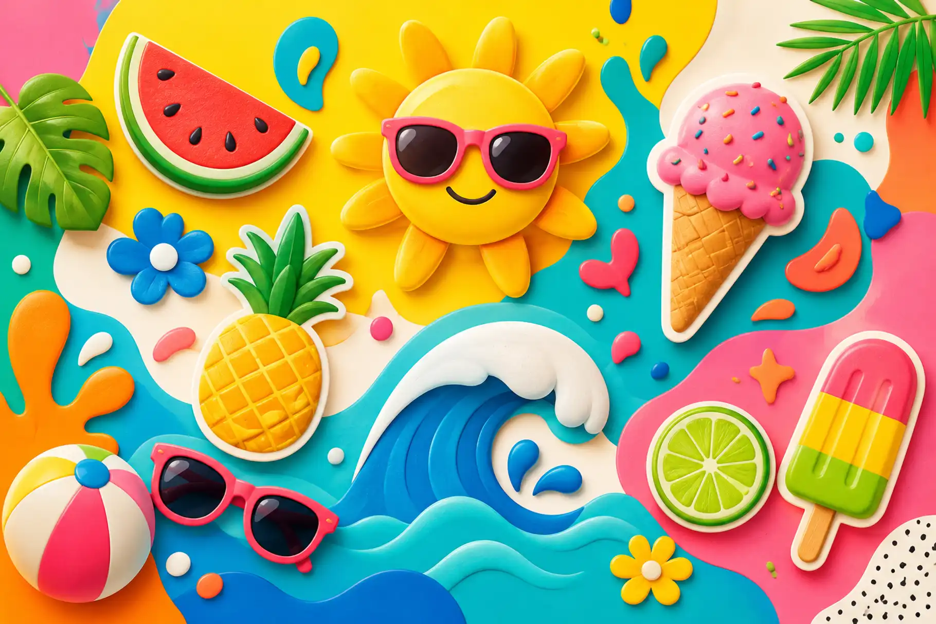
Playful pop style is bright, bold, and expressive.
It works well for summer sales, food packaging, festivals, kids’ products, social media posts, creator graphics, and merch drops.
Use strong colors, chunky display fonts, rounded shapes, stickers, and fun illustrations. Keep the headline large and simple. Pair decorative fonts with a cleaner supporting font so the design stays readable.
This style is perfect when the brand wants to feel cheerful and energetic.
3. Clean Coastal Minimalism
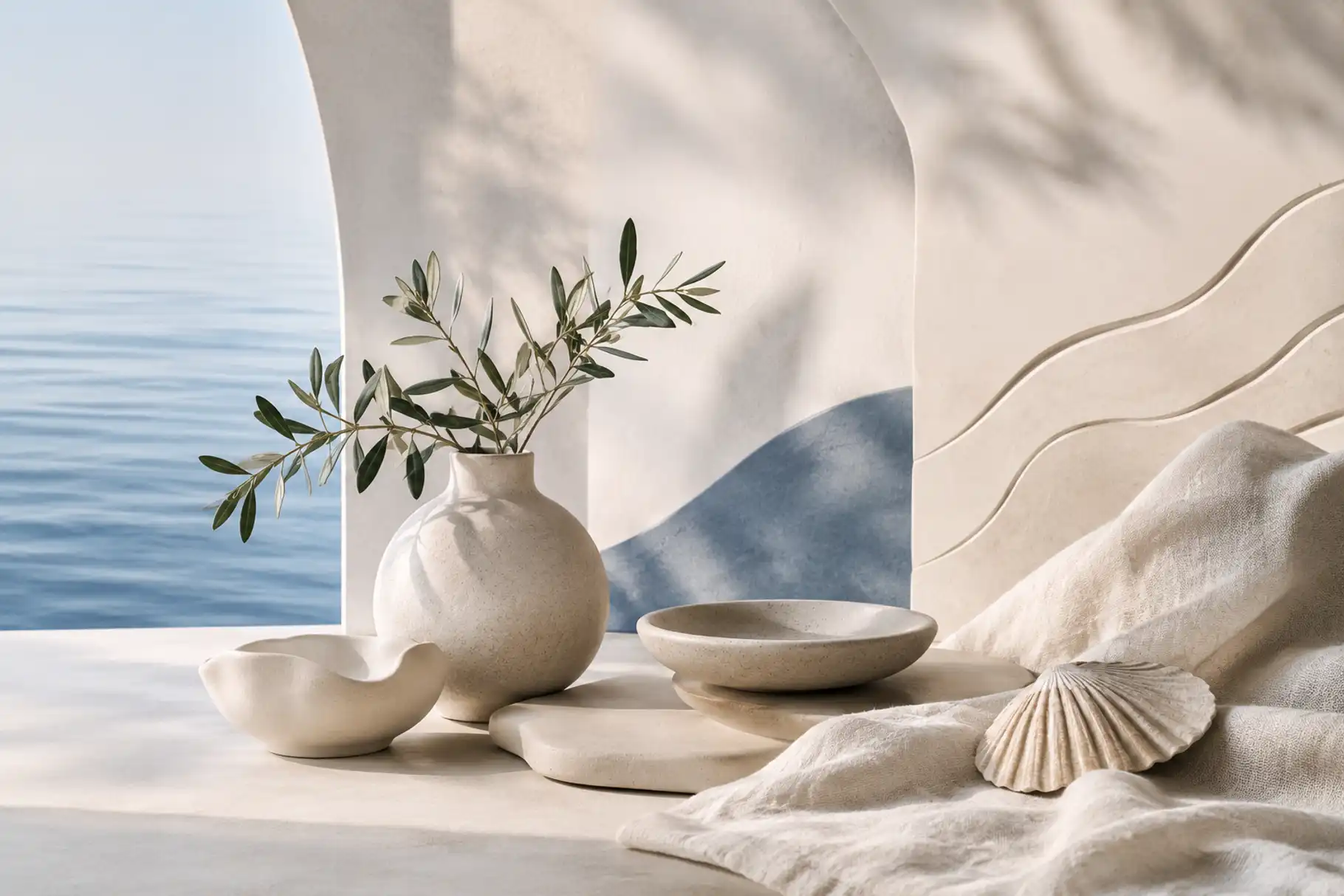
Clean coastal minimalism is soft and calm.
It uses sand beige, ivory, muted blue, soft green, warm gray, and lots of white space. It works well for wellness brands, skincare, interior products, boutique hotels, handmade goods, and lifestyle branding.
Typography should feel clean and refined.
Use a modern sans serif, an elegant serif, or a light handwritten accent. This style is less about shouting and more about creating trust.
4. Retro Vacation Style
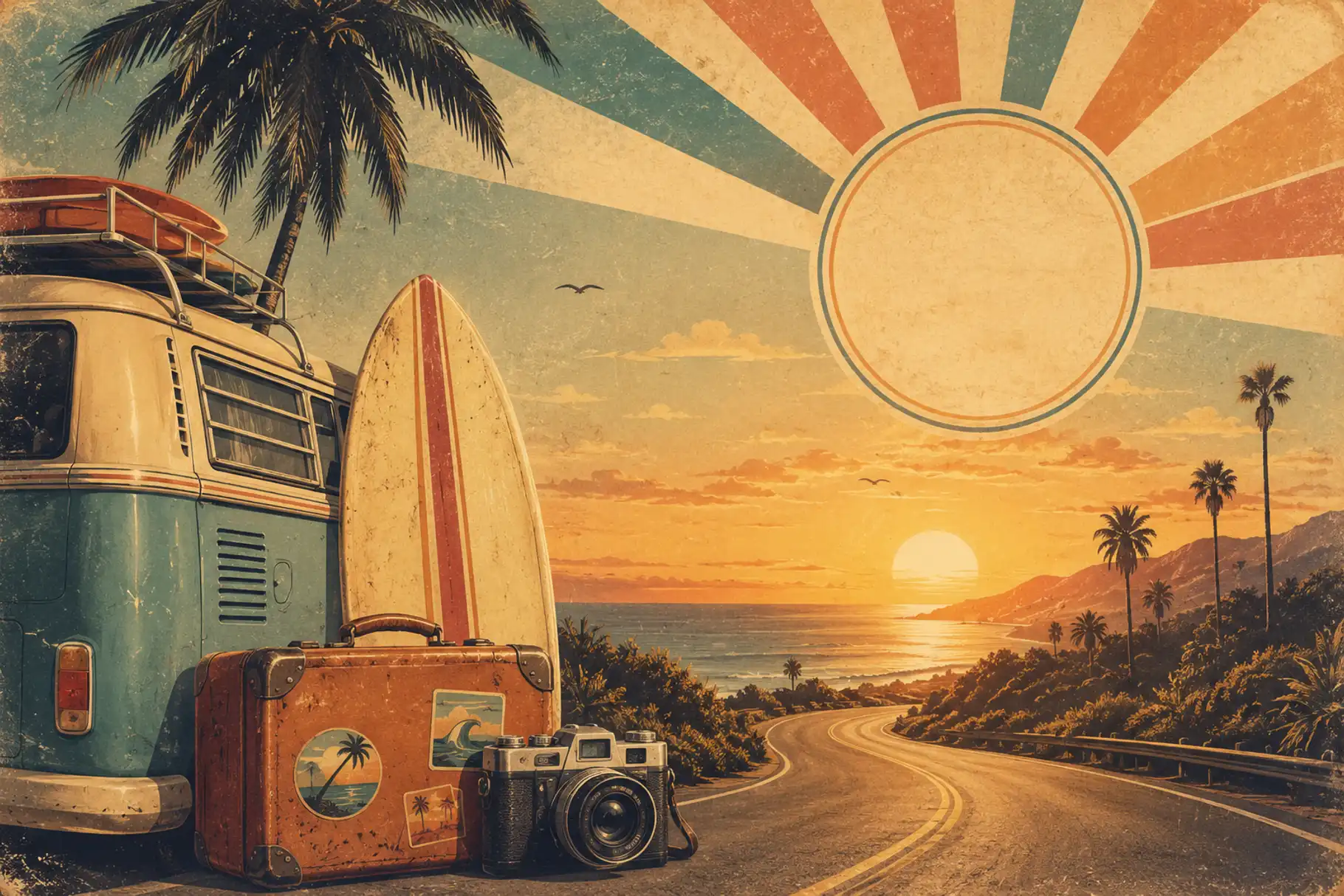
Retro vacation style brings nostalgia into summer marketing.
Use faded colors, vintage-inspired typography, badge layouts, grain texture, postcard references, and warm photography. This style works well for apparel, coffee brands, beach bars, posters, travel merch, and event campaigns.
A retro summer design can feel familiar and memorable.
To keep it fresh, avoid using too many retro effects at once. Choose one strong visual direction and give it space.
5. Handwritten Summer Style
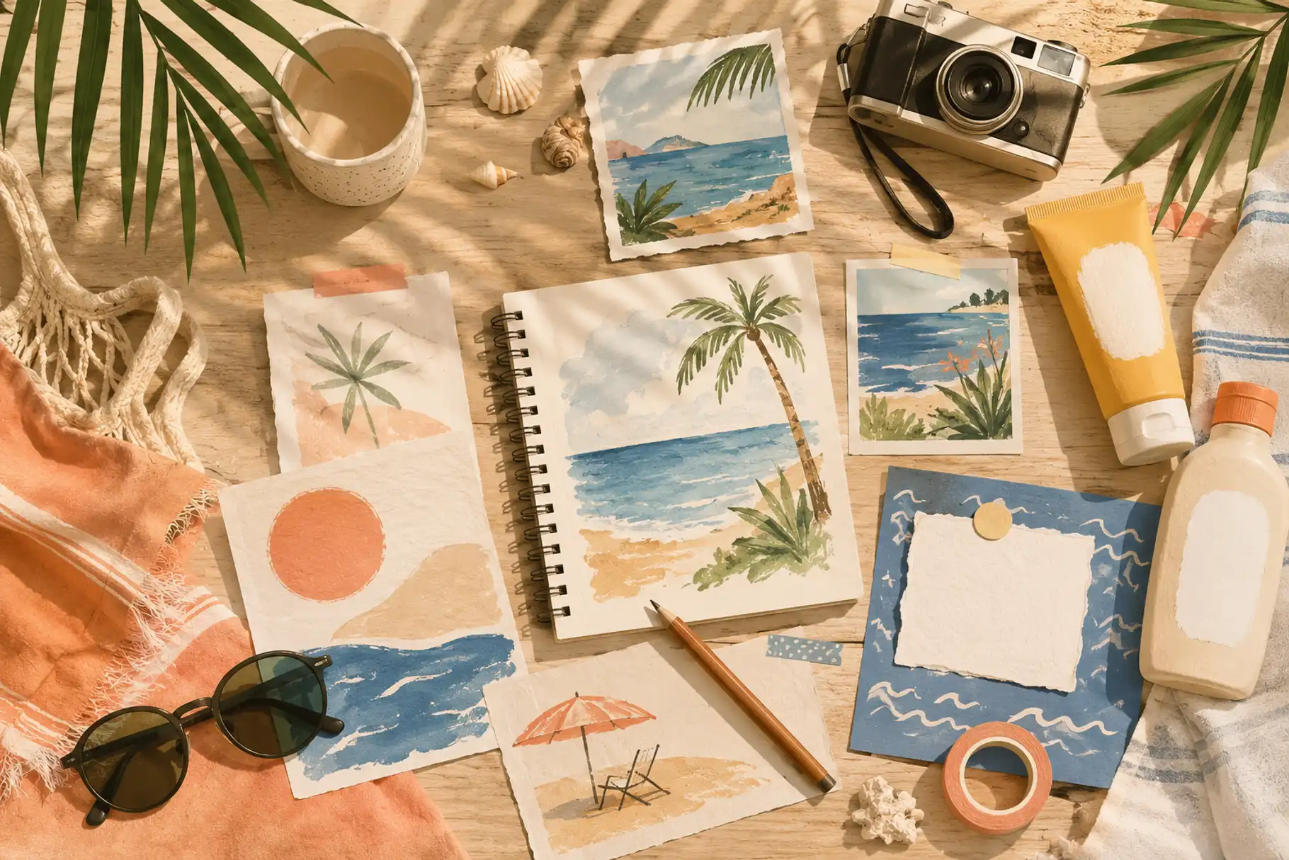
Handwritten summer design feels personal and relaxed.
It can make a campaign look more human, especially for lifestyle products, quote graphics, packaging, social content, beach brands, handmade labels, and seasonal invitations.
This is where a font like Moris Palm fits naturally. Moris Palm is a handwritten summer font with a warm, carefree feel, making it suitable for relaxed summer graphics, vacation branding, packaging, and social media visuals.
Use handwritten fonts for short phrases, product names, campaign headlines, or emotional accents. For longer text, pair them with a simple sans serif.
6. Bold Festival Style
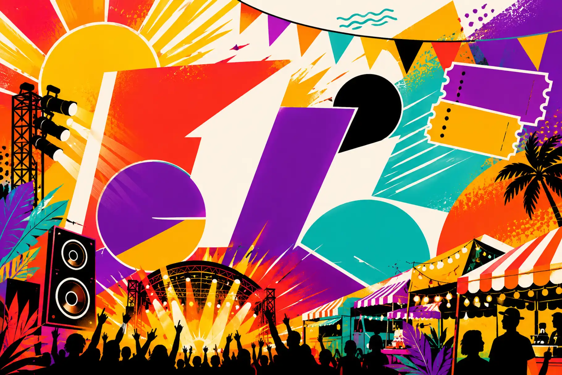
Summer is full of events.
Music festivals, food markets, pop-up shops, sports events, art fairs, and beach parties all need visuals that can grab attention quickly.
Bold festival design usually uses large typography, strong contrast, dynamic shapes, bright accents, and clear event information.
The most important rule is readability.
People should understand the event name, date, location, and call to action within seconds.
For extra impact, try pairing a bold display font with a clean supporting font. This keeps the campaign exciting without making it hard to read.
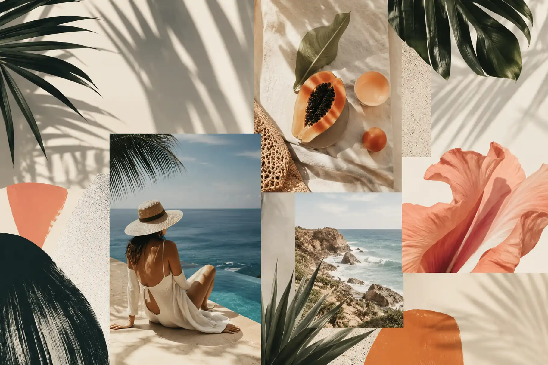
7. Sun-Washed Lifestyle Style
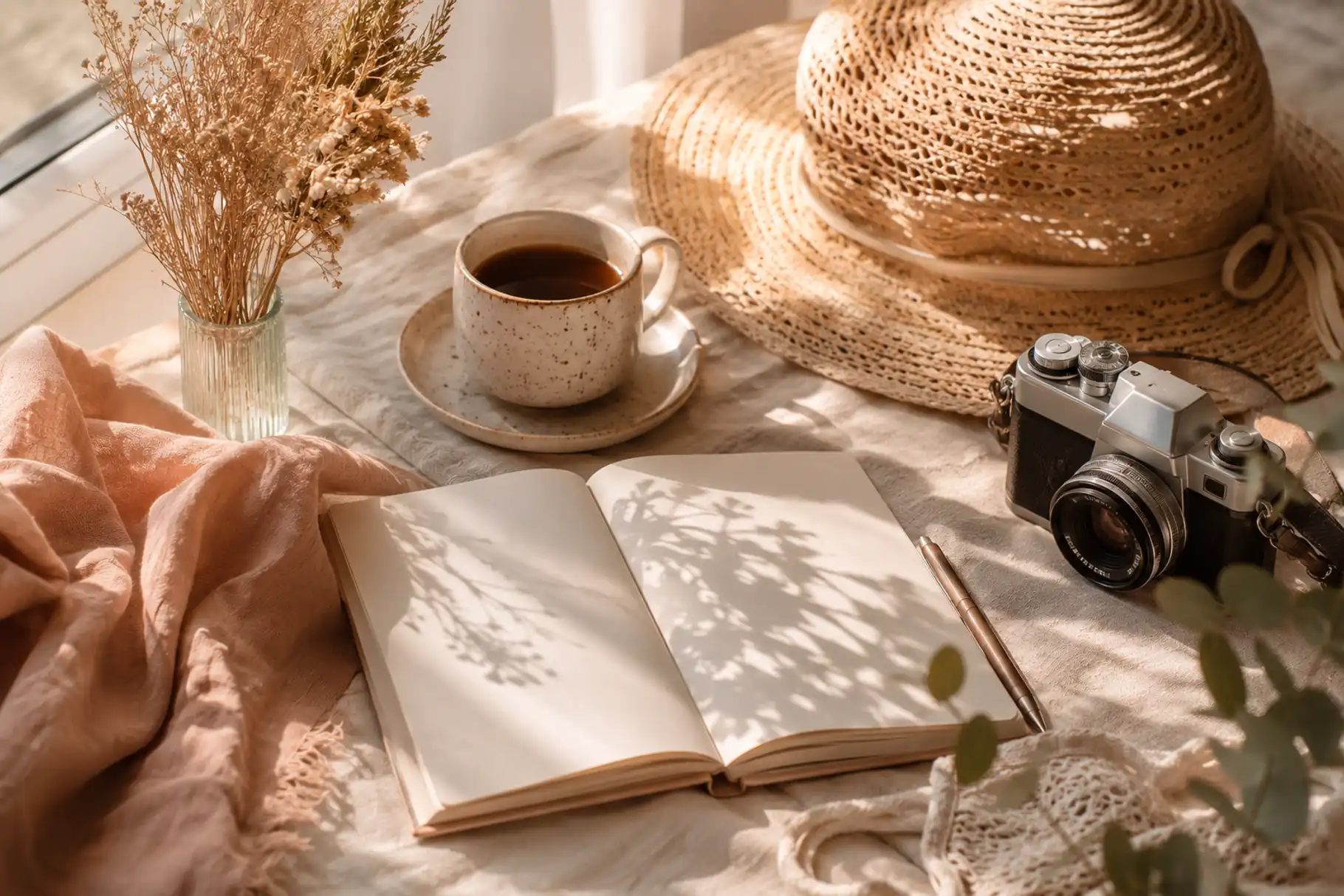
Sun-washed lifestyle design feels warm, soft, and emotional.
It uses natural photography, muted summer colors, soft overlays, handwritten accents, and relaxed spacing. This style works well for personal brands, photographers, coaches, wellness creators, lifestyle shops, and small businesses.
The goal is not loud attention.
The goal is connection.
This style is great for campaigns that want to feel honest, human, and easy to trust.
Font Choices for Summer Marketing Designs
Fonts can make or break a summer campaign.
A strong seasonal visual needs type that supports the mood. For summer graphic design styles, you can explore different Figuree Studio fonts based on the campaign personality.
Moris Palm – Handwritten Summer Font

Summer Sunshine – Fresh Display Font

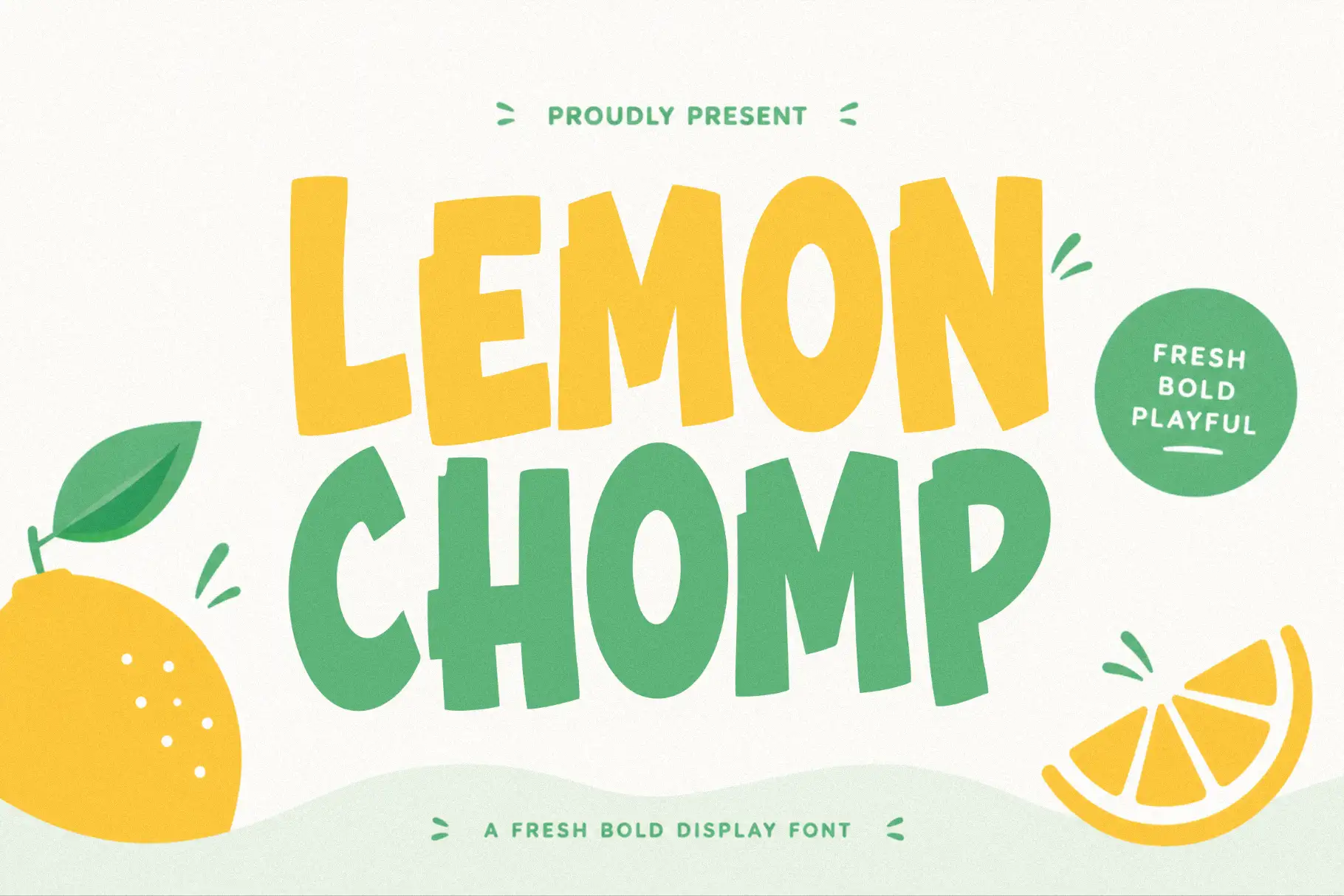
Lemon Chomp – Playful Display Font
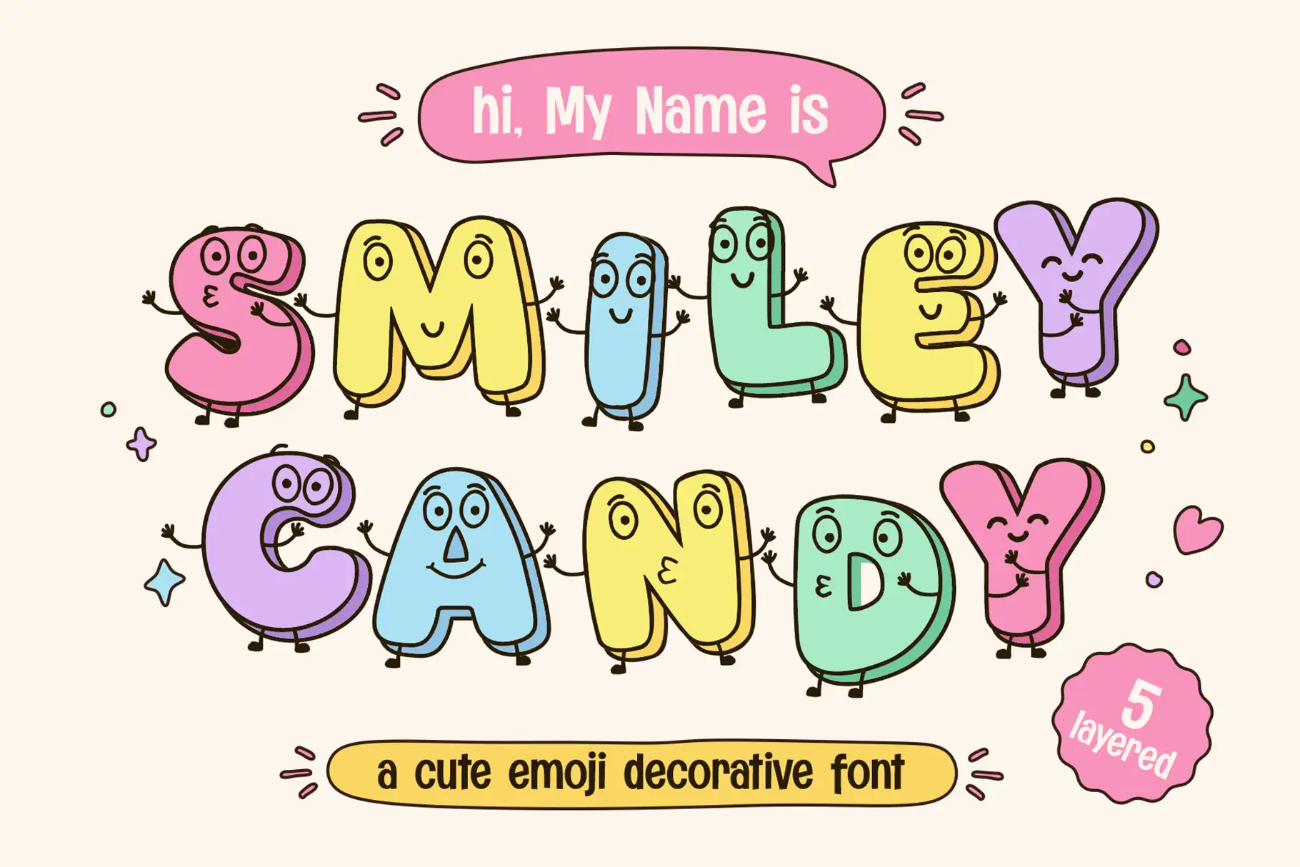
Smiley Candy – Cute Emoji Font
Fresh Kids – Playful Display Font
Glops – Retro Brush Font
Groovy Waves – Psychedelic Retro Font
How to Use Summer Design Across Marketing Channels
A summer style should not live in only one post.
Use it across your main campaign touchpoints so the brand feels consistent. This can include Instagram posts, Pinterest pins, website banners, email headers, product packaging, landing pages, ads, event posters, and merchandise.
Create a simple seasonal design kit.
Include your color palette, main font, supporting font, image style, texture direction, and layout rules. This makes the campaign easier to repeat without looking messy.
For creators selling digital products or merch, typography can also influence how product previews feel. You can read Fonts That Sell: Make Your Etsy Shop Stand Out for more ideas on using fonts in product presentation.
From Our Desk
Summer design does not need to be complicated.
The strongest campaigns often come from simple choices: a fresh palette, a readable type system, a clear headline, and one strong visual mood.
Do not chase every summer trend. Build a design style that fits your brand, your product, and your audience.
A relaxed beach brand, a bold festival poster, and a premium resort campaign should not look the same. Each one needs its own visual voice.
That is where typography becomes powerful.
Fonts help your audience feel the campaign before they read every detail.
Final Thoughts
Summer graphic design styles can help your marketing feel more timely, emotional, and memorable.
Use color to create mood. Use typography to shape voice. Use layout to guide attention. Use imagery and texture to make the campaign feel alive.
Whether you are designing for social media, packaging, events, digital ads, or seasonal branding, summer gives you room to be warmer, brighter, and more expressive.
Explore the Figuree Studio font catalog to find typefaces that can bring your next summer campaign to life.