Introduction: When a Brochure Becomes a Silent Salesperson
Picture this: you hand your brochure to a potential traveler at a fair. They skim the cover, glance at the itinerary—and in less than five seconds, they decide if your brand feels premium or forgettable. That decision isn’t about your pricing or photos alone. It’s about the typography. The right Travel Agency Fonts create trust, evoke wanderlust, and make your brand unforgettable.
Table of Contents
- Introduction: When a Brochure Becomes a Silent Salesperson
- Why Choosing the Right Travel Agency Fonts Matters
- Clarity First, Emotion Second
- Matching Font Personality with Your Package
- Legibility Across Mediums
- The Top 10 Travel Agency Fonts for 2025
- Sans Serif: The Backbone of Brochure Design
- Script: The Emotional Hook
- Winning Pairings for Your Next Brochure
- Layout Blueprint: How to Apply Travel Agency Fonts
- From Our Desk: Lessons in Travel Agency Fonts
- Licensing: Stay Safe as You Scale
- Empowering Conclusion
Designers, freelancers, and travel brand owners know this: brochures must do two things at once—deliver details and spark dreams. That’s why, in 2025, the strongest brochures pair clear sans-serifs with elegant scripts. Sans-serif fonts keep the structure legible, while scripts add the emotional flourish that makes readers feel they’re already halfway to Santorini.
Also Read: Best 2025 Fonts for Beauty Brands to Instantly Elevate Luxury
Why Choosing the Right Travel Agency Fonts Matters
Clarity First, Emotion Second
Every brochure has to juggle hotel categories, dates, and inclusions. A sans-serif like Midnight Workers keeps those lists crisp and professional. Then, when you want to showcase destinations, use a script like Hadejah to layer emotion into your headings.
Also Read: Design Better Apps: Fonts That Transform Web & Mobile UX
Matching Font Personality with Your Package
Luxury tours need refinement. Radditya Signature works beautifully for high-end travel experiences. But if you’re promoting a youthful, city-hopping trip, Nightfall paired with Ignazio gives you a modern edge.
Legibility Across Mediums
A font may look great on screen but struggle in print. Print your designs at 100% scale. If your tables blur, switch to a weightier sans like Bolde. And remember, scripts should never carry body text—they belong in headlines, cover titles, or quotes.
Also Read: Proven Font Combos to Make Your Packaging Design Pop
The Top 10 Travel Agency Fonts for 2025
We handpicked ten fonts from the Figuree Studio catalog—five sans-serifs for clarity, five scripts for elegance. Together, they cover every mood your travel agency brochures need.
Sans Serif: The Backbone of Brochure Design
Midnight Workers: modern and reliable, ideal for body text in itineraries.

Bolde: strong yet smooth, excellent for section headers.

Ignazio: versatile, brandable, perfect for logos and tables.

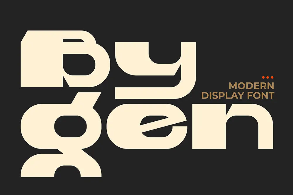
Bygen: geometric and sharp—gives a futuristic vibe for modern agencies.
Garuda Extend: bold and energetic, great for adventure travel or sports tourism.

Script: The Emotional Hook
Hadejah: luxury and refinement—perfect for honeymoon and high-end escapes.

Radditya Signature: sleek and stylish, great for taglines and cover text.

Graphiel: bold, dynamic strokes that grab attention on covers.

Break Fridays: modern script with clean lines, great for subheaders.

Brotherside: elegant lifestyle vibe—ideal for boutique travel agencies.

Also Read: 2025’s Most Elegant Fonts for Wedding Invitations Every Bride Will Love
Winning Pairings for Your Next Brochure
- Ignazio + Hadejah → Premium resort tours.
- Midnight Workers + Radditya Signature → Curated city breaks.
- Bolde + Graphiel → Bold cruise promotions.
- Bygen + Brotherside → Editorial-style catalogs.
- Garuda Extend + Break Fridays → Family adventure packages.
Layout Blueprint: How to Apply Travel Agency Fonts
- Covers: Hero destination in Hadejah, subtitle in Ignazio.
- Itinerary spreads: Day headers in Midnight Workers, pull quotes in Graphiel.
- Pricing pages: Tables in Bolde, accent labels in Break Fridays.
Want to sharpen your pairing skills? 99designs’ font pairing guide is an excellent external resource.
From Our Desk: Lessons in Travel Agency Fonts
“Design is the silent ambassador of your brand.” — Paul Rand.
After reviewing dozens of brochures, we realized one thing: let sans-serifs like Ignazio carry the logistics, while scripts like Radditya Signature carry the promise.
As Seth Godin often says, people buy stories, not stuff. When you use Hadejah on a cover title, you’re not just writing “Paris Escape”—you’re painting a story. And Jeff Bezos put it best: “Your brand is what other people say about you when you’re not in the room.” With the right fonts, your brochures keep selling even when you’re offline.
Also Read: The Hidden Formula Behind Corporate Brands’ Obsession with Handwritten Fonts
Licensing: Stay Safe as You Scale
Brochures often move beyond small print runs—into ads, PDF downloads, and team usage. Make sure your licenses are covered. Check our license options (special discount on Extended License) and explore Corporate License for larger rollouts.
Want to experiment first? Use our free fonts for mockups. And for consistent updates, subscribe to our newsletter for design tips and exclusive offers.
Empowering Conclusion
Fonts aren’t decoration. They’re strategy. Pairing a strong sans like Midnight Workers with an elegant script like Hadejah transforms brochures into trust-building tools.
Don’t let weak typography hurt your brand. Design with clarity, inspire confidence, and grow your bookings.
- Browse the full catalog
- Subscribe to our newsletter
- Grab freebies to prototype