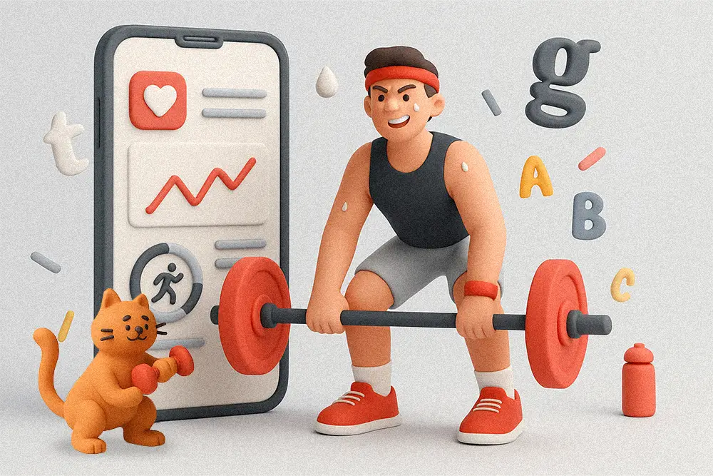
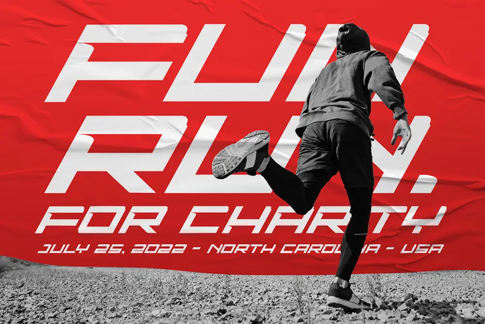
There’s something about a great fitness app that makes you want to move.
It’s not just the progress bars or the sleek interface — it’s the energy it radiates. Every color, motion, and fitness app font works together to push users forward, make them feel unstoppable, and remind them that discipline is a daily practice. The right fitness app fonts don’t just decorate your design — they drive motivation and turn every tap into momentum.
That’s the power of Fitness App Fonts — they don’t just decorate your UI, they motivate it. For designers, freelancers, and brand owners creating digital fitness experiences, choosing the right font is like setting the right workout playlist. The rhythm changes everything.
In this article, we’ll break down how to pick fitness app fonts that truly motivate users — and introduce 10 bold typefaces from Figuree Studio’s collection built for performance, passion, and persistence.
Typography shapes perception.
According to 99designs, the right font can immediately communicate energy, trust, or motivation — which is crucial in the wellness and fitness niche.
For fitness apps, this means finding fonts that:

Fonts that strike this balance not only look good but feel right. They make every screen feel alive — from onboarding flows to achievement badges.
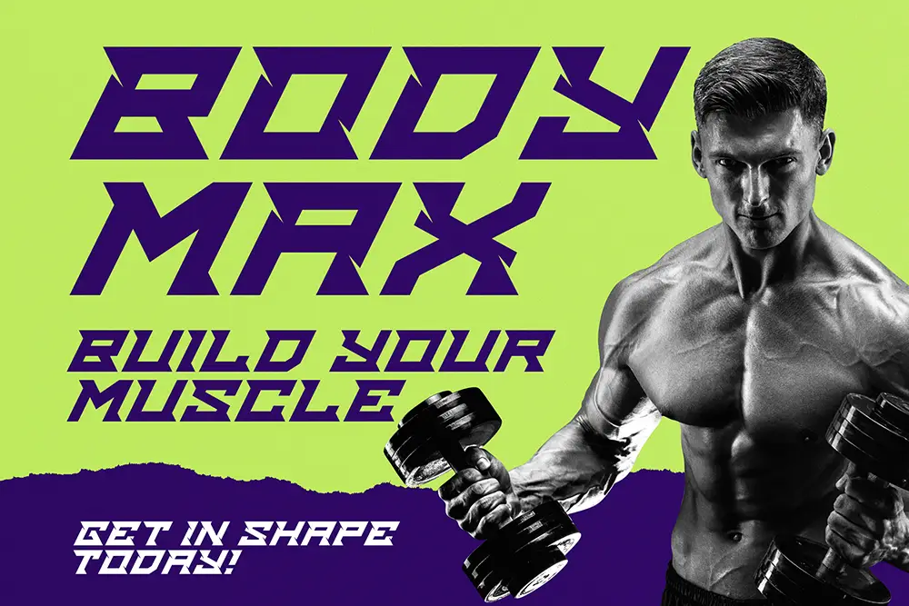
Quinoss is built for momentum. With bold angles and geometric precision, it captures the athletic intensity every fitness app needs. Perfect for timers, titles, and brand marks, Quinoss adds an instant sense of speed.
Pro tip: Use it on progress dashboards or splash screens to subconsciously trigger “movement.”

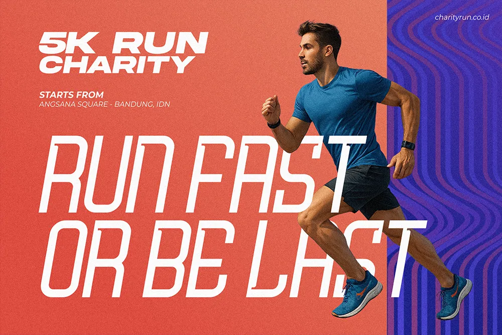
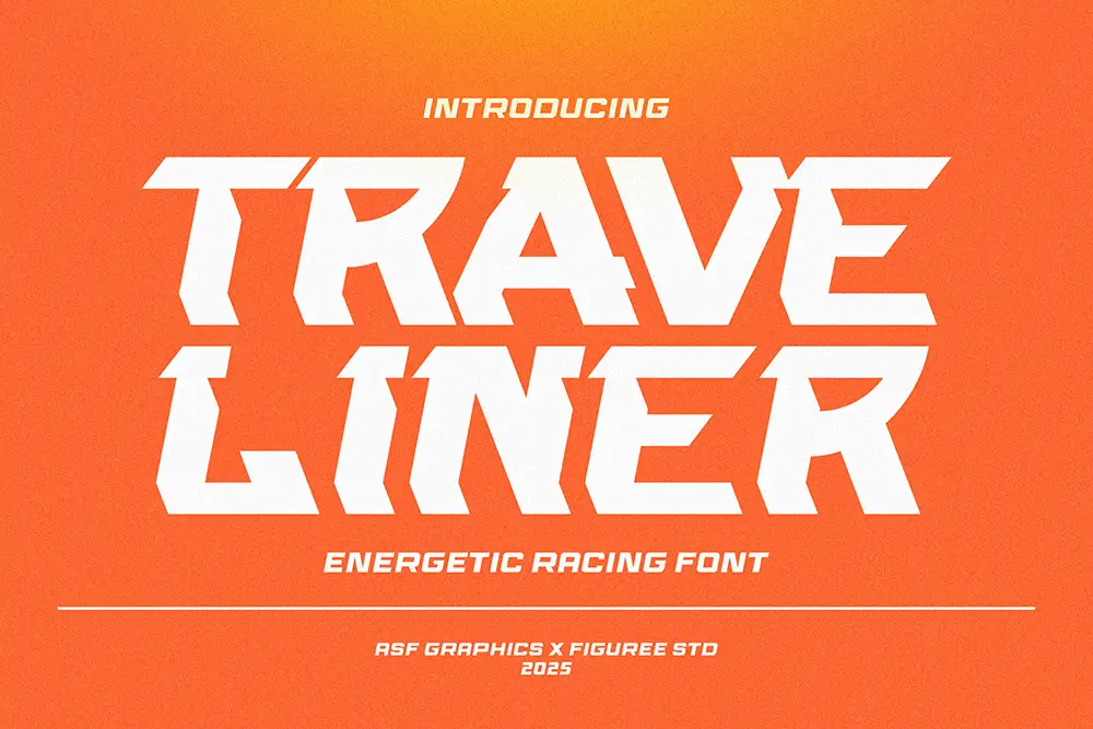
Traveliner feels like it’s in motion — even when static. Designed for racing-inspired brands, this font fits workout apps that want to emphasize progress and performance.
If your app tracks running, cycling, or daily steps, Traveliner’s energy visually amplifies that purpose.
Also Read:
Design Better Apps: Fonts That Transform Web & Mobile UX
Proven Font Combos to Make Your Packaging Design Pop
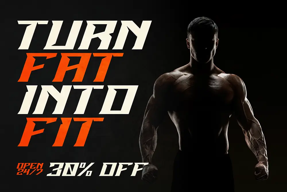
When users feel the burn, Brake Disc delivers the grit.
Brake Disc radiates high-octane energy with its sharp edges and dynamic contrast — perfect for gym or HIIT-based apps.
Imagine it in “Workout Complete” screens or digital leaderboards. The impact is instant — victory visualized through typography.

Sonic Turbo brings pure velocity to digital branding.
Its aerodynamic letterforms fit perfectly into gamified fitness experiences — from spin-class screens to heart-rate trackers.
Pair it with sleek gradients or motion UI, and your design screams: get moving.

When precision meets power, you get Dominiums.
Dominiums offers clean mechanical rhythm, excellent for logos or hero headlines inside modern fitness dashboards.
Its futuristic, industrial edge instantly modernizes your visual language — and it looks phenomenal in both light and dark mode designs.

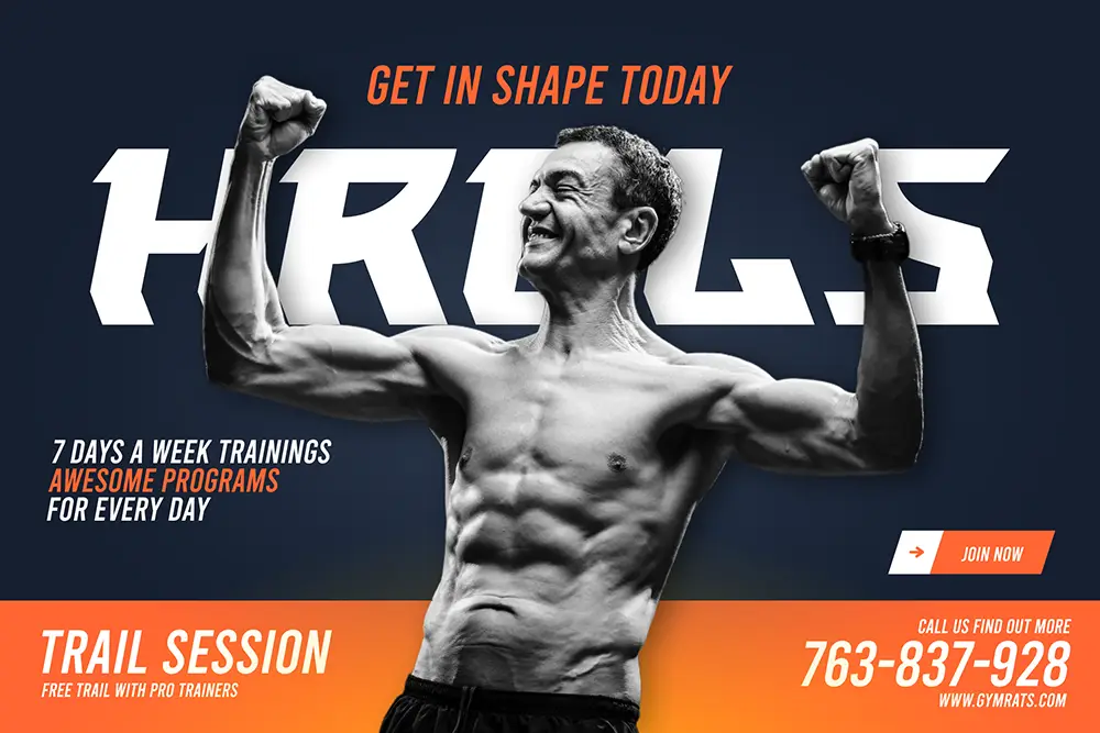
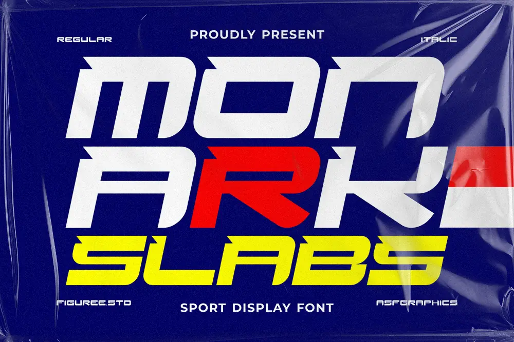
Monark Slab adds a classic, powerful presence.
Its slab-serif strength makes it perfect for professional gym brands or personal training apps that want to project endurance and reliability.
Monark Slab’s solid baseline feels grounded — exactly the vibe you want for users who value consistency over hype.
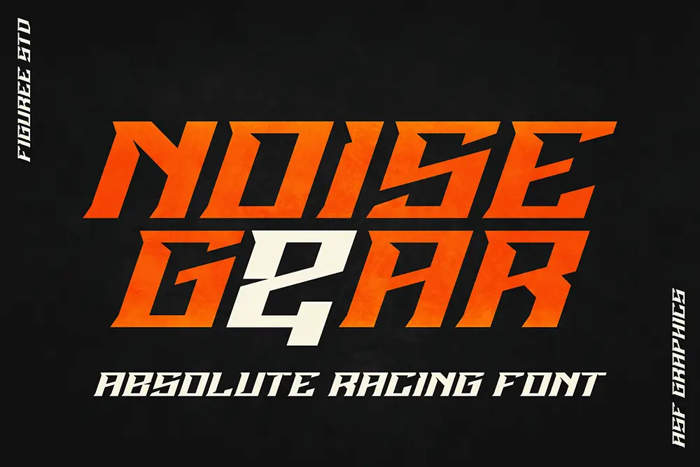
If your fitness app is data-driven, Noise Gear is the ultimate fit.
It merges tech aesthetics with bold mechanics, creating a UI voice that feels analytical yet motivating.
Perfect for biometric apps or smartwatch companion interfaces.
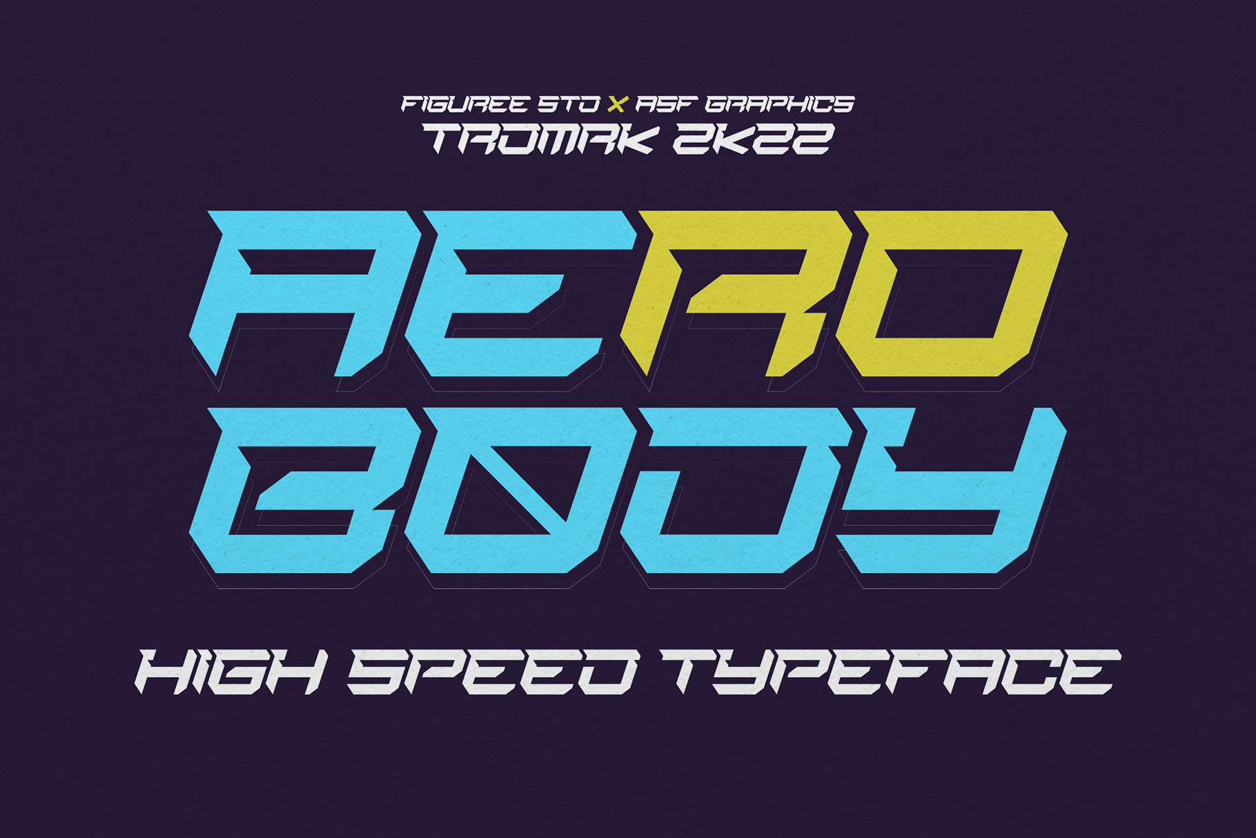
The name says it all — Aerobody is built for performance.
Sleek, aerodynamic shapes communicate agility and motion. It’s ideal for running trackers or cycling companion apps where smooth UX flow matters as much as visual rhythm.
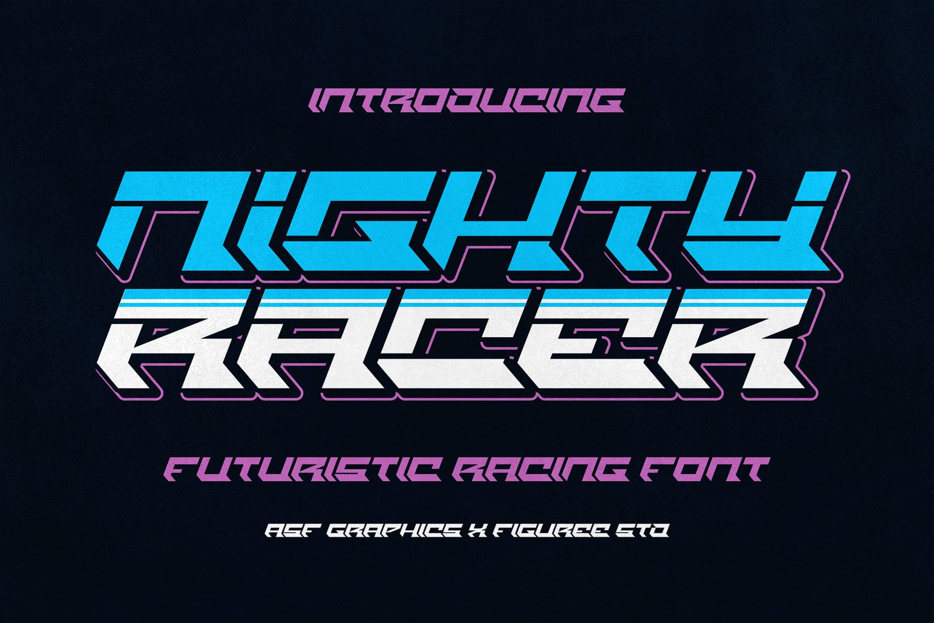
Nighty Racer delivers the glow of determination.
Its neon-like energy adds excitement to fitness apps with dark themes or nighttime training modes.
Designers love it for its futuristic energy that mirrors endurance and progress.
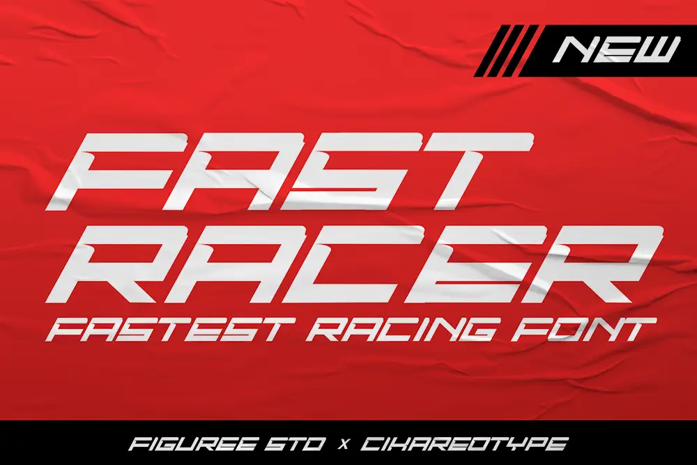
When your users push limits, Fast Racer pushes visuals.
It captures the momentum of speed, making it perfect for challenge-based or competition apps.
For onboarding animations or reward screens, Fast Racer builds adrenaline through design.
Sometimes, you need fonts that balance boldness with usability.
That’s where these supporting choices shine:
Together, these fonts create balance between power and focus — a must for every fitness UI system.
“Energy and persistence conquer all things.” — Benjamin Franklin
We’ve learned that typography is the quiet coach in every design. It sets tone, rhythm, and motivation. When you use the right fitness app fonts, you’re not just making things look aesthetic — you’re shaping user behavior and building emotional connection.
The best fitness app fonts become part of the user’s inner rhythm — helping them stay focused, track progress, and celebrate achievements. A font can make someone trust your app, push through one more rep, or stay on track with a long-term goal. That’s why we believe in designing not just for visibility, but for vitality.
Your app could have the smartest features — AI tracking, calorie logging, even gamified challenges — but if your typography doesn’t feel strong, users subconsciously disconnect. The right fitness app fonts bring consistency, energy, and emotion — turning ordinary UI into a source of motivation.
Fonts like Quinoss, Traveliner, and Sonic Turbo work because they visually align with your brand’s promise: movement, motivation, and mastery. Each of these fitness app fonts creates momentum in design, helping your brand stand out in a crowded fitness market.
And the best part?
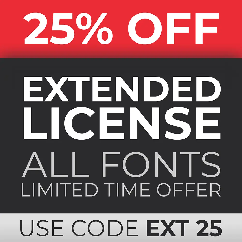
You can license all of these fitness app fonts for personal, professional, or corporate use — with a special discount on Extended Licenses at Figuree Studio’s License Page.
Great design doesn’t just communicate — it moves.
So next time you build a fitness app, remember: your typography can be the difference between a user who logs off… and one who keeps coming back for more.
Don’t let your next design lose its heartbeat.
Explore our full font catalog, grab your freebies, and subscribe to our newsletter for weekly creative insights and exclusive drops.
Also Read:
Don’t let generic fonts drain your design energy.
Choose typography that moves with your mission — powerful fitness app fonts that make every pixel count.
Design with motion. Create with strength. Inspire with type.
 Neon Strix - Futuristic Display Font
Price range: $21 through $1,299
Neon Strix - Futuristic Display Font
Price range: $21 through $1,299 Greatboyz - Graffiti Tag Font
Price range: $21 through $1,299
Greatboyz - Graffiti Tag Font
Price range: $21 through $1,299
Elevate your projects with premium freebies. Fonts, graphics, and templates handpicked for creators like you — download them all today, free forever.
Download Freebies