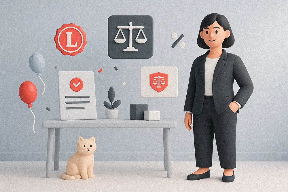
A great law firm doesn’t just win cases—it wins trust.
And that trust often begins with design. The right Law Firm Fonts instantly tell clients that your brand is reliable, experienced, and confident. In a world where people judge professionalism by appearance, typography becomes your silent handshake—an introduction that says, “You can count on us.”
That’s why choosing the right Law Firm Fonts is far more than a design decision—it’s a branding strategy. The right serif or sans serif font tells your audience that your firm stands for reliability, confidence, and prestige. Let’s explore the fonts that will make your legal brand not only trustworthy, but truly unforgettable.
In a world saturated with digital-first brands, consistency is everything. According to 99designs, typography plays a direct role in how credible your business feels at first glance. Serif fonts evoke tradition and professionalism, while sans serifs communicate clarity and modern intelligence—an ideal balance for forward-thinking firms.
If you’ve ever wondered why major law offices like Clifford Chance or Baker McKenzie use timeless serif and geometric sans-serif combinations, it’s because those fonts create subconscious trust. They look stable. They feel dependable.
Also Read:
Best Fonts for Logo Design: Make Your Brand Unforgettable
Avoid Legal Trouble: Understand Font Licensing Now
Fonts and Imagery in Design: Your Ultimate Visual Storytelling Guide

Before a single word is read, fonts already communicate values. Serif typefaces—like Kastroz or Locrian—exude authority and heritage. They are rooted in tradition, giving clients the sense that your firm has decades of experience. Meanwhile, sans serif fonts—like Bolde or Midnight Workers—bring a modern sophistication that aligns with progressive legal practices and digital-first firms.
It’s not about choosing between old and new—it’s about balance. Pair a solid serif headline with a clean sans-serif paragraph, and your message instantly becomes both classic and current. This typographic synergy is what separates “just another law office” from a brand that commands respect.
Each of these fonts from Figuree Studio has been curated to help your law firm communicate professionalism and prestige.
The gold standard of classic elegance. Kastroz gives your logo a premium, heritage-inspired character—ideal for established firms that want to project long-term reliability.

A beautifully balanced serif with luxury undertones. It signals both tradition and refinement, perfect for firms in corporate, family, or estate law.

If your firm blends classic roots with a modern vision, Olyphs adds a touch of glamour. Inspired by the Art Deco movement, it’s a confident and polished choice.

As the name suggests, Bolde stands firm. Clean, modern, and assertive—it works brilliantly for digital legal platforms or rebranding projects that require clarity and confidence.

Inspired by late-night professionals, this font captures dedication and discipline. Ideal for legal tech startups or boutique firms that thrive on modern minimalism.

A sharp and balanced sans-serif that conveys strength without being aggressive. Great for websites, pitch decks, and client-facing documents.

This refined serif communicates class and prestige. Its high-contrast lines make it excellent for high-end law brands or executive-level consulting.

Geometry meets trust. Gued blends clean design with subtle personality, ensuring your brand feels sophisticated yet approachable.

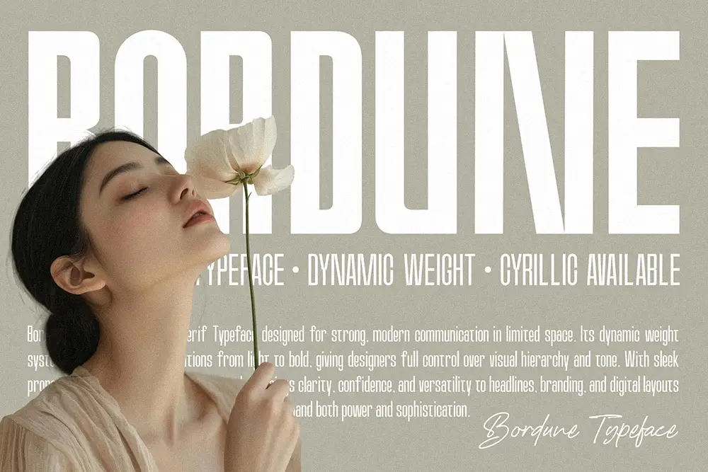
Compact yet commanding, Bordune is ideal for firms looking to maximize space in letterheads or brochures while keeping every detail sharp.
An unexpected but powerful choice. Rudgion adds a human touch to your branding—perfect for personal law practices or boutique firms that want to balance authority with warmth.

When it comes to Law Firm Fonts, the secret is subtlety.
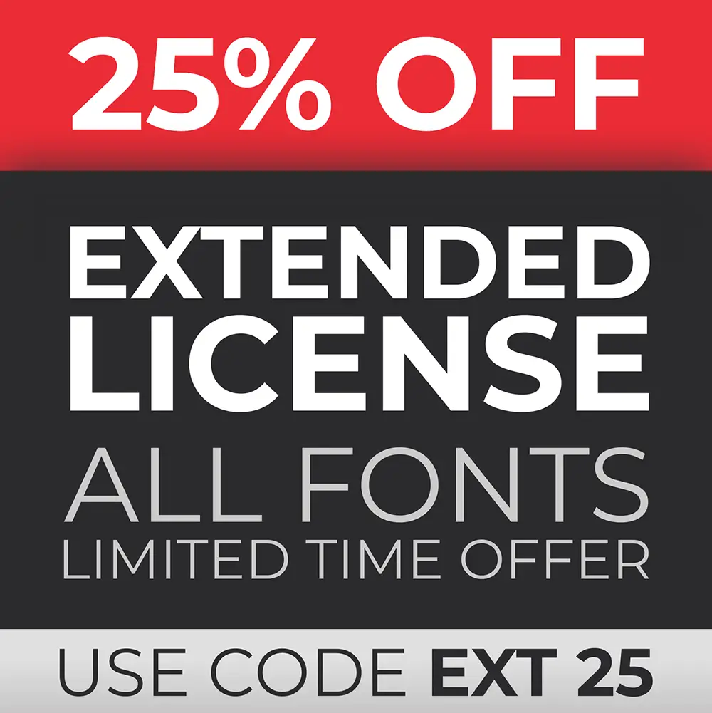
Pro Tip: Make sure your font licenses are properly covered. Check Figuree’s License Page — there’s a special discount for Extended License that’s perfect for corporate identity projects and website use.
“Trust is built on consistency, not words.” — Jeff Bezos
Typography, much like the legal profession, is about structure, precision, and interpretation. At Figuree Studio, we’ve learned that fonts aren’t just visual tools—they’re emotional anchors. A serif curve can symbolize tradition; a clean sans-serif can express innovation.
In law branding, where every impression counts, your typeface becomes your tone of voice. Clients don’t just read your name—they feel it.
Also Read:
How to Design Fonts That Make People Feel: Emotional Storytelling Secrets
The Hidden Formula Behind Corporate Brands’ Obsession with Handwritten Fonts
When clients choose a law firm, they aren’t just buying services—they’re buying certainty. The fonts you use on your website, letterhead, or courtroom presentations reflect that. They speak before you do.
So whether your brand voice is conservative and classic or bold and progressive, there’s a Law Firm Font that captures your essence.
Don’t let generic typography dull your credibility. Choose fonts that mirror your expertise and elevate every visual detail.
Because in law—as in design—credibility isn’t declared, it’s designed.
 Augustha - Lovely Handwritten Font
Price range: $21 through $1,299
Augustha - Lovely Handwritten Font
Price range: $21 through $1,299 Neobique - Modern Display Serif
Price range: $21 through $1,299
Neobique - Modern Display Serif
Price range: $21 through $1,299 Boordens Street – Rebellious Graffiti Font
Price range: $21 through $1,299
Boordens Street – Rebellious Graffiti Font
Price range: $21 through $1,299
Elevate your projects with premium freebies. Fonts, graphics, and templates handpicked for creators like you — download them all today, free forever.
Download Freebies