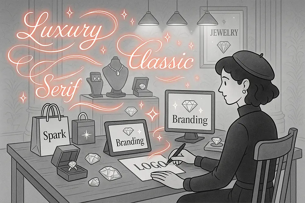
Introduction: Where Luxury Meets Legibility
If you sell jewelry—fine, demi-fine, or fashion—your type choices whisper luxury before your logo even says a word. The right jewelry branding fonts make gold look warmer, diamonds brighter, and storytelling effortless. For designers, freelancers, and brand owners, fonts are more than letterforms; they’re trust signals on a velvet tray. In this guide, we’ll unpack the serif, script, signature, bold script, and brush styles that consistently elevate jewelry branding fonts—with real font picks you can deploy today.
Table of Contents
- Introduction: Where Luxury Meets Legibility
- Why Jewelry Brands Lean on Serifs & Scripts
- The Ground Rules for Jewelry Branding Fonts
- Keep it Minimal, Cohesive, and Readable
- Prioritize Luxury Cues without Sacrificing Clarity (H3)
- Align Fonts with Materials and Price Positioning (H3)
- The 10 Best Jewelry Branding Fonts (Figuree Studio Picks) (H2)
- 1) Kastroz – Luxury Vintage Serif
- 2) Huitside – Fashion Serif Typeface
- 3) Neobique – Modern Display Serif
- 4) Olyphs – Luxury Art Deco Font
- 5) Hadejah – Elegant Signature Font
- 6) Radditya Signature – Elegant Handwritten
- 7) Gabrietha – Lovely Signature
- 8) Graphiel – Modern Bold Script
- 9) Break Fridays – Clean Bold Script
- 10) The Brother Hoops – Classy Brush
- Styling Guide: How to Use Jewelry Branding Fonts Across Touchpoints
- Logo & Monogram
- Packaging & Unboxing
- Website & PDPs
- Social & Editorial
- What Luxury Does Right
- From Our Desk: What We’ve Learned About Jewelry Typography
- Licensing & Scale
- Calls to Action
- Make Your Brand Shine—Subtly, Powerfully
Also Read: Best 2025 Fonts for Beauty Brands to Instantly Elevate Luxury
Why Jewelry Brands Lean on Serifs & Scripts
Luxury brands often rely on refined serifs or cursive forms to signal heritage, poise, and intimacy—exactly what a jewelry purchase demands. Research and industry guidance routinely recommend picking fewer, clearer fonts and maintaining hierarchy so your brand feels consistent and premium. (99designs)
At the top end, high-contrast serifs (think Didone DNA) instantly read “couture,” while elegant scripts and signatures cue personalization and craft—two pillars of jewelry. Leading type resources echo these choices for luxury sectors. (monotype.com, I Love Typography, Mediaboom)
Also Read: Every Font License Type Explained: How to Choose the Right One for Your Projects
The Ground Rules for Jewelry Branding Fonts
Keep it Minimal, Cohesive, and Readable
Limit your brand system to two or three complementary faces—typically one serif for logos/headlines and one script or signature for accents. You’ll preserve clarity while amplifying luxury. (Emily Foster Creative)
Prioritize Luxury Cues without Sacrificing Clarity (H3)
Modern luxury identities often fuse timeless serifs with crisp sans or refined scripts. Consistency across packaging, cards, boxes, and ecommerce PDPs matters as much as the logo. (99designs)
Align Fonts with Materials and Price Positioning (H3)
A high-contrast serif can mirror the sharp facets of gemstones, while a flowing signature font echoes artisan engraving. This “material-to-type” metaphor helps customers feel value before they read a line.
Also Read: Proven Font Combos to Make Your Packaging Design Pop
The 10 Best Jewelry Branding Fonts (Figuree Studio Picks) (H2)
Below are curated jewelry branding fonts across Serif, Script, Bold Script, Signature, and Brush. Each links directly to Figuree Studio so you can preview or license.
1) Kastroz – Luxury Vintage Serif
A bold, all-caps luxury serif with refined ligatures—perfect for monogram logos, outer box lids, and foil-stamped certificates.

2) Huitside – Fashion Serif Typeface
High-fashion energy with elegant contrast; ideal for wordmarks, collection names, and lookbook covers.

3) Neobique – Modern Display Serif
Futuristic elegance meets classic poise; use for premium headlines on your site’s hero and homepage banners.

4) Olyphs – Luxury Art Deco Font
Art-Deco sophistication for boutique jewelry houses aiming at vintage-glam with modern restraint.

5) Hadejah – Elegant Signature Font
Authentic, airy strokes that feel like hand-signed guarantees—great for thank-you cards and care booklets.

6) Radditya Signature – Elegant Handwritten
Refined flow and beautiful ligatures; works as a secondary mark or quality-seal signature.

7) Gabrietha – Lovely Signature
Soft, intimate letterforms that shine on product tags, social quotes, and bridal capsule lines.

8) Graphiel – Modern Bold Script
Confident curves with contemporary weight; perfect for capsule sub-brands or collabs.

9) Break Fridays – Clean Bold Script
Clean, legible, and stylish—excellent for campaign headlines across ads and window displays.

10) The Brother Hoops – Classy Brush
A refined brush texture for editorial accents, gift-wrap patterns, and seasonal promos.

Pro Tip: Pair one display/serif for the logo with one signature/script for accents, and keep body copy in a neutral sans or transitional serif for readability. Industry guidance consistently recommends fewer, stronger choices. (Emily Foster Creative, 99designs)
Also Read: 2025’s Most Elegant Fonts for Wedding Invitations Every Bride Will Love
Styling Guide: How to Use Jewelry Branding Fonts Across Touchpoints
Logo & Monogram
Use Kastroz or Huitside for the master mark. Keep tracking tight, avoid thin hairlines at micro sizes, and test emboss/deboss on rigid boxes.
Packaging & Unboxing
Combine Olyphs for collection titles with Gabrietha or Hadejah as a signature flourish on care cards and polishing cloth sleeves.
Website & PDPs
Hero headlines in Neobique or Graphiel, with a calm paragraph font for descriptions. Keep ADA contrast and mobile legibility in mind—clear typography builds trust and conversions. (Shopify)
Social & Editorial
Seasonal campaigns can pull in Break Fridays for bold quotes and The Brother Hoops for textured overlays—use sparingly to avoid clutter.
What Luxury Does Right
Luxury logos increasingly favor clean, readable typography with restrained palettes. Many use sophisticated serifs or spare sans-serif marks, keeping the overall system minimal and premium. That discipline is precisely what your jewelry brand needs to project value. (99designs, Logome)
From Our Desk: What We’ve Learned About Jewelry Typography
Great jewelry identities feel inevitable—as if no other font could fit. The path there is strategic, not loud: fewer fonts, clear hierarchy, ample negative space, and patient testing in real contexts (foil, ribbon, tissue, micro-type on certificates). Two quotes we live by:
- “Details make perfection, and perfection is not a detail.” — Leonardo da Vinci
- “Style is a way to say who you are without having to speak.” — Rachel Zoe
Those lines guide how we choose jewelry branding fonts: we test kerning on tiny hallmark labels, ensure hairlines survive hot-foil, and validate legibility on matte vs. glossy print. The result is typography that feels like craft, not decoration.
Licensing & Scale
As your brand grows—from local artisan to multi-channel retailer—ensure your font rights scale with you. For campaigns, marketplaces, and multi-seat teams, upgrade to the appropriate license early to avoid legal friction. Browse our license options (with special discount for Extended License): https://figureestudio.com/license/
Calls to Action
- Browse our full font catalog
- Subscribe to our inspiring newsletter
- Grab our latest freebies
Make Your Brand Shine—Subtly, Powerfully
To make jewelry feel precious online and in-hand, let your jewelry branding fonts do quiet, consistent work: one timeless serif, one intimate signature, and disciplined spacing. Don’t let messy type dilute your sparkle. Design with clarity, grow with confidence.