
Try This Font Online
Preview Figuree Studio fonts on trusted external font platforms. Please note that demo or try-font versions available on these platforms are generally for personal use only. For commercial projects, review and purchase the appropriate license from Figuree Studio.
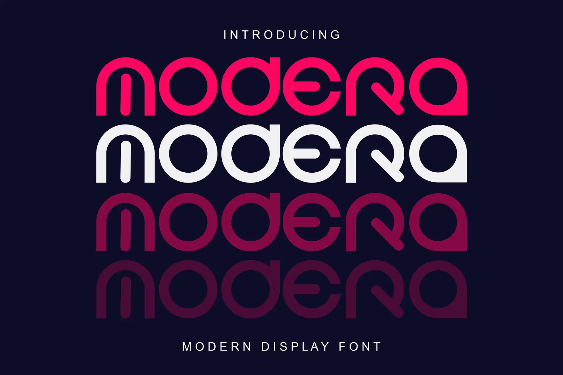
Modera Display Sans Serif Font for Confident Modern Visuals
Modera Display Sans Serif Font is created for designers who need type that feels clean, confident, and visually direct. Built with an all caps design, Modera gives your words a strong typographic presence without making the layout feel crowded or overly decorative.
This font is especially useful for projects where the typography must lead the composition. Think logo marks, editorial titles, product packaging, campaign headlines, website hero text, social media visuals, posters, apparel graphics, and brand presentation layouts. Its modern display style makes it a practical choice for large text, while its consistent letter structure helps designers keep layouts clean and controlled.
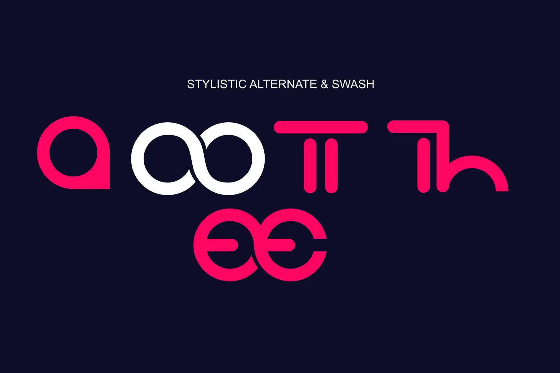
Modera also includes stylistic alternates, swash characters, and ligatures, giving you more room to shape a headline with personality. You can keep the look sharp and minimal, or add expressive typographic accents when the project needs a stronger visual signature.
Design Style and Visual Personality
Modera carries the clarity of a modern sans serif with the presence of a display font. Its all caps structure makes every word feel intentional, which is useful for brands that want to communicate confidence, direction, and polish.
The letterforms are designed for strong hierarchy. That means Modera works well when you need a headline to sit above supporting text, a logo to stand clearly on packaging, or a title to command attention in a poster composition. It does not rely on excessive ornament. Instead, it uses structure, spacing, and alternate details to create impact.
The included swash characters add an expressive layer for designers who want to create more memorable typography. These accents can be helpful for editorial covers, boutique branding, promotional graphics, fashion-inspired layouts, and creative packaging. The stylistic alternates allow you to vary character appearance, helping each design feel more custom without moving away from the font’s clean modern base.
Best Use Cases
Modera is a strong choice for design work that needs modern, uppercase typography with a refined display feel. It can support both commercial branding and creative visual projects, especially when the main text needs to become part of the design identity.
Use Modera for logos, brand marks, packaging labels, product names, editorial headlines, magazine covers, lookbooks, posters, apparel graphics, quote designs, website banners, landing page hero titles, social media campaigns, advertising visuals, and digital product covers.
Because WOFF is included, Modera can also support web-related projects where a matching typographic look is needed between digital layouts and brand materials. The OTF and TTF files make it flexible for common print and design workflows, while WOFF gives designers and brand owners a practical option for web presentation.
Key Features
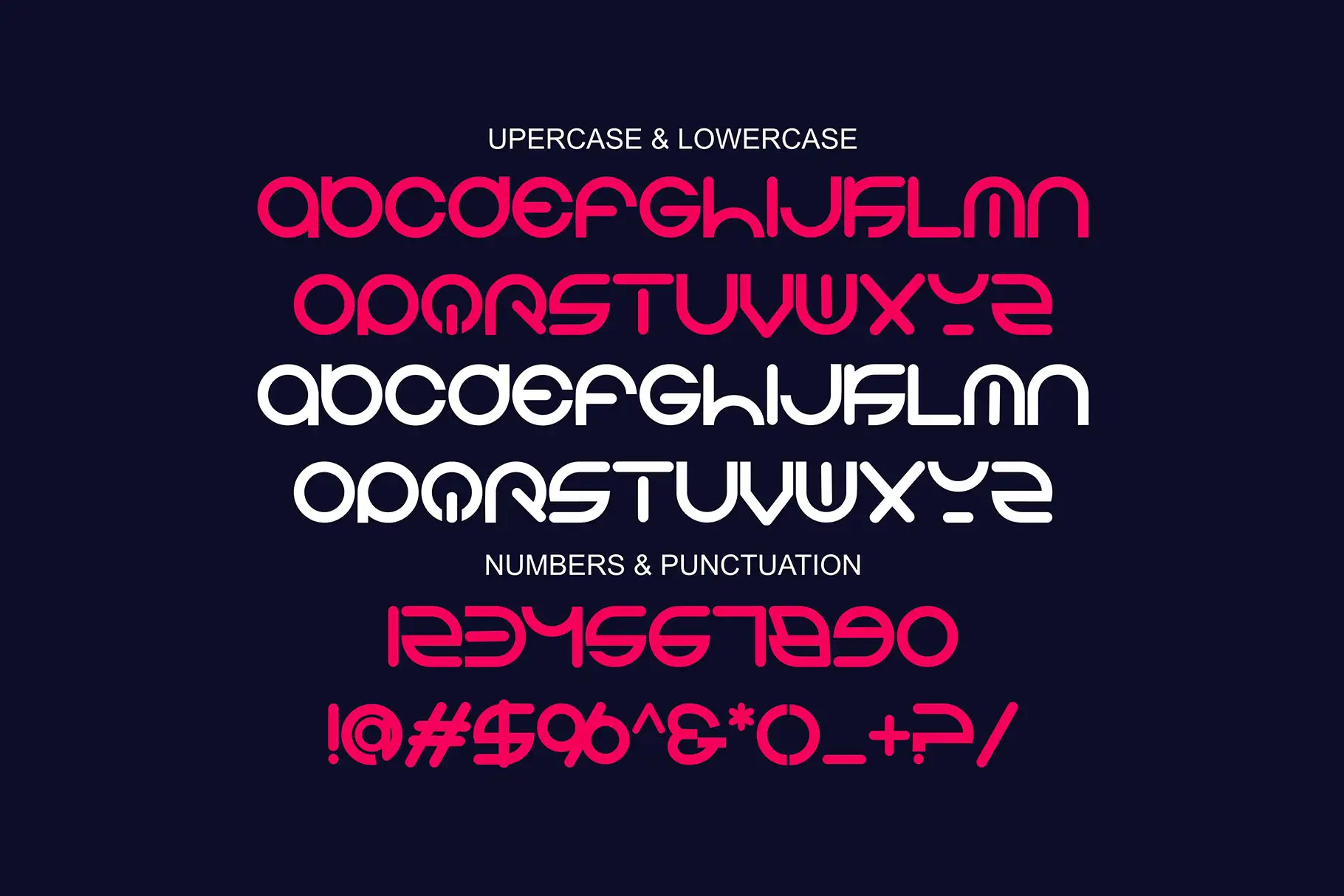
All caps design for strong typographic hierarchy
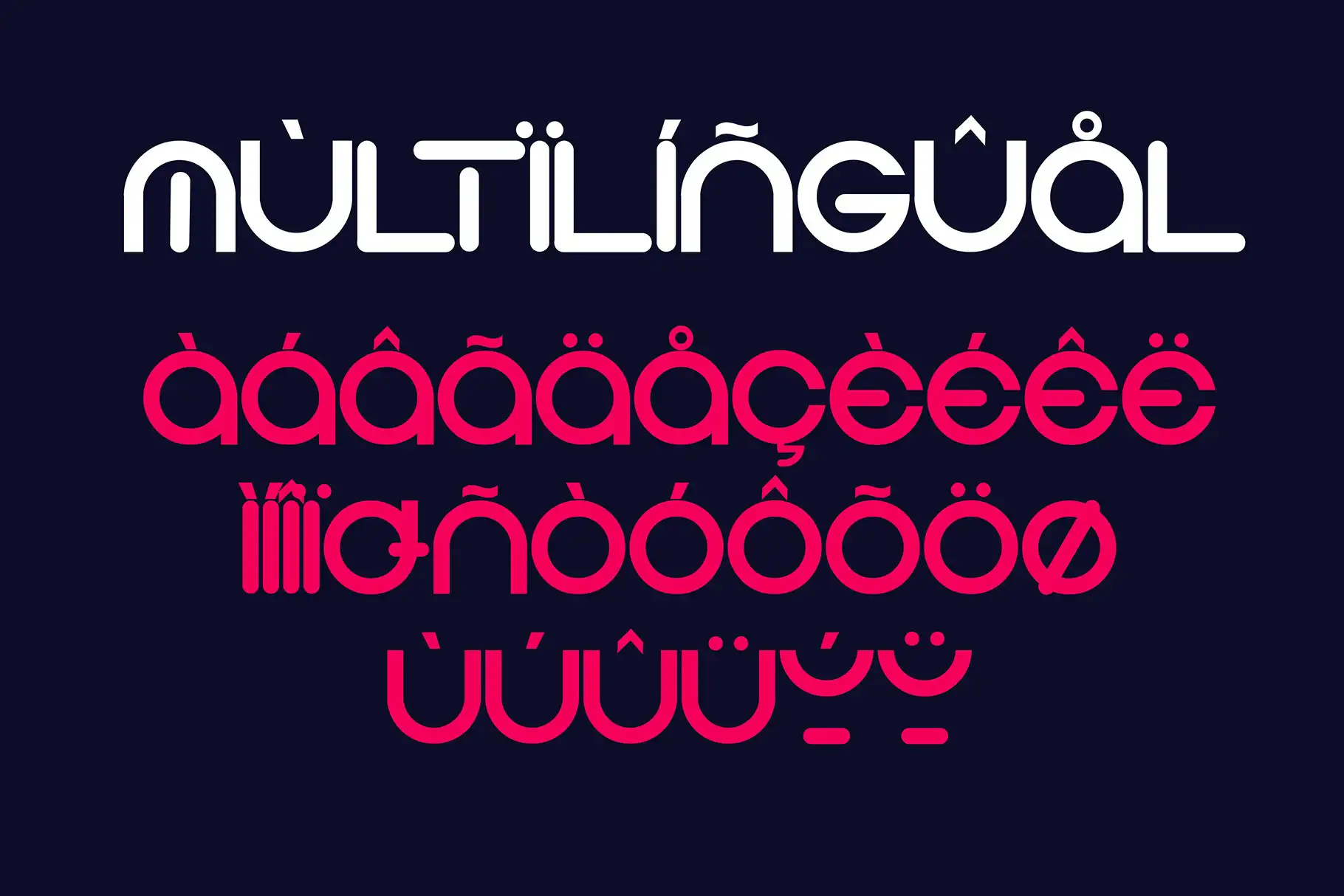
Multilingual support for global communication
Stylistic alternates to vary character appearance
Swash characters for expressive typographic accents
Ligatures for smoother letter connections
Modern display style suitable for titles and large text
OTF, TTF, and WOFF files for print and web projects
Consistent letter structure for clean layout control
File Included
Modera OTF
Modera TTF
Modera WOFF
Why Designers Love It
Designers love Modera because it gives them a direct way to create strong visual hierarchy. In branding and layout work, a headline often needs to do more than simply display information. It needs to create mood, guide attention, and make the project feel memorable. Modera helps with that through its all caps design and modern display character.
The consistent letter structure makes it easier to build clean compositions. Whether you are designing a logo lockup, packaging front panel, campaign poster, or website header, Modera gives your typography a stable foundation. It feels structured enough for brand systems, yet expressive enough for creative campaigns.
The stylistic alternates and swash characters are valuable for designers who want a more custom look. You can use the cleaner characters for a minimal layout, then introduce alternates or swashes when the design needs a distinctive moment. Ligatures also help selected letter combinations feel smoother, supporting a more polished typographic result.
For brand owners and creative studios, Modera is useful because it can move across different visual assets. A product name, social media title, web banner, and packaging headline can all share the same typographic tone, helping the brand feel more consistent.
Font Pairing
Pair Modera with other Figuree Studio fonts to create contrast, hierarchy, and a more complete visual system.
For a clean modern pairing, try Midnight Workers. Its modern sans serif style can support Modera in layouts where you need a simpler companion for secondary text or brand materials.
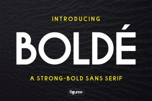
For a strong sans serif combination, explore Bolde. It can work well when your project needs a bold, confident typographic direction across logos, titles, and supporting brand elements.
For another modern sans serif option, consider Ignazio. It can help create a polished and balanced visual system for branding, editorial layouts, and promotional design.
Also Read
For more inspiration on using fonts in real design projects, you may enjoy these Figuree Studio articles:
Avoid These 7 Common Branding Mistakes That Hurt Your Growth
Proven Font Combos to Make Your Packaging Design Pop
Fonts and Imagery in Design: Your Ultimate Visual Storytelling Guide
Try the Font
Want to preview how your words look before using Modera in a project? Try here.
License and Support
Need to compare usage rights before purchasing? You can review the detailed license comparison on this License Finder page:
License Finder
If you have questions before choosing a license, feel free to contact Figuree Studio via email at hi@figureestudio.com or through the contact form here:
Contact us
Final CTA
Modera Display Sans Serif Font is a strong choice when your project needs uppercase typography with modern structure, expressive details, and clean visual control. Use it to create memorable titles, confident branding, polished packaging, and bold editorial compositions that feel intentional from the first glance.
CTA options:
Browse our font catalog
Subscribe to our inspiring newsletter
Grab our latest freebies