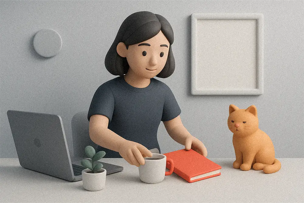
You open your laptop, the tabs explode, cables tangle, and your canvas feels cramped. If your workspace looks busy, your brain feels busy too. This guide shares Minimalist Desktop Setup Ideas that quietly remove friction—so your design time turns into output, not overwhelm. In UX, reducing visual clutter lowers cognitive load and helps people complete tasks faster. The same rule applies to your desk: clear the noise, sharpen the signal. (Nielsen Norman Group)
These Minimalist Desktop Setup Ideas reduce decision fatigue and protect your creative focus. Bold move for today: pick one change from the list below and implement it. Momentum beats perfection.
Apply these Minimalist Desktop Setup Ideas when your workspace starts to feel noisy or cramped. Minimalism is about removing extraneous cognitive load—anything that makes your brain work harder than necessary. UX guidance is clear: avoid redundant elements and unnecessary visuals; build on existing mental models so your flow isn’t interrupted. Treat your desk like an interface: fewer objects, clearer groupings, faster decisions. (Nielsen Norman Group)
For freelancers, Minimalist Desktop Setup Ideas are the fastest way to turn chaos into clarity. When posture “disappears,” creativity shows up. Quick wins: keep the monitor roughly an arm’s length away, with the top at—or slightly below—eye level; place it directly in front of you, not off to the side. If you work primarily on a laptop, add a stand plus external keyboard/mouse for instant alignment. (Mayo Clinic)
Divide your desk into Create (center), Stage (left), Park (right).
Create = input tools (keyboard/mouse or tablet). Stage = today’s 1–2 references. Park = phone face-down, to-do card, items ready to leave. Zoning reduces context switching and protects attention.

Route once, forget forever. Use an under-desk tray, velcro ties, and one master power strip. Put the USB-C hub under the desk so I/O clutter never reappears. Small frictions compound; removing them compounds, too.
Try a “one screen, one mission” rule: design canvas on the big display; references on a secondary screen or tablet; comms minimized until breaks. Your attention is finite—guard it like a premium asset. Research shows visual clutter competes for neural processing and reduces task performance; fewer elements improve focus. (news.yale.edu)
In color-critical workflows, Minimalist Desktop Setup Ideas prevent visual cast and eye strain. Neutral backdrops prevent color casting on your designs. Add a soft bias light behind the monitor to ease eye strain. Matte desk pads tame reflections and sound. Aim for calm materials so your UI—not your furniture—gets the spotlight.
We value what we assemble. Even adding a clamp arm or simple shelf increases ownership and the urge to keep it tidy. This “IKEA effect” is robust across studies—labor increases valuation and care. (Harvard Business School)
End each session with: return items to zones, clear the Stage, wipe the surface. Evidence suggests messy spaces correlate with lower persistence and higher frustration; the reset is a kindness to your future self. (Harvard Business Review)
Keep pairings clean: one serif for elegant headings, one sans for UI clarity and labels. These Figuree Studio fonts echo minimalist discipline:
Locrian — Luxury Serif Font
Premium, uncluttered headlines for wall prints, proposal covers, and principle cards.

Kastroz — Luxury Vintage Serif
Characterful A5 quote prints and section headers in brand books; pair with a modern sans for body.

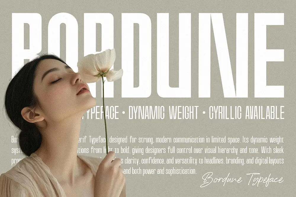
Bordune — Condensed Sans Serif Font
Slim drawer labels, cable tags, and compact UI labels where space is tight.
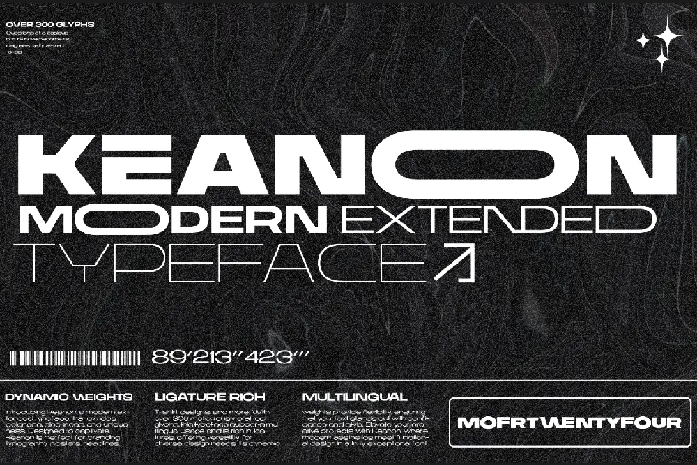
Keanon — Modern Expanded Font
Spacious dashboard titles and wall-board headers; use sparingly for hierarchy without clutter.
Hareva — Sleek Retro Sans Font
Friendly, clean body text for printable checklists and quick-guide cards on your desk.
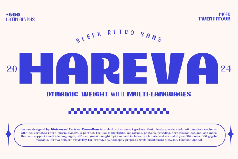
Pairing tip: Locrian (serif) for headlines + Hareva (sans) for body. Sprinkle Bordune for tight labels, and Keanon for big section headers.
Licensing note: packaging fonts into client deliverables or editable templates? See our License page—there’s a special discount on Extended License right now.
When we stripped our own desks to essentials, delivery time dropped and revisions got calmer. Two ideas guide us:
“Less, but better.” — Dieter Rams
“Clarity is kindness.” — Brené Brown
Rams reminds us to remove the non-essential with intention; Brown reframes tidiness as a service to your future self and clients. The UX literature agrees: reduce clutter, work with mental models, and offload tasks to keep focus high. (Nielsen Norman Group)
Minimal doesn’t mean sterile. Label cables and drawers using Bordune for legibility. Print a one-page “Design Principles” card with Locrian headlines + Hareva body. Add a small A5 print in Kastroz (“Less, but better.”) as a compass, not decor. Explore more options in our font freebies, and join the newsletter via the homepage for weekly font drops and minimalist workflow tips.
Also Read (curated):
Freelancer Focus Hacks That Beat Burnout and Boost Flow
Best Laptop Tips for Freelancers 2025: Unlock Hidden Speed & Focus
AI Tools That Help You Think Better: Boost Your Creative Workflow
CLIENT_project_v1.ai).Minimalism isn’t an aesthetic flex; it’s a creative systems choice. Start with one change—monitor height, desk zoning, or a three-minute reset—and you’ll feel the difference in tomorrow’s draft. Don’t let clutter tax your attention. Design with clarity; grow with confidence.
Browse our catalog and lock in a clean serif + sans pairing (try Locrian + Hareva). If you package templates for clients, check the License page — Extended License has a special discount right now. Want more like this? Join the newsletter on the homepage and grab some free fonts to start shaping your minimalist brand kit today.
 Bakso Tahu - Playful Handwritten Font
Price range: $21 through $1,299
Bakso Tahu - Playful Handwritten Font
Price range: $21 through $1,299 Perfect Love - Warm Display Font
Price range: $21 through $1,299
Perfect Love - Warm Display Font
Price range: $21 through $1,299 Goats – Street Graffiti Vector Illustration
$0
Goats – Street Graffiti Vector Illustration
$0
Elevate your projects with premium freebies. Fonts, graphics, and templates handpicked for creators like you — download them all today, free forever.
Download Freebies%20by%20Figuree%20Studio)