If you’re building a product that doesn’t exist yet—or reimagining one that should—your first five seconds of brand impression matter. Potential users don’t read a mission statement before forming opinions; they react to signals. Tech Startup Fonts are one of those signals. When your type feels futuristic yet human, crisp yet warm, you earn trust faster and lower the friction to try.
Founders, designers, and early teams often tell me, “We’ll fix the brand after launch.” But real talk: your landing page, pitch deck, onboarding screens, and app chrome are the brand. They carry your promise before your features can. That’s why we’ll map Tech Startup Fonts that perform—fonts that clearly communicate innovation, reliability, and momentum.
Quick note: If you’re new to pairing or evaluating type, the Google Fonts Knowledge primer on choosing typefaces is a great grounding reference that explains legibility, hierarchy, and use-case fit in plain language (see “Choose Typefaces”). It’s short and actionable—perfect for sprinting teams. (External ref: Google Fonts Knowledge → Choose typefaces.)
Before we dive into the shortlist, align your team on these signals. If a typeface fails one, move on.
Also Read: Best Fonts for Logo Design: Make Your Brand Unforgettable — a practical bridge from marks to full systems.
To keep this useful for buyers (founders, brand owners) and practitioners (designers, freelancers), we rated each font on:
We purposely focused on Tech Startup Fonts with futuristic or techno DNA, plus a few modern display options for striking “demo screenshots” and pitch-deck slides.
With its angular precision and multiple styles (Regular, Italic, Light, Light Italic), Synthetix looks like it was engineered in a lab. It’s perfect for startups that want to project precision and future-readiness right from the first scroll.

Technos blends sharp uppercase and lowercase characters with a cyberpunk vibe. It makes “Next Release” banners and pricing cards feel both bold and trustworthy.

Sleek, avant-garde lettering that instantly signals “cutting-edge.” Ideal for logos, app icons, and premium landing page sections where the wordmark must shine.

If your startup is gearing up for launch day, Exoflash delivers that “poster reveal” energy. Its crisp lines are perfect for pitch deck headers and hero images.

A geometric powerhouse with digital personality. Robot Brain feels right at home on dashboards, growth metric slides, and animated UI elements.

All-caps, bold, and commanding—Heat Robox makes “Now Shipping” banners, countdown timers, and launch campaigns impossible to ignore.

Minimal yet razor-sharp, Overmars is a versatile workhorse. It scales beautifully from app interfaces to feature highlights on landing pages.
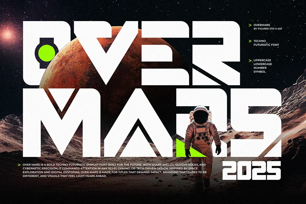
Oversa brings a structured techno look with uppercase, lowercase, and numeric alternates. Great for sub-brands like “Labs,” “AI,” or “Cloud.”

Byte Sharp strikes a balance between aggressive digital edges and everyday readability. It’s excellent for brand taglines, UI toolbars, and even merch drops.

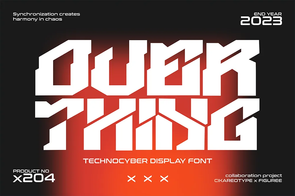
Overthing delivers cyber-styled angles without sacrificing clarity. It shines on login screens, onboarding flows, and “download now” CTAs.)
Four styles—Regular, Italic, Outline, Outline Italic—give you a whole micro-brand kit. Outline versions are stunning for ecosystem diagrams or developer docs.

Minimal, galactic alternates and strong numerals make Futrons a natural for infographics, performance snapshots, and timeline years.

Also Read: SaaS Branding Simplified: Fonts That Make Your Tech Startup Look Future-Ready — great companion for system thinking.
Also Read: Design Better Apps: Fonts That Transform Web & Mobile UX — turn choices into UI rules your engineers can ship.
To keep Tech Startup Fonts maintainable, consider this starter combo:
Spacing & Rhythm:
Accessibility:
As you scale usage across web, app, and campaigns, make sure your rights scale with you. Read the terms to cover web/app embedding, logo usage, seats, and impressions.
CTA: Ready to deploy? Explore license options here: Figuree Studio License page.
CTA: Want to test styles first? Browse our Freebies section to trial pairings.
CTA: Get our latest drops and founder-friendly tips—subscribe via our homepage.
When your product is new, people judge promise before they judge features. Typography is the emotional shortcut to that promise. Innovation isn’t just angular corners—it’s clarity under pressure. The more complex your message, the simpler your type system should be.
“Make it simple, but significant.” — Don Draper (fictional, but a useful creative principle)
“Design is the silent ambassador of your brand.” — Paul Rand
A practical lens we use: Clarity → Energy → Memory
When we ship branding for early teams, we often lock Midnight Workers for UI clarity, then pick Technos or Synthetix for energy. Memory comes from consistent usage across the funnel—site, deck, in-product banners, and social.
Also Read: 100 Dream-Chasing Quotes So Powerful You’ll Never Want to Quit Again — useful for brand voice moodboarding.
Innovation isn’t just what your product does; it’s how confidently you communicate it. Choose Tech Startup Fonts that are clear enough to ship, energetic enough to excite, and memorable enough to scale. Start lean with a two-font system, document your sizes and spacing, and protect your momentum with the right license.
Don’t let unclear typography slow your growth. Design with clarity, grow with confidence.
👉 Browse our full font catalog to build your stack.
👉 Subscribe to our newsletter on the homepage for drops, guides, and discounts.
👉 Grab designer-friendly freebies to test pairings before you commit.
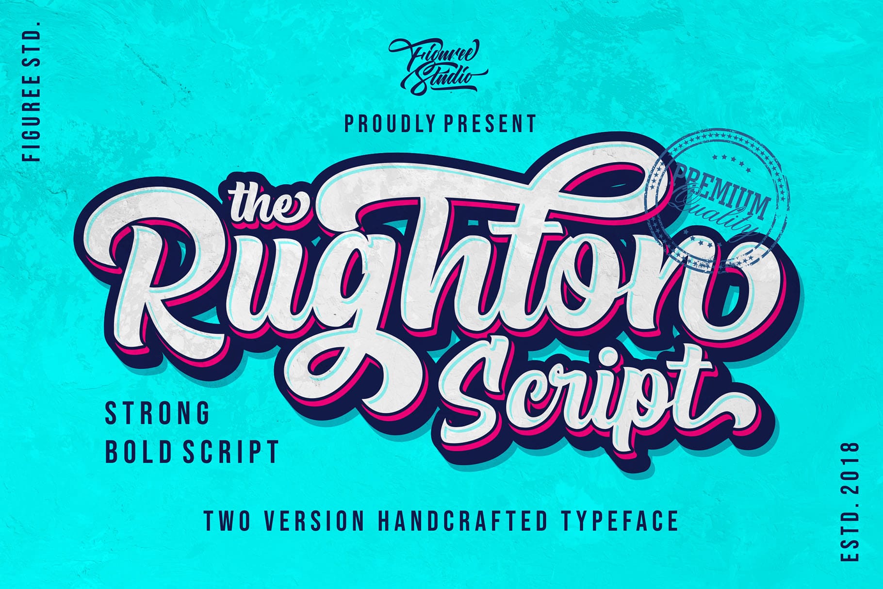 The Rughton - Strong Bold Script
$21 – $1,299Price range: $21 through $1,299
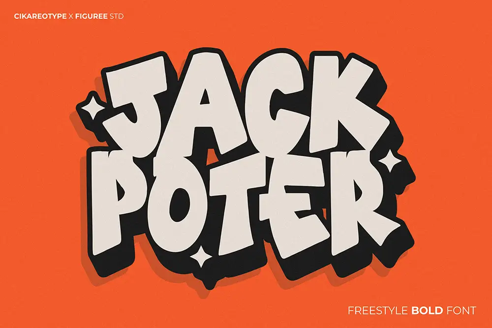 Jackpoter – Freestyle Bold Font
$21 – $1,299Price range: $21 through $1,299
 Bright Heritage - Strong Brush Font
$21 – $1,299Price range: $21 through $1,299
Elevate your projects with premium freebies. Fonts, graphics, and templates handpicked for creators like you — download them all today, free forever.
Download Freebies