
Let’s be honest. When you’re aiming for a premium look, it’s easy to fall into the trap of using fonts that scream “elegant” — but feel flat. Script fonts that try too hard. Serif fonts that feel dated. And sans-serifs that blend into a sea of sameness.
But what if we told you that premium doesn’t have to be boring?
Whether you’re a designer, freelancer, or brand owner, your project deserves fonts that feel high-end but also have character — fonts that whisper elegance while still turning heads.
Also Read: Avoid These 7 Common Branding Mistakes That Hurt Your Growth

A truly premium font does more than just look expensive — it communicates:
But it must also be:
A premium font should feel like an experience, not just a decoration.
Here’s our curated list of premium fonts with personality, taken straight from Figuree Studio’s catalog. Each one was crafted with branding impact in mind.
Bold, confident, and incredibly refined. Kastroz combines classic serif elegance with modern luxury. Perfect for logos, packaging, and editorial layouts that demand attention.
Why Designers Love It:

A bold, brushy script that oozes confidence. It’s perfect for premium beauty brands, packaging, and social posts that want flair with sophistication.

Classic retro curves meet bold lettering. Think vintage soda brands but elevated — perfect for high-end nostalgia-driven packaging or signage.

Art Deco glamour in a sleek modern package. Olyphs brings a clean yet ornamental feel that fits fashion brands and luxury packaging alike.

🔗 Check Midnight Workers
Understated, sleek, and made for late-night creators. This font bridges the gap between modern professionalism and premium elegance.
Also Read: Fonts That Make Your Digital Planners Look Stunning

Top platforms like Envato Elements and WebDesignerDepot echo the same trend:
“Modern premium fonts now blend elegance with uniqueness — without sacrificing readability or personality.”
Your font choices aren’t just decoration — they’re brand language.
We used to design fonts that were too safe. Until we got a DM from a client that said:
“This is beautiful… but it looks like every other brand out there.”
That hit hard. It made us rethink how premium design should also feel original.
Since then, our team at Figuree Studio has:
“Design is the silent ambassador of your brand.” — Paul Rand
And our biggest lesson?
A font must express brand emotion, not just brand value.
Use these fonts when:
But most of all — use them when you want people to say:
“Wow. That font feels expensive.”
Want to impress clients or elevate your brand presence?
🛒 👉 Browse the Full Font Catalog Here
📩 👉 Need an extended or corporate license?
🎁 👉 Grab our latest font freebies
 The Gunslinger - Natural Bold Script
Price range: $21 through $1,299
The Gunslinger - Natural Bold Script
Price range: $21 through $1,299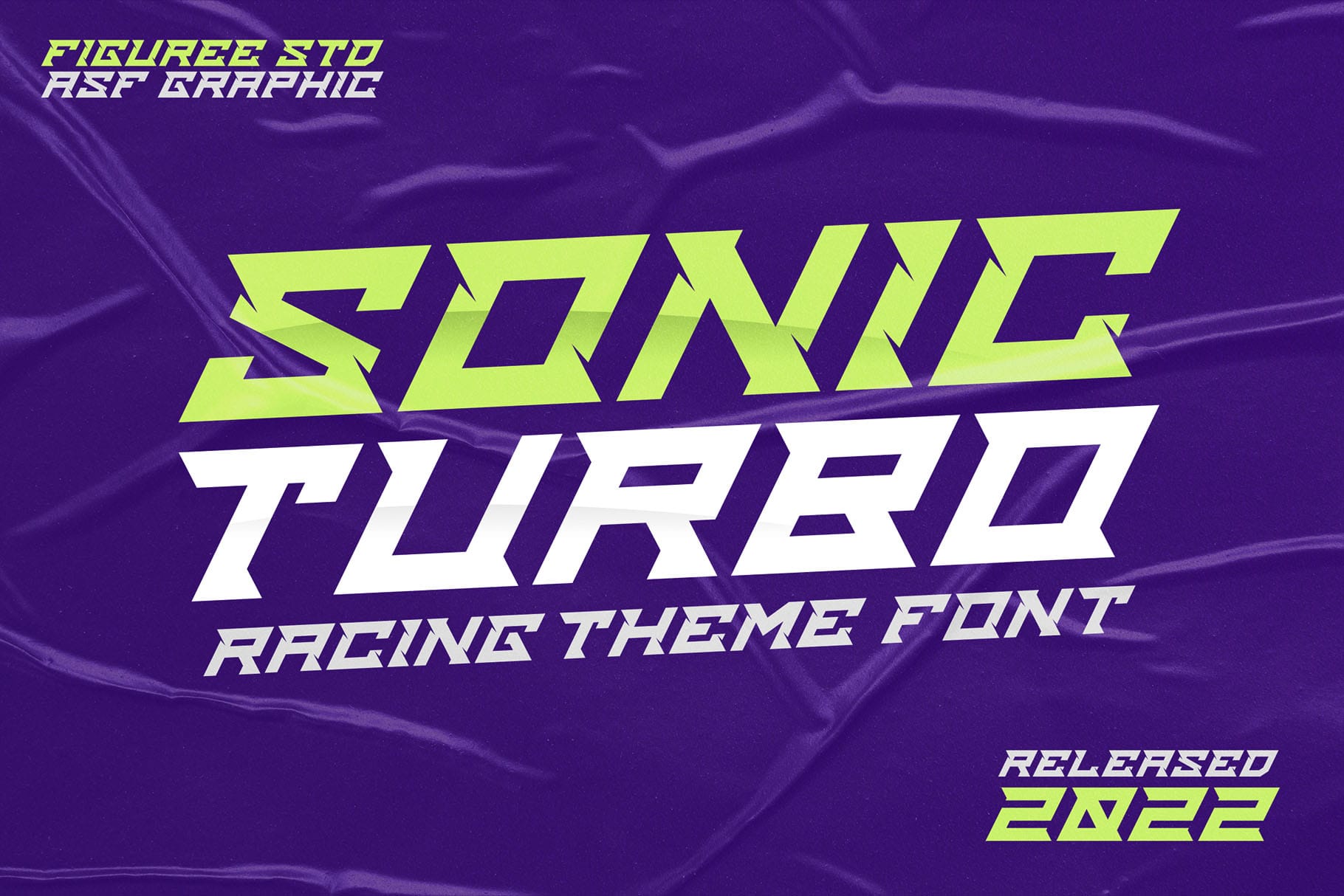 Sonic Turbo - Racing Theme Font
Price range: $21 through $1,299
Sonic Turbo - Racing Theme Font
Price range: $21 through $1,299 Huitside - Fashion Serif Typeface
Price range: $21 through $1,299
Huitside - Fashion Serif Typeface
Price range: $21 through $1,299
Elevate your projects with premium freebies. Fonts, graphics, and templates handpicked for creators like you — download them all today, free forever.
Download Freebies