Introduction: Font Choice Shapes First Impressions
Your brand’s typeface isn’t just style—it’s strategy. Whether you choose serif or sans-serif, the font will influence how people feel about you.
Table of Contents
- Introduction: Font Choice Shapes First Impressions
- The Serif Font: Tradition, Elegance, and Trust
- The Sans-Serif Font: Clean, Modern, and Bold
- Ask Yourself: What Does Your Brand Stand For?
- Think About Your Audience’s Expectations
- Consider Where Your Font Will Live
- Still, Torn? Combine the Two Strategically
- Final Thoughts: Let Your Font Speak for Your Brand
It sets the tone before your audience reads a single word. So, picking the right one is critical to brand success.
The Serif Font: Tradition, Elegance, and Trust
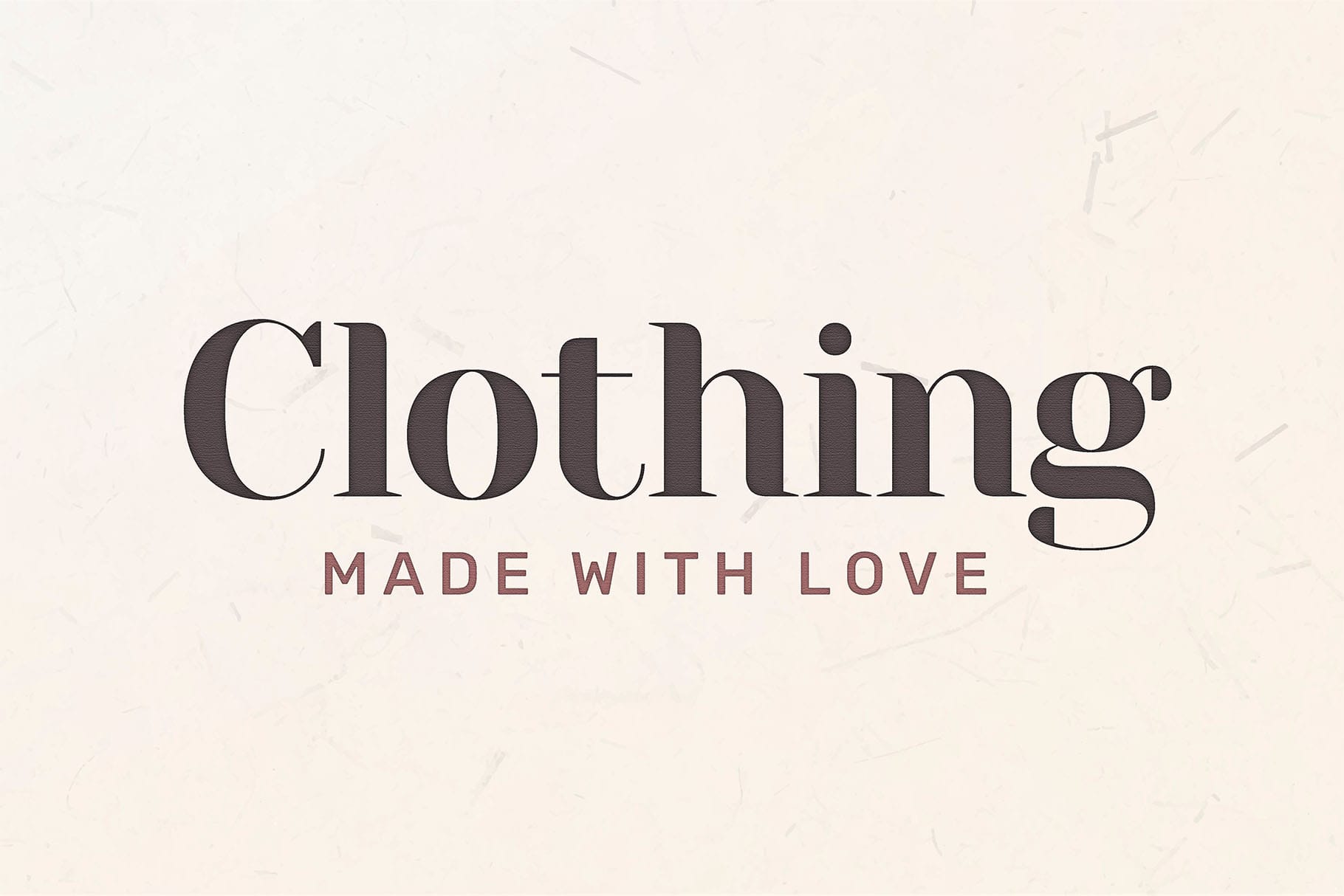
Serif fonts have small decorative lines or “feet” at the ends of their letters. They often feel timeless, formal, and established.
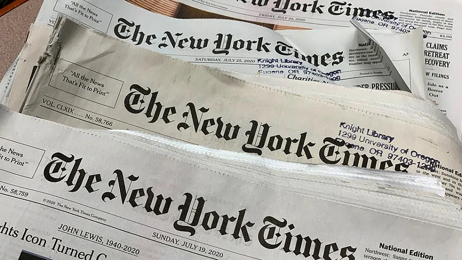
Brands like The New York Times, Vogue, and Time Magazine use serif fonts to project reliability and legacy. If your brand values trust, tradition, or authority, serif might be the way to go.
Additionally, serif fonts work especially well for industries like law, finance, and editorial publishing.
The Sans-Serif Font: Clean, Modern, and Bold
Sans-serif fonts are sleek and minimal. Without extra flourishes, they feel fresh, youthful, and direct.
Tech giants like Google, Spotify, and Netflix use sans-serif fonts to reflect innovation and simplicity. If your brand is modern, accessible, or forward-thinking, sans-serif fonts are a smart choice.
These fonts shine in digital spaces. They’re easier to read on screens and feel more casual yet confident.
Ask Yourself: What Does Your Brand Stand For?
Before you decide, revisit your brand values. Is your brand traditional or disruptive? Conservative or creative?
For example, a luxury brand might choose a serif font for sophistication, while a startup might prefer sans-serif to feel current and clean.
If you’re unsure about your visual identity, check our brand clarity checklist to get aligned.
Think About Your Audience’s Expectations
Your audience brings their own biases and expectations. For instance, older audiences may feel more comfortable with serif fonts. Younger users often gravitate toward sans-serif.
So, choose the font that speaks their language—not just yours. A good font builds a bridge between your message and their mindset.
Want more on font psychology? Here’s a helpful deep dive into how fonts influence perception.
Consider Where Your Font Will Live
Your font won’t just appear on a logo. It’ll show up on websites, social posts, packaging, and more.
Therefore, pick a style that performs well in multiple formats. Serif fonts look great in print, while sans-serif often reads better on screens. That’s a key factor in choosing your font family.
Still, Torn? Combine the Two Strategically
Great news—you don’t always have to pick one. Many brands successfully combine serif and sans-serif fonts.
For example, use a bold sans-serif for your logo and a classic serif for body text. This creates contrast while keeping your brand flexible and dynamic.
Just remember: consistency is key. Choose complementary fonts and stick to your style guide.
Final Thoughts: Let Your Font Speak for Your Brand
Your font does more than decorate—it communicates. Whether you choose serif or sans-serif, the decision should feel aligned, not random.
Take time to explore. Test different combinations. Get feedback from your team and your audience. When you find the right match, your brand won’t just look good—it’ll feel right.