Introduction: Your Logo Starts with Emotion
Your logo is more than art—it’s your first brand impression. The typeface you choose speaks before any words do. Therefore, it must reflect who you are and what you stand for.
Table of Contents
- Introduction: Your Logo Starts with Emotion
- Why Typeface Selection Really Matters
- Step 1: Know Your Brand Before You Pick a Font
- Step 2: Understand What Each Font Family Says
- Step 3: Balance Originality with Clarity
- Step 4: Choose a Typeface That Works Everywhere
- Step 5: Don’t Let Trends Make the Decision
- Step 6: Always Test and Collect Feedback
- Conclusion: Let Your Font Speak Louder Than Words
Why Typeface Selection Really Matters
Fonts influence emotions. For instance, serif fonts feel traditional and trustworthy. On the other hand, bold sans-serifs show strength and innovation.
However, using the wrong font can damage trust or create confusion. That’s why choosing the right one is so powerful—it helps you make a positive connection immediately.
For deeper insight, visit this guide on how fonts shape emotion.
Step 1: Know Your Brand Before You Pick a Font
Before selecting a typeface, understand your brand personality. Are you playful or professional? Friendly or luxurious?
Because your font reflects your brand’s voice, it must match this personality perfectly. Otherwise, your message will feel off-brand.
Need help refining your visual identity? Check our guide on brand refresh tips.
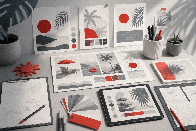
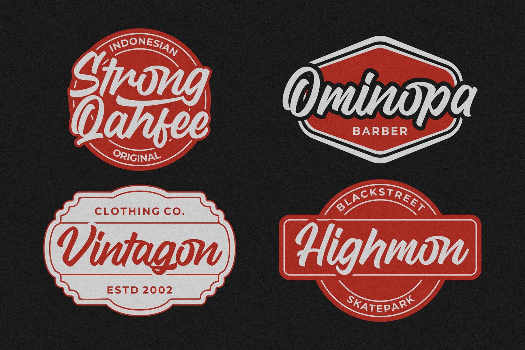
Step 2: Understand What Each Font Family Says
Each font family has its own energy:
- Serif: Trustworthy, classic
- Sans-serif: Clean, modern
- Script: Elegant, personal
- Display or handwritten: Bold, expressive
Still, avoid overly decorative fonts for logos. If they’re hard to read, your brand loses impact. Always prioritize clarity.
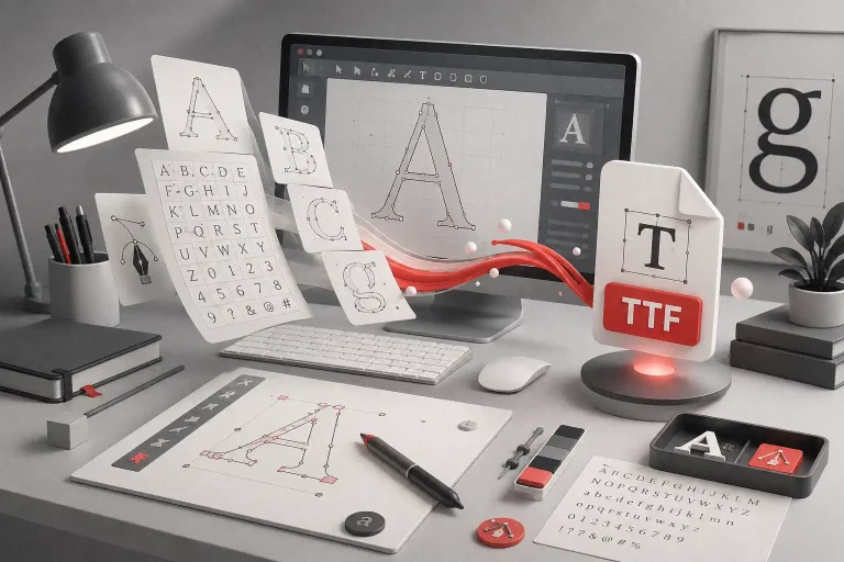
Step 3: Balance Originality with Clarity
It’s tempting to go for something unique—but don’t sacrifice legibility. After all, people need to recognize your name in seconds.
So, test the font in different sizes and on various screens. Then ask others: does it read clearly? If not, keep looking.
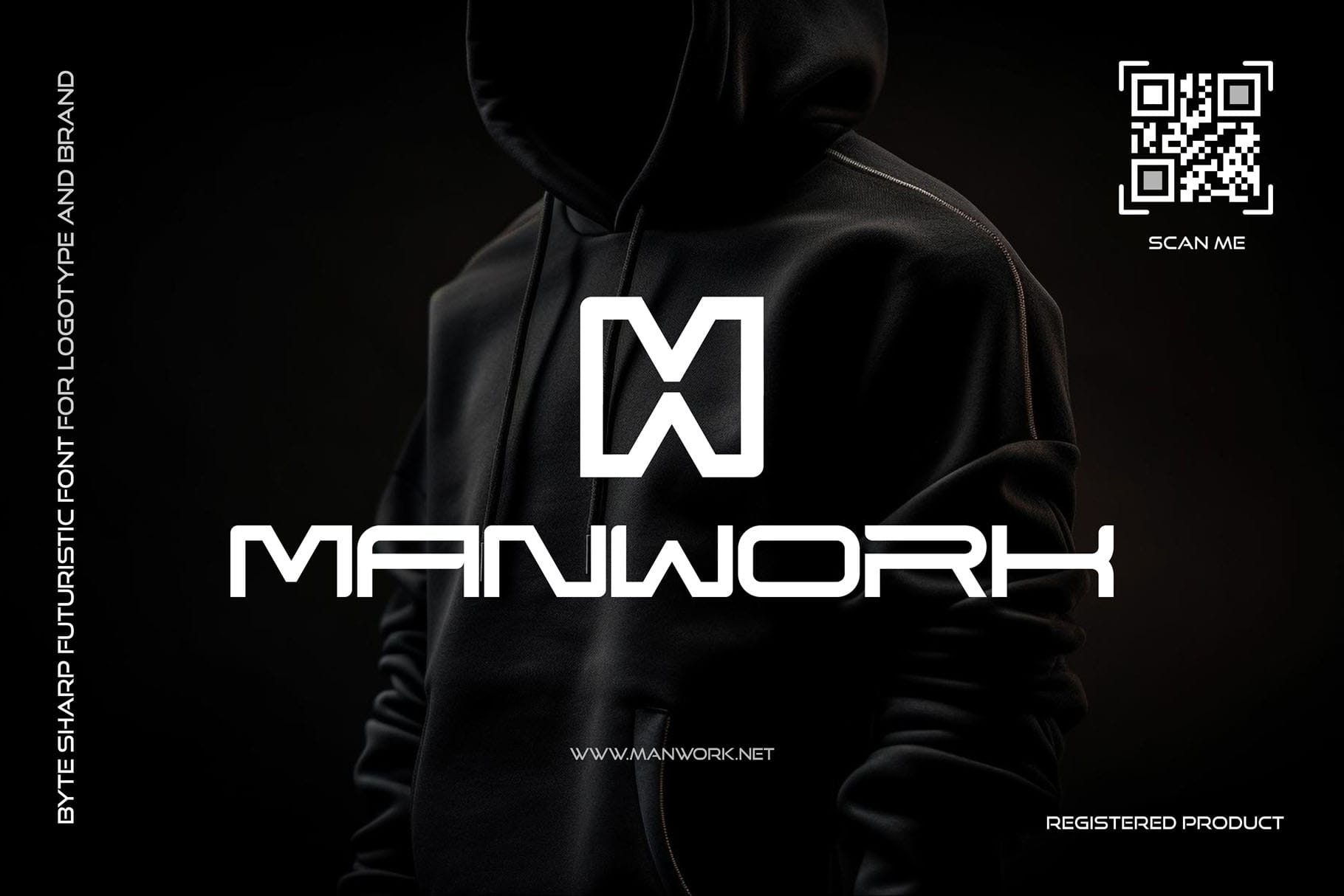
Step 4: Choose a Typeface That Works Everywhere
Your logo will appear in many places—on websites, social media, products, and more. Because of that, your font must be versatile and scalable.
For example, it should remain sharp in both small and large formats. Furthermore, it must work in black-and-white, too.
Step 5: Don’t Let Trends Make the Decision
Trendy fonts often fade quickly. Although they may seem stylish now, they might look outdated in a year.
Instead, look for timeless styles. Fonts with lasting appeal keep your brand strong over time. You can still stand out by slightly customizing a classic font.
Want something fresh and exclusive? Explore independent type foundries to find hidden gems.
Step 6: Always Test and Collect Feedback
After creating a few logo versions, test them in real scenarios. Use mockups, printouts, and digital previews.
Then, gather feedback from your team or even customers. Often, fresh eyes catch issues you may miss. That extra step makes all the difference.
Need inspiration? Browse real examples in our Figuree Studio portfolio.
Conclusion: Let Your Font Speak Louder Than Words
The right font tells your story without a sound. It builds emotion, sparks connection, and earns trust—all in a glance.
So, don’t rush. Instead, take time to explore, test, and feel what fits. When the font clicks, your brand identity comes to life.