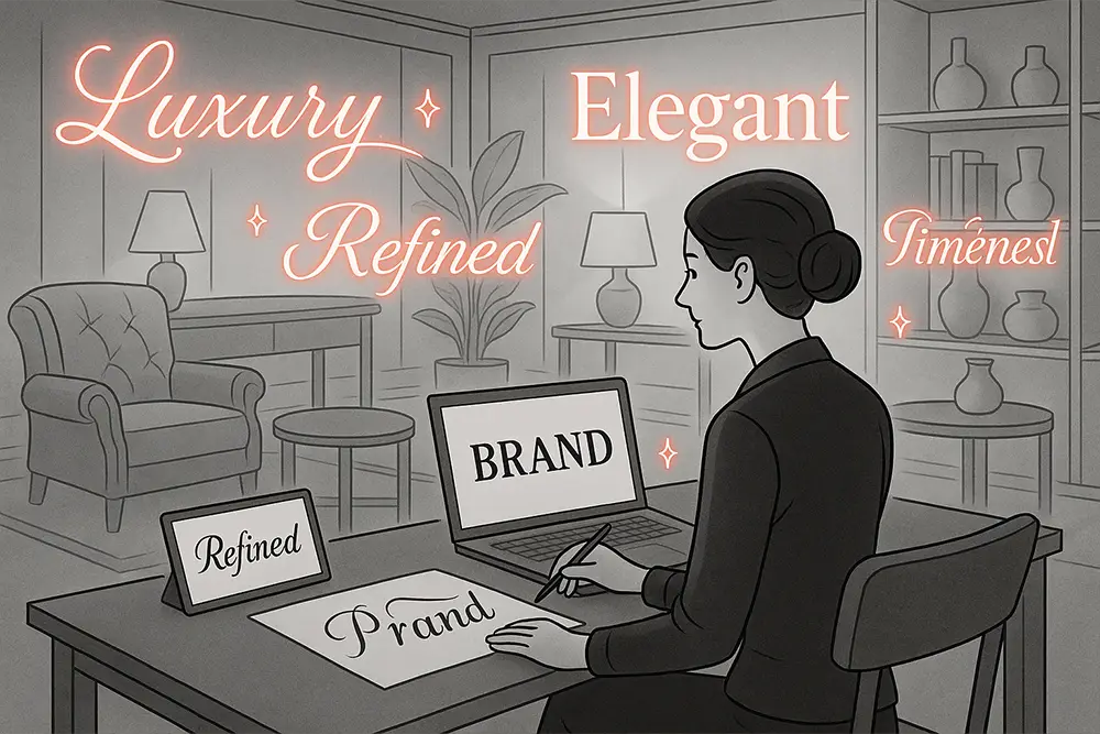
When shoppers browse furniture brands, they aren’t just buying a chair—they’re buying a mood, a material story, a promise of longevity. Typography quietly sets that promise. The right furniture branding fonts can make plywood feel like walnut, elevate a basic shelf into a collectible, and help your logo look like it belongs inside a beautifully lit showroom.
If you’re a designer, freelancer, or brand owner in the home & interior space, this guide shows how to choose furniture branding fonts that signal quality, heritage, and clarity—without losing modern appeal. We’ll pair bold serif voices with clean sans workhorses, then show 10 ready-to-use fonts from Figuree Studio to ship your identity system faster.
Also Read: Best Fonts for Logo Design: Make Your Brand Unforgettable
High-consideration purchases—sofas, dining tables, storage—rely on trust. The first seconds on your site, box, or swing tag must whisper: “This brand won’t warp, chip, or date.” That’s the job of well-chosen furniture branding fonts. Serif details suggest craft and tradition; a neutral sans serif adds control and ease. Together, they create a premium rhythm customers can feel from logo to care card.
Also Read: The Ultimate Guide to the Best Fonts for Packaging Design in 2025

Think of your typography system like joinery. The serif is the statement joint—the dovetail on the cabinet face—while the sans is the hidden bracket that keeps everything sturdy. For furniture branding fonts, use:
This pairing feels editorial and expensive, and it scales beautifully across website, catalog, price tags, assembly manuals, and social.
Also Read: Clean Logo Fonts That Make Your Small Business Look Professional and Future-Ready
1) Material match
Your furniture branding fonts should echo material choices. Solid oak and linen? Choose high-contrast serifs with graceful terminals. Powder-coated steel and glass? Pick geometric sans with sharp profiles.
2) Legibility across touchpoints
From 14px PDP copy to 3-meter window decals, test your fonts at micro and macro scales. Good families carry furniture branding fonts gracefully through every zoom level.
3) Personality arcs
Define the spectrum: Heritage → Contemporary → Futuristic. Place your serif and sans along that arc so the voice stays coherent in seasonal campaigns.
4) Licensing fit
If you’ll embed fonts in apps, use for social ads, or print catalogs at scale, review the right license early to avoid rework. (See: Figuree Studio License — ask us about the Extended License discount for corporate teams.)
External tip: A quick refresher on type pairing principles from WebDesignerDepot can sharpen your eye when mixing serif and sans for branding systems. (Great primer on hierarchy, contrast, and tone.)
Below are curated furniture branding fonts from Figuree Studio—with role suggestions so you can drop them straight into your system.
All-caps elegance with refined ligatures for timeless wordmarks and hero headers. Perfect for premium wood lines and limited editions.
Use it for: Logo, masthead, box lids.
Pair with: Ignazio or Bolde for body and specs.

High-contrast editorial serif that photographs beautifully. Works wonders on lookbooks and collection pages.
Use it for: Headlines, collection names, catalog covers.
Pair with: Ignazio for clean UI text.

Futuristic elegance with precision-crafted serifs—great for modern cabinetry and modular systems.
Use it for: Logos, campaign slogans, magazine-style spreads.
Pair with: Midnight Workers for sleek navigation.

Art-Deco geometry that screams boutique showroom. Use for high-margin lines, monograms, and edition numbers.
Use it for: Foil-stamped swing tags, certificates, price plaques.
Pair with: Bolde for tech sheets.

Humanized geometry with calm authority; a perfect info workhorse.
Use it for: Menus, PDP specs, assembly guides, app UI.
Pair with: Kastroz or Huitside.

Slightly sturdier sans for tables, dimensions, and warranty sections.
Use it for: Size charts, care instructions, caption text.
Pair with: Neobique or Olyphs.

A crisp modern sans ideal for QR labels, SKU stickers, and store signage.
Use it for: Wayfinding, shelf talkers, checkout screens.
Pair with: Huitside.

Geometric display with contemporary edge—use sparingly for collection nicknames or campaign keywords.
Use it for: Sub-marks, social titles, landing hero overlays.
Pair with: Ignazio for clarity.

A refined signature for founder notes, certificates, and limited-run authenticity cards—adds human warmth to hard materials.
Use it for: Founder letter, special edition cards.
Pair with: Kastroz.
A softer signature style for lifestyle imagery and care card quotes—whispering premium hospitality.
Use it for: Pull quotes, lifestyle captions, tissue wrap prints.
Pair with: Olyphs or Huitside.
Also Read: Transform Your Portfolio with These Interior Design Fonts Designers Love

Step 1 — Logo & monogram
Choose one statement serif (Kastroz / Huitside / Neobique / Olyphs). Test small sizes, embossing, and foil. Your furniture branding fonts should hold detail in metal stamps and stay crisp on fabric labels.
Step 2 — Type hierarchy
Lock in H1 serif → H2 serif → H3 sans → body sans. This keeps product pages elegant yet scannable. Repeat the hierarchy on spec sheets and assembly PDFs so the experience feels continuous.
Step 3 — Numerals & specs
Pick a sans family with strong numerals (e.g., Bolde). Dimensions, weights, and materials appear constantly in furniture storytelling—your furniture branding fonts must render numbers cleanly.
Step 4 — Signatures & certificates
Add a tasteful script ( Radditya Signature or Hadejah ) for authenticity notes; it’s a subtle luxury cue customers love to photograph.
Step 5 — Licensing & scale
Confirm the right license up front (Extended/Corporate) if you’ll use furniture branding fonts across retail displays, national ads, and multi-site web. Get the best rate here: Figuree Studio License.
Also Read: Fonts for Restaurant & Café Branding: How to Pick the Perfect Logo and Menu Typefaces in 2025
Pro tip: When pairing furniture branding fonts, aim for contrast with cohesion: if the serif is highly expressive, the sans should be calmer (and vice versa).
Premium brands win on restraint. The most expensive feeling systems often use fewer weights, more spacing, and consistent rhythm across assets. Two ideas that keep returning in our projects:
“Good design is a language, not a style.” — Massimo Vignelli
“The job of typography is to honor content.” — Robert Bringhurst
If your collection spans rustic oak to powder-coated steel, you don’t need seven typefaces. You need one great serif voice plus one humble sans, both implemented with discipline.
Also Read : 100 Short Love Quotes to Inspire Your Creative Soul
Premium isn’t an accident; it’s a system. Choose furniture branding fonts that echo your materials, balance elegance with clarity, and stay consistent from logo to assembly card. Start with a statement serif (Kastroz, Huitside, Neobique, or Olyphs), then lock your UI and specs with Ignazio or Bolde. Add a quiet signature to humanize the brand, and you’re ready to launch a timeless identity—one that customers trust and love to share.
Don’t let these branding risks hold you back. Design with clarity, grow with confidence.
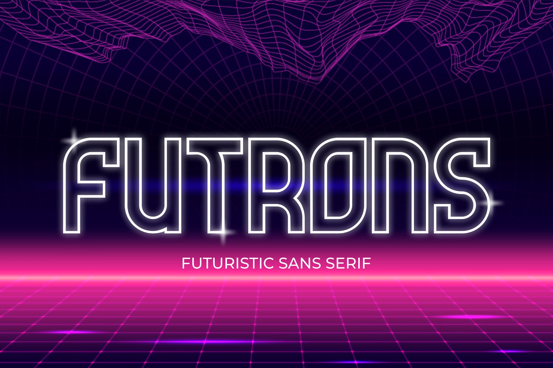 Futrons - Futuristic Display Font
Price range: $21 through $1,299
Futrons - Futuristic Display Font
Price range: $21 through $1,299 Brotherside - Stylish Signature Font
Price range: $21 through $1,299
Brotherside - Stylish Signature Font
Price range: $21 through $1,299 Neobique - Modern Display Serif
Price range: $21 through $1,299
Neobique - Modern Display Serif
Price range: $21 through $1,299
Elevate your projects with premium freebies. Fonts, graphics, and templates handpicked for creators like you — download them all today, free forever.
Download Freebies