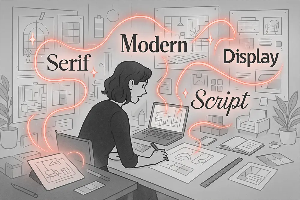
A gorgeous room photo can stop the scroll, yet the wrong typography can quietly lower perceived value. Interior designers, freelancers, and brand owners don’t just sell spaces—they sell taste. And taste is transmitted through type. The right interior design fonts make your portfolio feel curated, modern, and expensive. The wrong ones create visual noise.
In this guide, we’ll combine modern sans and elegant serif choices that work beautifully across moodboards, case studies, proposals, and brand decks. You’ll also find strategic pairings, real-world use cases, and ready-to-use font recommendations from the Figuree Studio catalog—so you can implement today and pitch with confidence.
“Good design is as little design as possible.” — Dieter Rams
When clients browse a portfolio, their brain is scanning for consistency and confidence. As you evaluate interior design fonts, aim for:
For inspiration and baseline studies on legibility and pairings, you can also explore references on Google Fonts to observe spacing, weights, and real-text previews before committing. Then, come back to premium options to lock in a unique look clients haven’t seen everywhere.

Pairing a modern sans with a refined serif creates contrast and credibility. In interior design portfolios, that combo signals both contemporary taste and craft heritage—perfect for high-ticket clients.
Below are five carefully selected interior design fonts from Figuree Studio that embody this formula. Each font includes a direct link so you can explore full previews and licensing options.
If your portfolio needs clarity with authority, start with Ignazio – Modern Sans Serif. Balanced strokes and humanized geometry make Ignazio ideal for project titles, hero captions, and slide headers.
Use it for: H1–H3, section titles, price tables, capabilities.
Pair with: Huitside or Kastroz for editorial descriptions.
Why it works: Ignazio communicates architectural discipline without feeling cold—perfect for contemporary interiors and minimalist studios.

Bolde – Powerful Sans Serif is your information workhorse. It keeps spec sheets, material lists, and timelines clean and legible.
Use it for: Project metadata (location, scope, timeline), infographics, process steps.
Pair with: Hadejah for sign-off pages or testimonials to add warmth.
Why it works: Its strength and smooth curves make complex layouts easy to digest, which matters when boards are reviewing multiple firms.

Huitside – Fashion Serif Typeface delivers editorial polish. It’s perfect for storytelling paragraphs in case studies, where you explain concept, constraints, and transformation.
Use it for: Body copy, design rationale, before/after stories, press excerpts.
Pair with: Ignazio for headings to create modern-meets-couture tension.
Why it works: Huitside’s refined curves imply luxury and taste, the two signals every premium client expects.

For projects with historical or hospitality flair, Kastroz – Luxury Vintage Serif adds gravitas without heaviness.
Use it for: Pull quotes, section openers, typography-led title pages, lookbook covers.
Pair with: Bolde for specs; Huitside for body.
Why it works: Kastroz cues heritage and craftsmanship—excellent for boutique hotels, restorations, and heritage-inflected residential work.

End sterile decks with a human note. Hadejah – Elegant Signature Font adds intimacy to sign-offs, testimonial highlights, or moodboard annotations.
Use it for: Designer’s signature, personal notes, curated material tags.
Pair with: Ignazio/Huitside to keep overall structure disciplined.
Why it works: That handwritten whisper softens modern minimalism and makes your studio feel approachable.

Radditya Signature brings refined, flowing strokes that elevate captions and annotations.
Use it for: Moodboard tags, lifestyle quotes, or thank-you notes in your portfolio.
Pair with: Bolde for balance, or Kastroz for luxury-driven projects.
Why it works: Its sophisticated curves lend a high-end personal touch that resonates with premium audiences.

Add an expressive twist with Roadpunks – Handbrush Typeface. It creates striking accents in otherwise minimalist layouts.
Use it for: Moodboard headings, creative cover pages, or transitional slides.
Pair with: Ignazio for structure and Huitside for body copy.
Why it works: Roadpunks injects raw, rebellious energy—perfect for designers who want to signal bold creativity.

Headlight – Stylish Bold Font adds a strong voice where you need impact.
Use it for: Section openers, bold callouts, or poster-style layouts in your portfolio.
Pair with: Huitside for elegance, or Hadejah for human warmth.
Why it works: Headlight’s natural, bold strokes give your pages a stylish edge that commands attention.

The Rughton Script blends boldness with personality.
Use it for: Logo mockups, slogans, or creative project identities inside your portfolio.
Pair with: Ignazio for stability, or Kastroz for heritage balance.
Why it works: Rughton brings energy and personality to otherwise neutral layouts—showing clients your versatility.

Finally, Nightfall – Urban Bold Script lends a trendy, street-smart vibe.
Use it for: Lifestyle projects, portfolio covers, or special project highlights.
Pair with: Huitside or Bolde to maintain legibility.
Why it works: Nightfall combines modern curves with urban flair, appealing to clients who want edgy yet elegant presentations.

Also Read: Strengthen your case-study copy with Proven Font Combos to Make Your Packaging Design Pop, then refine pricing narratives using The Truth About Pricing: Transparent Strategies for Freelance Designers and Every Font License Type Explained.
H1 (Ignazio 64–72): Project name + one-line result.
Deck (Huitside 20–22): Brief outcome and scope.
H2 (Ignazio 32–36): Concept / Challenges / Transformation / Specs.
Body (Huitside 16–18): 55–70 characters per line, 1.6–1.8 line height.
Pull quotes (Kastroz 28–32): Use sparingly to punctuate key insights.
Annotations (Hadejah 18–22): On moodboards or materials to humanize.
Also Read: Learn to craft better visuals for social promotion in 10 Game-Changing AI Tools to Make Stunning Product Mockups.
Clients are buying your judgment. Use typography to frame why choices were made:
This rhythm—claim → proof → narrative—is where the right interior design fonts make your thinking feel precise, not opinionated.
Also Read: For consistent publishing routines that compound reach, read Consistency Over Motivation: The Real Secret to Long-Term Creative Growth.
When portfolios underperform, the culprit is rarely the work—it’s the communication layer. We’ve reviewed hundreds of designer decks and noticed three patterns:
Strategic fix: Commit to two core interior design fonts—a modern sans (Ignazio/Bolde) and an elegant serif (Huitside/Kastroz)—then add a signature accent (Hadejah) only where human warmth helps close the deal.
“Your brand is what other people say about you when you’re not in the room.” — Jeff Bezos
“Styles come and go. Good design is a language, not a style.” — Massimo Vignelli
These quotes remind us: typography is how your brand speaks. Make it deliberate.
Presenting to corporate or hospitality clients? Ensure you’re covered. Check Figuree Studio Licenses—there’s a special discount for Extended License, and Corporate licensing for large teams or high-impression installs. For exploration or social content, browse our freebies to prototype quickly before you commit.
Each pairing keeps interior design fonts consistent, legible, and emotionally on-brand.
With a focused system and the right mix of interior design fonts, your portfolio becomes a persuasive story, not a scrapbook. Lead with a modern sans for clarity, deepen trust with an elegant serif, and sign off with a human touch. Clients won’t just see your rooms—they’ll feel your judgment.
Don’t let typography hold your brand back.
Browse our catalog, pick your pairing, and present your next project like a premium magazine spread.
 Nightfall - Urban Bold Script
Price range: $21 through $1,299
Nightfall - Urban Bold Script
Price range: $21 through $1,299 Headlight - Stylish Bold Font
Price range: $21 through $1,299
Headlight - Stylish Bold Font
Price range: $21 through $1,299 Noise Gear - Absolute Racing Font
Price range: $21 through $1,299
Noise Gear - Absolute Racing Font
Price range: $21 through $1,299
Elevate your projects with premium freebies. Fonts, graphics, and templates handpicked for creators like you — download them all today, free forever.
Download Freebies