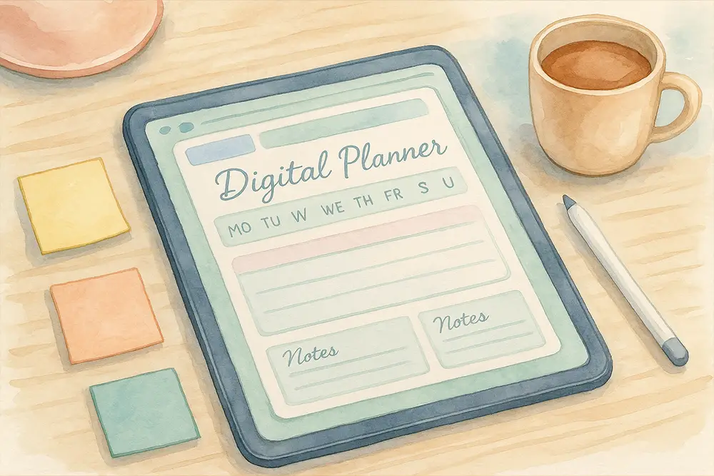
Digital planners have become more than just tools for organizing your life — they’re reflections of your personality. Whether you’re structuring your life in Notion, sketching a weekly spread in GoodNotes, or selling planner templates on Etsy, fonts play a huge role in setting the tone.
You could have the most stunning layout, but the wrong font? It can ruin the whole vibe. Choosing the right font isn’t just a design decision — it’s a statement of style, clarity, and user experience.
Not all fonts work well in planner layouts. Here are the key traits of planner-perfect fonts:

At Figuree Studio, we love exploring fonts by hand first — sketching headers, playing with brush pens, scanning the strokes, and refining them in Procreate. It’s part of our creative DNA.
One time, our team tested the same digital planner layout using two fonts: Moris Palm and Byte Sharp. The difference in mood was mind-blowing. One felt soft and playful. The other? Techy and bold. That’s the power of typography.
Personally, I love using Grow Boys in my Notion layouts. It’s sleek, effortless to read, and doesn’t distract from the content. When we designed Hadejah, we took inspiration from natural handwriting in bullet journals — and it just works beautifully in digital spreads.
“Typography is what language looks like.” — Ellen Lupton, Thinking with Type
This quote perfectly sums up what we believe at Figuree — the font you choose isn’t just design. It’s identity.
Your digital planner isn’t just a tool — it’s your personal canvas. Whether you use GoodNotes, Notion, or an iPad journaling app, the right font can elevate the experience. Below are our top picks from Figuree Studio to make your planner look stunning, unique, and totally on-brand.
Shutter Breathing is a handcrafted organic brush font designed for creatives who love natural textures and fluid strokes. It’s perfect for daily journaling, affirmation pages, or any layout that calls for a touch of authenticity.
Use it in: aesthetic digital planners, habit trackers, self-care layouts

Akihabored brings the elegance of Japanese brush calligraphy to your digital workspace. It adds a dynamic, artistic feel to your spreads — ideal for themed planners, quote pages, or cultural calendar layouts.
Use it in: travel planners, Asian-themed spreads, or decorative headers

Nightfall is a modern script font with bold energy and sleek curves. It comes with ligatures and stylistic alternates that make your headings pop. If you love trendy, expressive fonts that still stay clean, this one’s for you.
Use it in: planner cover pages, daily quotes, bold weekly layouts

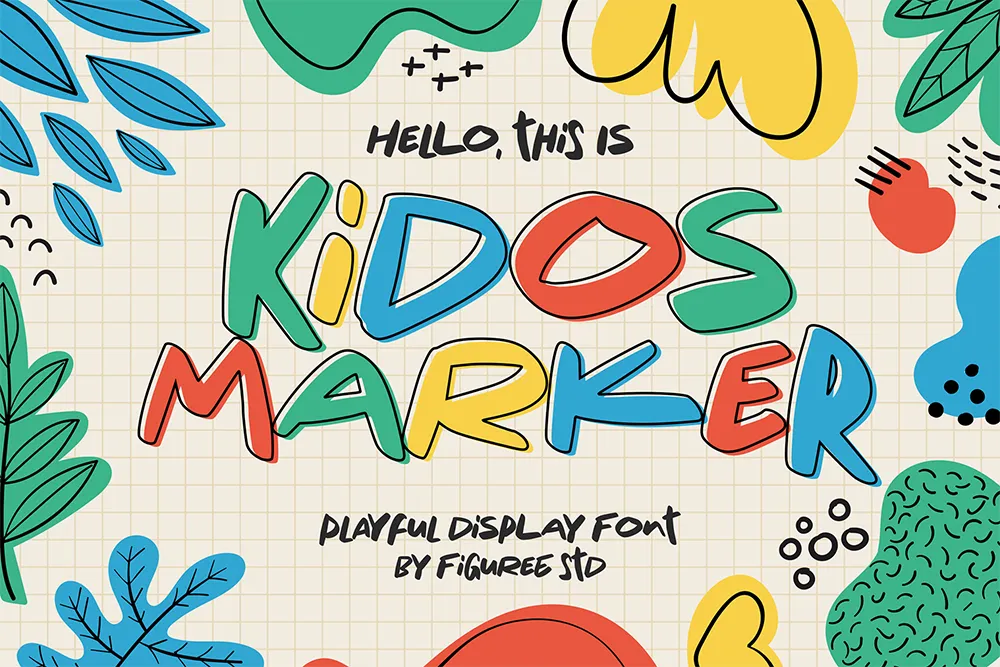
Kidos Marker is a cheerful display font that brings joy to every layout. Inspired by kids’ doodles, it adds a colorful and spontaneous vibe to your digital planner.
Use it in: mood trackers, kids’ schedules, colorful weekly plans
👉 Use Kidos Marker
The Barethos is a delicious display font inspired by food packaging and retro diner vibes. It adds boldness and character, making it perfect for organizing recipes, meal plans, or fun weekend layouts.
Use it in: recipe planners, shopping lists, food-themed spreads
👉 View The Barethos

Magic Dreams is a whimsical comic-style font full of energy and imagination. It’s ideal for themed layouts, creative projects, or anyone who wants their planner to feel a little more magical.
Use it in: story-based layouts, vision boards, comic-inspired spreads
👉 Preview Magic Dreams

Need additional references? Check out Google Fonts or browse planner templates on Creative Market. Just remember to always use fonts with proper commercial licenses.
If you’re a designer creating digital planner products for resale or client use, you’ll need the right licenses:
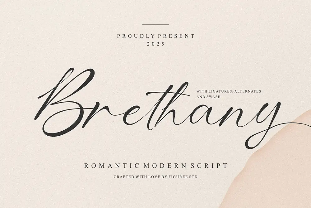 Brethany – Romantic Modern Script Font
Price range: $21 through $1,299
Brethany – Romantic Modern Script Font
Price range: $21 through $1,299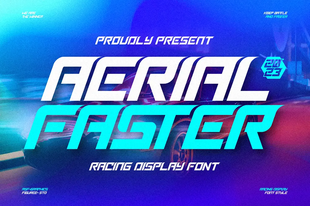 Aerial Faster – Racing Display Font
Price range: $21 through $1,299
Aerial Faster – Racing Display Font
Price range: $21 through $1,299 Break Fridays - Clean Bold Script
Price range: $21 through $1,299
Break Fridays - Clean Bold Script
Price range: $21 through $1,299
Elevate your projects with premium freebies. Fonts, graphics, and templates handpicked for creators like you — download them all today, free forever.
Download Freebies