I still remember the first time a property developer asked me to “make it look expensive.” They already had glass towers, drone photography, marble lobbies—but the brochure still felt… cheap. The problem wasn’t the building; it was the typography.
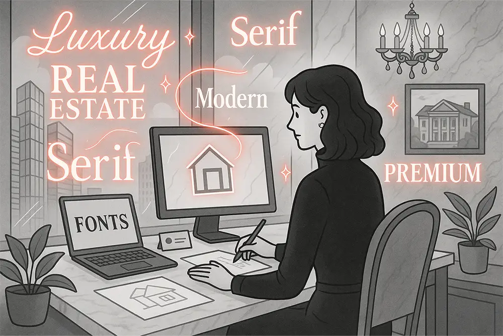
Real Estate Fonts carry enormous weight in shaping first impressions. They can whisper trust, scream exclusivity, or simply fade into background noise. In a market where buyers sign checks for millions, perception is everything. A wrong typeface can make a premium project look like a budget rental.
As designers, freelancers, and brand owners, our job is not just to decorate—it’s to build trust through every visual cue. Fonts are the quiet architecture of your brand.
Walk into a sales gallery of a luxury development. The space is silent, polished, every detail intentional. The font on the wall signage, the nameplate of the tower, the invitation card—these Real Estate Fonts are not random choices. They’re signals. Serif curves echo heritage, wide tracking signals exclusivity, handwritten accents whisper intimacy.
That’s why choosing fonts for real estate is not just “design.” It’s strategy. It’s pricing psychology wrapped in typography.

If you’ve ever wondered why a brochure feels like it belongs on a coffee table in Milan instead of a trade show in Jakarta, the answer is simple: fonts. And the right fonts change everything.
Here’s the shortlist I’ve seen consistently transform real estate projects from “decent” to “premium.” Some come from Figuree Studio’s own catalogue, some from fellow designers I admire. Together, they form a toolkit you can rely on.
Kastroz – Luxury Vintage Serif: Sharp elegance, perfect for project logos and tower names. When set in all caps, Kastroz feels like stone carved into typography.

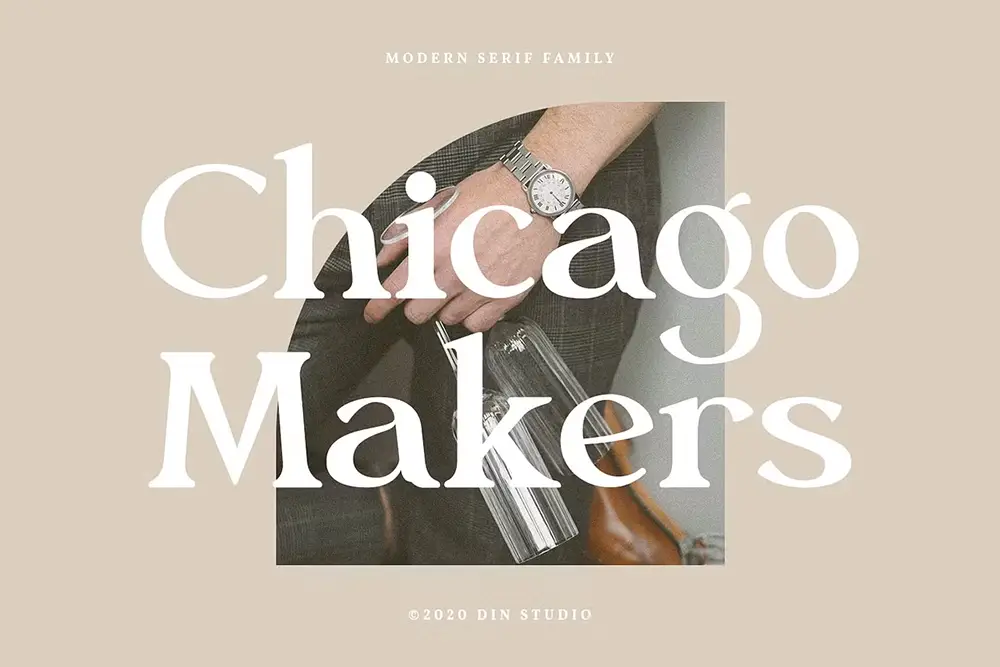
Chicago Makers – Modern Serif Family: A strong editorial serif with proportions built for high-end brochures. Think glossy spreads, investment decks, and floor plan covers.
Roadpunks – Handbrush Typeface: Use sparingly—great for lifestyle campaigns or neighborhood events where you want an artisanal vibe without losing class.

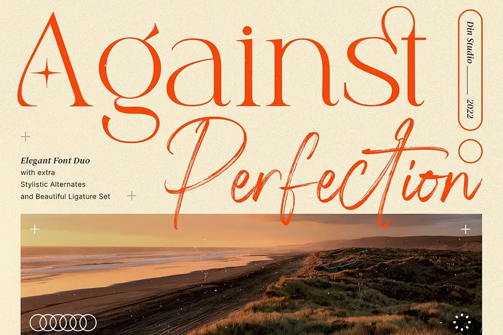
Against Perfection – Elegant Font Duo: A versatile pairing of serif + brush. Ideal for brands that want to balance prestige and approachability.
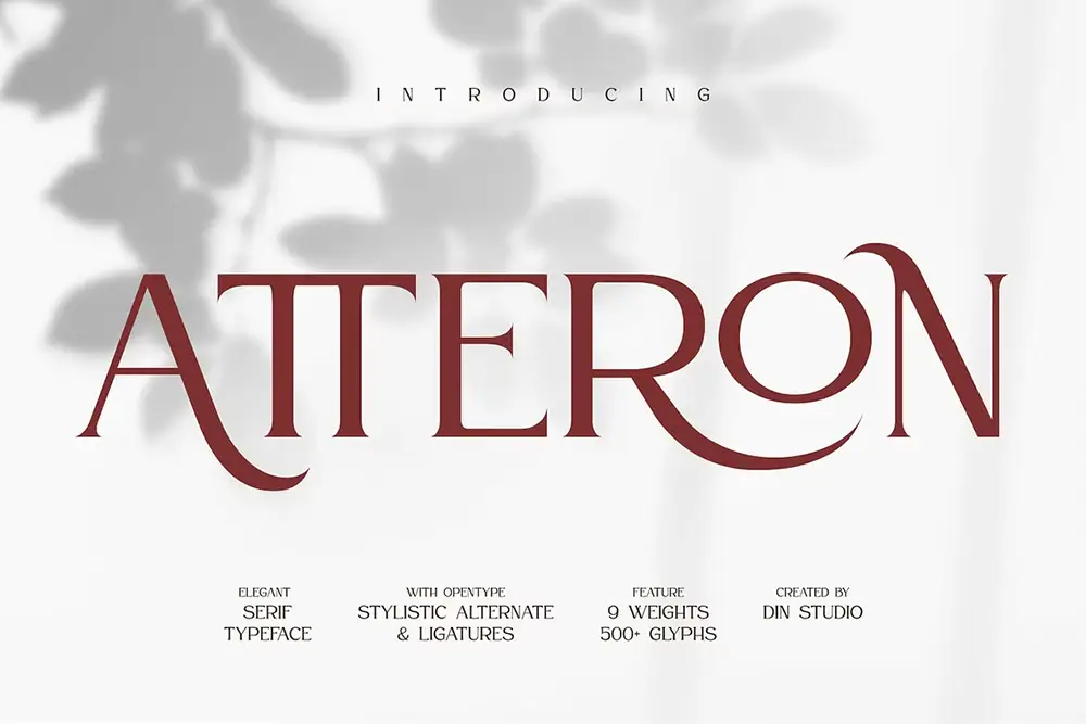
Atteron – Elegant Serif: Refined serif details that fit penthouse-level projects. A go-to for hero headlines.
Singkey – Variable Font: A flexible modern font that adapts across screen sizes—ideal for responsive real estate websites.

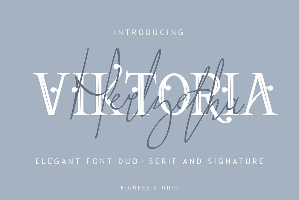
Viktoria – Stylish Font Duo: Clean serif for authority, script for warm, human notes like invitations or event branding.
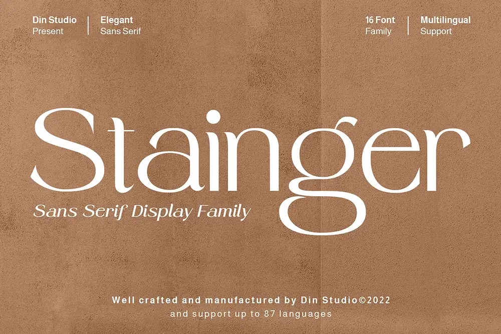
Stainger – Sans Serif Display Family: Your technical backbone. Perfect for data, tables, and floor plans where clarity matters most.
Hadejah Signature – Elegant Signature: Bring the personal touch—ideal for agent sign-offs, letters, or limited-edition prints.

Bolde – Powerful Sans Serif: Strong, clean, modern. Works brilliantly as a supporting type for signage and digital UI.

Each font has its role, but together they create harmony. Luxury branding isn’t about loud variety—it’s about restraint, hierarchy, and precision.
Use Kastroz in all caps with wide tracking. Its weight and ligatures feel timeless. Atteron or Chicago Makers are solid alternatives for slightly softer editorial vibes.
This is where Chicago Makers shines. Pair it with Viktoria’s serif, then drop in Hadejah Signature for a human touch—an architect’s note, a client testimonial. It feels curated, not corporate.
Stainger and Bolde bring clarity where buyers need to focus. They don’t distract; they support. A clean sans serif in your Real Estate Fonts system makes the numbers easy to trust.
Roadpunks or Against Perfection brush scripts can appear on limited-edition invites or event posters. They inject a “crafted by humans” spirit into an otherwise polished ecosystem.
On websites, Singkey adapts beautifully across screen sizes. Viktoria’s serif keeps the luxury tone, while Bolde ensures buttons and forms are frictionless.
Luxury isn’t created with loud design—it’s crafted through micro decisions:
Like Leonardo da Vinci said, “Simplicity is the ultimate sophistication.” The less noise, the more premium your Real Estate Fonts feel.
For more strategies on hierarchy and pairing, check out Proven Font Combos to Make Your Packaging Design Pop—the logic applies directly to real estate brochures.
After years designing for property developers, I’ve learned one truth: buyers don’t just buy property—they buy reassurance. Serif-led Real Estate Fonts compress that reassurance into seconds. They’re visual shorthand for “this is worth your money.”
The best systems are simple: one impeccable serif (Kastroz, Atteron, or Chicago Makers), one clean sans (Stainger or Bolde), and one human accent (Hadejah Signature). That’s it. Then scale, space, and finishes do the rest.
“Good design is obvious. Great design is transparent.” — Joe Sparano
Typography in real estate should feel invisible in its sophistication. When done right, buyers never notice the font—they just feel the premium.
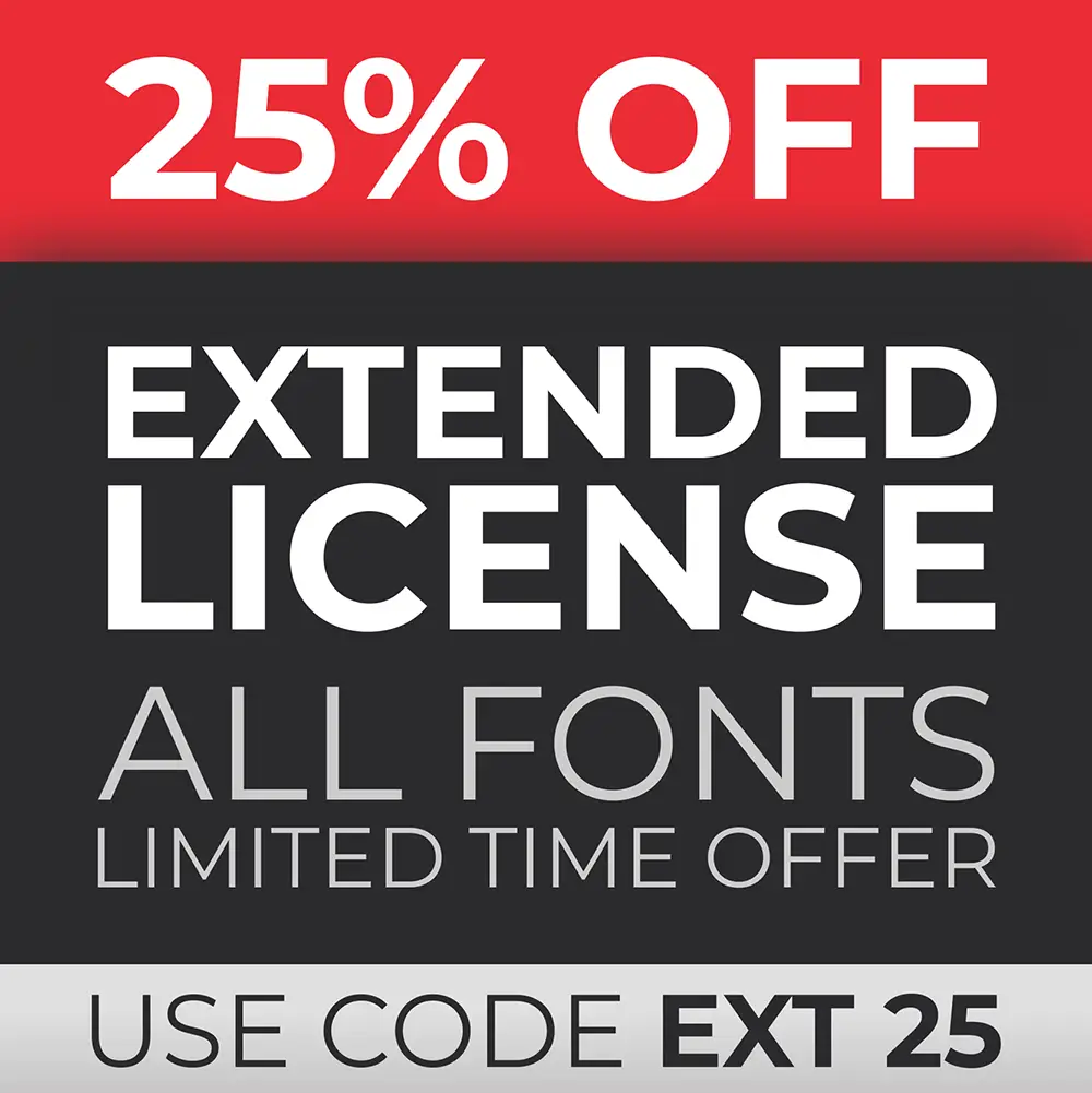
Every premium project needs a solid foundation—not just in architecture but in licensing. Start with the Standard License for most client deliverables. If you’re handling trademarks or national campaigns, upgrade to Extended or Corporate licenses (we offer discounts). Clients will appreciate your transparency, and you’ll protect your reputation.
Luxury real estate isn’t about louder ads or glossier paper—it’s about restraint and clarity. With the right Real Estate Fonts, you make buyers feel trust before they meet an agent.
So next time you design for a developer or agency, think strategically:
Design with clarity, grow with confidence, and let your fonts tell the story of prestige living.
👉 Explore our catalog of fonts, subscribe to our newsletter for fresh insights, and download freebies to start experimenting today.
Also Read:
 Toxic Rebel – Layered Drip Graffiti Font
Price range: $21 through $1,299
Toxic Rebel – Layered Drip Graffiti Font
Price range: $21 through $1,299 Brake Disc - Energetic Racing Font
Price range: $21 through $1,299
Brake Disc - Energetic Racing Font
Price range: $21 through $1,299 Race Freak – The Ultimate Racing Font
Price range: $21 through $1,299
Race Freak – The Ultimate Racing Font
Price range: $21 through $1,299
Elevate your projects with premium freebies. Fonts, graphics, and templates handpicked for creators like you — download them all today, free forever.
Download Freebies