
Product packaging isn’t just a container. It’s the first handshake between your brand and your customer. And in a crowded market, typography can make or break that first impression. The right font combo can scream “premium!”, whisper “eco-friendly”, or shout “fun!” — even before anyone reads the text.
In this guide, we’re unlocking font combinations that have proven their power across food, cosmetics, fashion, and toy packaging. Whether you’re a freelancer, studio owner, or brand designer, these font pairs will help your packaging design pop off the shelf and stick in the memory.
According to 99designs, the right font pairing not only increases visual appeal but also improves legibility and consumer trust — both crucial in packaging design.
Fonts create emotional cues. Combining two that complement each other gives hierarchy, personality, and readability — all crucial on limited space like boxes or labels. Done right, it’s a silent brand ambassador. Done wrong? It’s visual noise.
Midnight Workers brings that clean, modern vibe that’s great for serious headers. Pair it with Playkidz — a joyful display font — and you’ve got the perfect combination for children’s snack packaging or educational toys.

Also Read: Fonts That Make Your Digital Planners Look Stunning


For organic beauty, eco snacks, or handmade goods, Shutter Breathing’s brush strokes bring that raw authenticity. Pair it with the balanced, neutral Midnight Workers and your labels feel honest and grounded.
Also Read: Avoid These 7 Common Branding Mistakes That Hurt Your Growth

Nightfall’s bold urban script is full of charisma. Magic Dreams brings a playful balance to the mix. Use them together for products targeted at younger demographics — energy bars, trendy cosmetics, or sports apparel.
Also Read: Designing a Life You Love: Creative Freelancer’s Roadmap


Packaging luxury doesn’t mean boring. Bolde is a sleek sans serif that screams premium. Add a touch of Unicorn Pop’s whimsy and you’ve got packaging that feels both exclusive and delightful — perfect for artisan chocolates or upscale kidswear.
Also Read: Fonts That Sell: Make Your Etsy Shop Stand Out


Olyphs screams luxury with its Art Deco influence. Aesthetic brings that handcrafted feel. Pair them for artisanal food packaging like olive oils, spice jars, or boutique wine — where heritage meets elegance.
Also Read: How to Make Money from Fonts in Your Sleep (Passive Income Guide)


At Figuree Studio, we’ve tested hundreds of pairings — from sketch to print — using tools like Procreate for ideation and Illustrator for final design. We learned:
“Your font pairing is your silent sales rep. It has less than 2 seconds to spark curiosity.”
— Jeff Bezos once said, “Your brand is what people say when you’re not in the room.” Fonts speak that language first.
Sometimes, it’s not about matching styles — it’s about balancing contrast. That’s why a clean sans serif like Midnight Workers works so well with expressive scripts like Shutter Breathing or Nightfall. Our favorite combo? Shutter Breathing + Olyphs — organic meets luxury.
Also Read: The Hidden Formula Behind Corporate Brands’ Obsession with Handwritten Fonts
Packaging isn’t decoration. It’s strategy. The right font pair can elevate perception, create memorability, and drive conversions. Whether you’re selling gourmet goods or glow-in-the-dark slime, typography matters.
Don’t let your font choice be an afterthought — make it your signature.
👉 Browse more fonts
👉 Need a custom license?
👉 Get free design resources & font deals
Also Read: Tired of the Same Fonts? Freelancers, Here’s How to Break Free
 Back Wild - Fun Graffiti Font
Price range: $21 through $1,299
Back Wild - Fun Graffiti Font
Price range: $21 through $1,299 Khaleiyfa – Lovely Modern Script Font
Price range: $21 through $1,299
Khaleiyfa – Lovely Modern Script Font
Price range: $21 through $1,299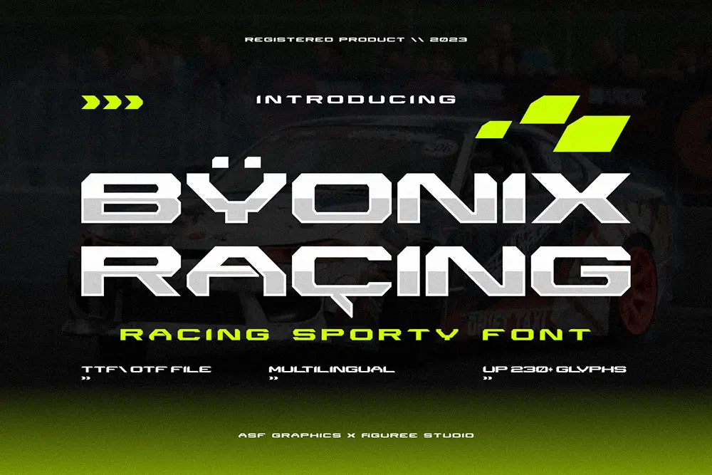 Byonix Racing – Racing Sporty Font
Price range: $21 through $1,299
Byonix Racing – Racing Sporty Font
Price range: $21 through $1,299
Elevate your projects with premium freebies. Fonts, graphics, and templates handpicked for creators like you — download them all today, free forever.
Download Freebies